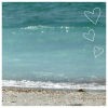
my crappy layout, a layout i made... |
Resource Center Links
This Month's Contests | Hosts Looking for Hostees | Hostees looking for Hosts | BigBookofResources
Submission Guidelines
  |

 Jun 18 2007, 01:25 PM Jun 18 2007, 01:25 PM
Post
#1
|
|
 mistermoze.  Group: Member Posts: 25 Joined: Sep 2006 Member No: 465,517 |
|
|
|
|


| *kimjaydot* |
Jun 18 2007, 01:32 PM
Post
#2
|
|
Guest |
lol looks okay to me, I like it orinagal
|
|
|
|
|
Jun 18 2007, 02:52 PM
Post
#3
|
|
 Senior Member Group: Member Posts: 107 Joined: Jun 2006 Member No: 417,055 |
i like it. however it is plain.
try adding some graphics or something. give it a little personality. 
|
|
|
|


|
Jun 18 2007, 02:57 PM
Post
#4
|
|
 d@niel Group: Member Posts: 1,267 Joined: Jan 2005 Member No: 91,453 |
yea...its pretty plain...
|
|
|
|

|
Jun 18 2007, 05:31 PM
Post
#5
|
|
|
im with the marching band Group: Member Posts: 740 Joined: Dec 2006 Member No: 491,167 |
simple.
but nice  add a background. |
|
|
|


|
Jun 18 2007, 05:43 PM
Post
#6
|
|
 What the fack. Group: Official Member Posts: 6,164 Joined: Mar 2004 Member No: 8,519 |
Like the others said, it's plain and simple. I like your color choices though.
Once you figure out what content to put in and get it all set up, it'll look better and bring it all together. 
|
|
|
|

|
Jun 19 2007, 03:14 AM
Post
#7
|
|
 High Voltage!∞ Group: Official Member Posts: 4,728 Joined: Jul 2004 Member No: 29,157 |
It looks nice!
I really like your color scheme.  Like others said, maybe try adding a graphic. A banner or background? It looks good so far! |
|
|
|

|
Jun 19 2007, 11:02 AM
Post
#8
|
|
 <3 KJJ Group: Member Posts: 59 Joined: Jun 2007 Member No: 531,342 |
yay blue! xD i like simple hehe. not everything needs to have a graphic right? x] but yea the back of my head still thinks it shud, lol. o-o.
|
|
|
|
|
Jun 19 2007, 12:07 PM
Post
#9
|
|
|
hardxcore. Group: Member Posts: 1,223 Joined: Nov 2006 Member No: 479,494 |
maybe you should try a simple banner.
i do love the colors, as everyone else said. and the font fits very well too. |
|
|
|

|
Jun 19 2007, 07:41 PM
Post
#10
|
|
 ;) Group: Staff Alumni Posts: 9,573 Joined: Feb 2005 Member No: 99,124 |
I like the simplicity, but I think you could atleast add a banner.
|
|
|
|

|
Jun 19 2007, 11:24 PM
Post
#11
|
|
 Two can keep a secret if one of them is dead. Group: Staff Alumni Posts: 2,682 Joined: Jun 2005 Member No: 156,187 |
if its crappy then why showcase it?
its pretty plain... doesn't seem to have much going on... maybe some graphics will help the layout some |
|
|
|

|
Jun 20 2007, 01:55 AM
Post
#12
|
|
 Oh Wow ... Group: Official Designer Posts: 688 Joined: Sep 2006 Member No: 468,522 |
Nice colors and font, why not trying to add a banner on the top? that'd give it a nice touch and you could make a simple banner if you're trying to go with a simple "theme // feel".
|
|
|
|

|
Jun 20 2007, 03:07 AM
Post
#13
|
|
 (Allison) Group: Human Posts: 420 Joined: Apr 2006 Member No: 395,668 |
Boooooooooring.
Add something. Anything. But nice try. |
|
|
|

|
Jun 20 2007, 08:44 AM
Post
#14
|
|
|
mistermoze. Group: Member Posts: 25 Joined: Sep 2006 Member No: 465,517 |
thanks for your replies, i think i'll try and make a banner for it soon...
|
|
|
|
|
2 User(s) are reading this topic (2 Guests and 0 Anonymous Users)
0 Members: