Design for my schools band, Where and How to put text? |
  |

 Mar 3 2007, 02:11 PM Mar 3 2007, 02:11 PM
Post
#1
|
|
|
Newbie  Group: Member Posts: 5 Joined: Dec 2006 Member No: 491,842 |
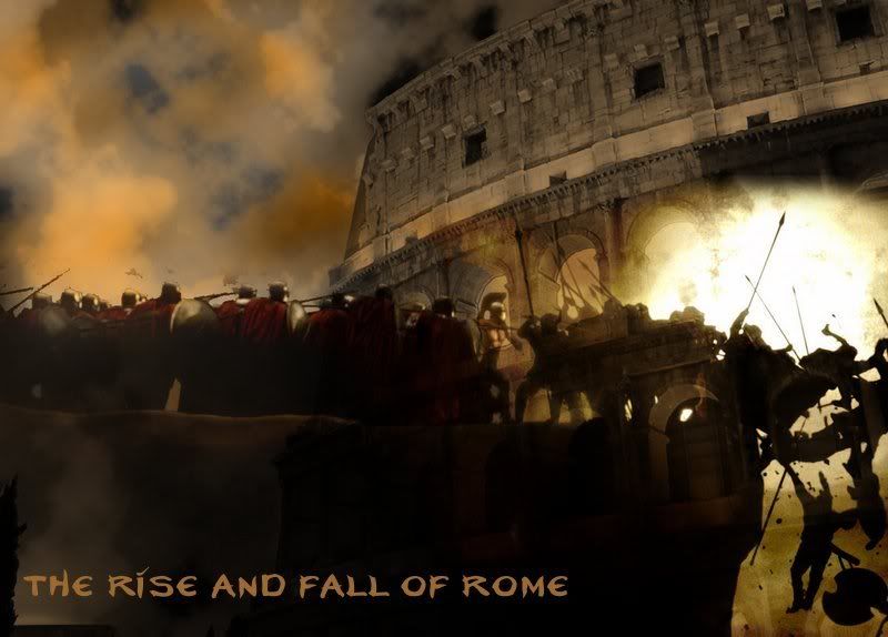
http://i68.photobucket.com/albums/i12/CHot_2006/RiseFall.jpg
I created this image for my School's marching band. Thier show is called "The Rise and Fall of Rome". I'm satisfied with how it is as of now. However, I need to place the Title on the image: http://i68.photobucket.com/albums/i12/CHot...6/Risefall2.jpg This is where I need some tips. The text needs to follow the colorscheme and feel of the image itself, but it also needs to be visible. Right now, it sticks out and takes away from the image. Any Ideas? |
|
|
|


|
Mar 3 2007, 08:33 PM
Post
#2
|
|
|
t-t-t-toyaaa Group: Official Member Posts: 19,821 Joined: Apr 2004 Member No: 11,270 |
I think the text would look better closer together and not so big. Well it can be big, but just maybe not smack dab in the middle where you can't see anything else. When its like that , its the first thing someone notices. ( And if they feel it doesn't fit , there goes the logo.) You should also make it so it stands out more. (Another color. Maybe white?) Default fonts like arial, georgia, times new roman, etc would even look good. I you have photoshop playing around with the text so its closer together, etc. Would be cool. But if your going with a more decorative font, you need something more mellow .
|
|
|
|


|
Mar 4 2007, 04:02 PM
Post
#3
|
|
|
hardxcore. Group: Member Posts: 1,223 Joined: Nov 2006 Member No: 479,494 |
 thumbed I know you didn't ask us to do it for you, but I was just giving a suggestion. Try & using sort of simple fonts with a twist. It needs to be smaller, as Toya said, so that it doesn't take away from the image. You did a great job, by the way. Some font suggestions are neverwinter, a lolita scorned, morphina, horny devils, dpscript, & all used up. I used neverwinter on this one with all lowercase letters. The fonts can be found here. |
|
|
|

|
Mar 13 2007, 07:55 PM
Post
#4
|
|
 Onyi eff. babii Group: Member Posts: 529 Joined: Aug 2005 Member No: 204,660 |
yea i think it should be in the bottom left hand corner ^^ but maybe a little bigger for when you do it with the same effects as you had it before
|
|
|
|

|
Mar 19 2007, 02:08 PM
Post
#5
|
|
 vengeance. Group: Official Member Posts: 3,058 Joined: Jul 2006 Member No: 437,024 |
Also for the text, I think should should go a lot smoother and less rougher.
|
|
|
|

|
2 User(s) are reading this topic (2 Guests and 0 Anonymous Users)
0 Members: