Collision v2, Re-Made! |
Resource Center Links
This Month's Contests | Hosts Looking for Hostees | Hostees looking for Hosts | BigBookofResources
Submission Guidelines
  |

 Oct 2 2006, 12:42 AM Oct 2 2006, 12:42 AM
Post
#1
|
|
 wondrously free.  Group: Member Posts: 134 Joined: Feb 2006 Member No: 380,103 |
Took my old collision sig..and re-did it into this:
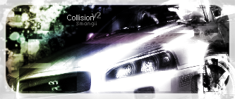 C&C appreciated! 
|
|
|
|


|
Oct 2 2006, 08:12 AM
Post
#2
|
|
|
Cassie Group: Member Posts: 143 Joined: Aug 2006 Member No: 459,516 |
I Love the gradient you used in this. Not a big fan of the text though.
|
|
|
|

|
Oct 2 2006, 08:25 AM
Post
#3
|
|
 Senior Member Group: Official Member Posts: 7,149 Joined: Aug 2005 Member No: 213,509 |
yah the text is bleh. but maybe you should show you original sig and so we can see what you changed. :\
but it looks good |
|
|
|

|
Oct 6 2006, 09:44 PM
Post
#4
|
|
|
wondrously free. Group: Member Posts: 134 Joined: Feb 2006 Member No: 380,103 |
Thanks! The original was this
|
|
|
|
|
Oct 7 2006, 01:20 AM
Post
#5
|
|
 I intend to live forever-so far, so good. Group: Member Posts: 2,820 Joined: Mar 2005 Member No: 115,137 |
The newer one is definitely an improvement. I like the sig you have now even better. Mainly because the colors are a lot more solid. I'm not too fond of the colors you chose for the one your V2 one
|
|
|
|

|
Oct 15 2006, 11:03 PM
Post
#6
|
|
 Senior Member Group: Member Posts: 1,584 Joined: Dec 2004 Member No: 70,748 |
perrty
|
|
|
|
| *Infinite.* |
Oct 19 2006, 04:18 PM
Post
#7
|
|
Guest |
Wow, I like that. I see anyone can really tell your art work out, it stands out from some. Also the whole border things.
I like this though, its very neat. The colors are too. |
|
|
|
|
2 User(s) are reading this topic (2 Guests and 0 Anonymous Users)
0 Members: