long way to go ... |
Resource Center Links
This Month's Contests | Hosts Looking for Hostees | Hostees looking for Hosts | BigBookofResources
Submission Guidelines
  |

 Sep 4 2006, 10:16 AM Sep 4 2006, 10:16 AM
Post
#1
|
|
 & my dreams fall down  Group: Member Posts: 1,173 Joined: Nov 2005 Member No: 291,336 |
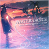
Okay, I made this for my website, I don't know what the hell I was doing with the placement but it looks bad.
 C&C please, I need to change it with you guys' help ! C&C please, I need to change it with you guys' help ! [thumbed] |
|
|
|


|
Sep 4 2006, 10:30 AM
Post
#2
|
|
 Senior Member Group: Official Member Posts: 7,149 Joined: Aug 2005 Member No: 213,509 |
uhm maybe add more brushes, like paint splatters or something in the background,and since you cut the last image out, maybe do the rest,looks okay
|
|
|
|

|
Sep 4 2006, 12:17 PM
Post
#3
|
|
|
<3 Group: Member Posts: 455 Joined: Jul 2006 Member No: 445,104 |
Pretty nice so far, love the colors. But yes more brushes to make it more alive.
|
|
|
|
|
Sep 4 2006, 12:32 PM
Post
#4
|
|
 Funny ol` world innit? Group: Member Posts: 133 Joined: May 2005 Member No: 144,657 |
Sharpen up the images!
|
|
|
|
|
Sep 4 2006, 12:40 PM
Post
#5
|
|
|
& my dreams fall down Group: Member Posts: 1,173 Joined: Nov 2005 Member No: 291,336 |
okay thanks everyone ...anyone else ?!
|
|
|
|
| *WHIMSICAL 0NE* |
Sep 4 2006, 01:01 PM
Post
#6
|
|
Guest |
Yes, I would say cut out the two images to the left.
Maybe even out the brush work, instead of just adding more. I doesn't look balanced. Also, I don't like how the color of the image on the right doesn't match the other two. Other than that, I like the colors you've used. Esspecially how you've incorporated the red into your design. |
|
|
|
| *Kathleen* |
Sep 4 2006, 03:20 PM
Post
#7
|
|
Guest |
I like it; well, I like the one on the far right. I don't think I like the cut-out look thing with the other two.

|
|
|
|
| *This Confession* |
Sep 4 2006, 04:41 PM
Post
#8
|
|
Guest |
I find it a little odd that you used her whole body, most people don't really do that, or maybe its just on how big it is. Perhaps add a little more brushes or something it seems a little plain on the right side.
Its nice though. |
|
|
|
|
Sep 4 2006, 05:54 PM
Post
#9
|
|
 Senior Member Group: Member Posts: 1,480 Joined: Jul 2006 Member No: 444,349 |
yeah i know it takes a while to cut out the images but you just can't do without it! lol! its cute and simple! maybe outline the others if you cut it but its good i like it!

|
|
|
|

| *digital.fragrance* |
Sep 4 2006, 07:28 PM
Post
#10
|
|
Guest |
Hmmm... I like it! The pattern is great! very 'vintage-y'
 Anyway, .... I do think more splotches/dotted lines on the right side would balance things out. I think that the image is rather larger, and the text too... maybe make them smaller for the site. Otherwise, you'll be scrolling down a ways before you get to the content. |
|
|
|
|
Sep 9 2006, 12:16 PM
Post
#11
|
|
 the name is ada. Group: Official Member Posts: 4,688 Joined: Dec 2005 Member No: 334,608 |
I love that song.
I don`t like the placement though. |
|
|
|
|
Sep 10 2006, 10:05 AM
Post
#12
|
|
|
& my dreams fall down Group: Member Posts: 1,173 Joined: Nov 2005 Member No: 291,336 |
Okay thanks everyone! Topic can be closed.

|
|
|
|
|
2 User(s) are reading this topic (2 Guests and 0 Anonymous Users)
0 Members: