DIV Layout Needs Feedback!, Gonna get accepted to CreateBlog this time! |
Resource Center Links
This Month's Contests | Hosts Looking for Hostees | Hostees looking for Hosts | BigBookofResources
Submission Guidelines
  |

 Aug 21 2006, 12:37 PM Aug 21 2006, 12:37 PM
Post
#1
|
|
 Quiet, Doggie!  Group: Member Posts: 394 Joined: Aug 2006 Member No: 452,267 |
What do you guys think?
 Any and all feedback accepted. As long as it's constructive. Don't just tell me that it sucks and you don't like it. I'm fine with that opinion as long as you elaborate so I can make it better. i was also wondering about the background color. i'm not really sure if i like it & i kinda wanna do more to it but i have no idea what.  any ideas? any ideas?plus i wanna know if it shows up right on you're guys' computers. Click Click okay. lay it on me. 
|
|
|
|


| *This Confession* |
Aug 21 2006, 01:39 PM
Post
#2
|
|
Guest |
Hmm okay, the layout set up looks really good to be honest with you. but the colors irk me. The whole green, blue, and orange. Look really bad together. Perhaps just change the orange to something else. Maybe a lighter color or black. Black goes with everything. It looks nice, and you choose a good band
|
|
|
|
|
Aug 21 2006, 01:44 PM
Post
#3
|
|
 Senior Member Group: Member Posts: 1,388 Joined: Feb 2004 Member No: 4,129 |
yeah i don't like the colors. mostly the orange, i like bright oranges. but the one you chose is like a faded dark one? OH i got one.. try changing the black text into white. it'll make the table background pop more & i like the banner

|
|
|
|


| *StanleyThePanda* |
Aug 21 2006, 01:44 PM
Post
#4
|
|
Guest |
I agree with Holly, its set up nicely, but I dont like the colors.
Cartel is awesome though, I like the blend.
|
|
|
|
|
Aug 21 2006, 01:52 PM
Post
#5
|
|
|
Quiet, Doggie! Group: Member Posts: 394 Joined: Aug 2006 Member No: 452,267 |
thanks everyone!
and like i said the background orange was the only thing i struggled with. i tried a lighter color blue. what do you think? |
|
|
|
|
Aug 21 2006, 01:57 PM
Post
#6
|
|
 mac & zee. Group: Member Posts: 243 Joined: Feb 2006 Member No: 376,265 |
I think it's pretty cool, and the blue definitely looks way better than the orange. :)
|
|
|
|
|
Aug 21 2006, 02:08 PM
Post
#7
|
|
|
Quiet, Doggie! Group: Member Posts: 394 Joined: Aug 2006 Member No: 452,267 |
here's a side-by-side comparison guys...
note:the orange in the picture is not the same as the original ugly orange. Thumbnailed! 
|
|
|
|
|
Aug 21 2006, 02:14 PM
Post
#8
|
|
 [BRITT;;] Group: Member Posts: 764 Joined: Jul 2006 Member No: 433,210 |
its great, just the colors. idk i don't like how they go together. the blue bg looks better.
|
|
|
|
| *StanleyThePanda* |
Aug 21 2006, 02:16 PM
Post
#9
|
|
Guest |
QUOTE(Rose-A-Lee @ Aug 21 2006, 3:08 PM)  here's a side-by-side comparison guys... note:the orange in the picture is not the same as the original ugly orange. Thumbnailed! http://img128.imageshack.us/img128/2561/screenscw8.jpg I like the green background and the black one.
|
|
|
|
|
Aug 21 2006, 02:17 PM
Post
#10
|
|
|
Senior Member Group: Member Posts: 1,388 Joined: Feb 2004 Member No: 4,129 |
have you tried white yet? i think it might look okay. i like the orange and blue one of your thumbnails. the green one is okay too. go for a lighter green?
|
|
|
|
|
Aug 21 2006, 02:18 PM
Post
#11
|
|
|
Quiet, Doggie! Group: Member Posts: 394 Joined: Aug 2006 Member No: 452,267 |
i didn't want a white background. it looked a little. meh.

|
|
|
|
|
Aug 21 2006, 02:21 PM
Post
#12
|
|
|
Senior Member Group: Member Posts: 1,388 Joined: Feb 2004 Member No: 4,129 |
would it be weird if you tried a yellow? i'd try this color: FEF1B5 or FFF68F
|
|
|
|
|
Aug 21 2006, 02:25 PM
Post
#13
|
|
|
Quiet, Doggie! Group: Member Posts: 394 Joined: Aug 2006 Member No: 452,267 |
yellow looks a little random to me.
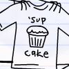
  i kind of had my heart set on finding the right orange. i got it from Nic's shirt in the blend. so i thought it might work. |
|
|
|
| *This Confession* |
Aug 21 2006, 02:50 PM
Post
#14
|
|
Guest |
Hmm when I was writing my post yellow came to mind, a really soft one. BUt the shades of blue and green your using won't make it all look right. I think the black background is your best bet.
|
|
|
|
|
Aug 21 2006, 03:12 PM
Post
#15
|
|
|
Quiet, Doggie! Group: Member Posts: 394 Joined: Aug 2006 Member No: 452,267 |
i guess if worst comes to worst people can just change the background color to what they like...
since i wanted the orange, i'll just submit with the orange... |
|
|
|
|
Aug 21 2006, 03:20 PM
Post
#16
|
|
 Running around, into the isles and into the yard. Group: Member Posts: 100 Joined: Jul 2006 Member No: 442,265 |
Before you do, look at a few of these.
(I have TOO much time on my hands)
Attached File(s)
|
|
|
|

|
Aug 21 2006, 03:41 PM
Post
#17
|
|
|
Quiet, Doggie! Group: Member Posts: 394 Joined: Aug 2006 Member No: 452,267 |
dude skt. i like the yellow.
i think that's what im gonna use. thanks! |
|
|
|
|
Aug 21 2006, 03:44 PM
Post
#18
|
|
|
Running around, into the isles and into the yard. Group: Member Posts: 100 Joined: Jul 2006 Member No: 442,265 |
Haha. WITHOUT EVEN TRYING FOR THE WIN!
Anytime! |
|
|
|
|
Aug 22 2006, 12:45 AM
Post
#19
|
|
|
Quiet, Doggie! Group: Member Posts: 394 Joined: Aug 2006 Member No: 452,267 |
Kay! Done. go ahead and close. thanks for the help everyone
|
|
|
|
|
2 User(s) are reading this topic (2 Guests and 0 Anonymous Users)
0 Members: