thats love, for you |
Resource Center Links
This Month's Contests | Hosts Looking for Hostees | Hostees looking for Hosts | BigBookofResources
Submission Guidelines
  |

 Jul 14 2006, 11:49 PM Jul 14 2006, 11:49 PM
Post
#1
|
|
 vengeance.  Group: Official Member Posts: 3,058 Joined: Jul 2006 Member No: 437,024 |
I was bored. Oh the things, Lucy can do when shes bored.  anyways, i make crappy things, this will just add to it. 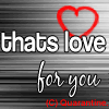 yeah its plain. but i don't know.. i kinda like it.. except it looks crappy. oh well. |
|
|
|


| *This Confession* |
Jul 14 2006, 11:55 PM
Post
#2
|
|
Guest |
yea its kind of plain, makes me think of just plain icons that just have text.
The background i suppose makes it add some interest. The heart and well red stuff is pixelated. the main text is nice though
|
|
|
|
|
Jul 15 2006, 12:04 AM
Post
#3
|
|
 I intend to live forever-so far, so good. Group: Member Posts: 2,820 Joined: Mar 2005 Member No: 115,137 |
I think you should get one of those brushes that are premade hearts, cuz hearts are really hard to do by hand. I think the red is a lil too bright against the black and white. And I know you don't want ppl to steal your site, but I don't think you should put that on there.
|
|
|
|

| *This Confession* |
Jul 15 2006, 12:07 AM
Post
#4
|
|
Guest |
^yea or make yourself a logo symbol and make it in to a heart shape form.
|
|
|
|
|
Jul 15 2006, 02:37 AM
Post
#5
|
|
 the name is ada. Group: Official Member Posts: 4,688 Joined: Dec 2005 Member No: 334,608 |
Thats nice and simple.I like the stripes.
|
|
|
|
|
Jul 15 2006, 07:27 AM
Post
#6
|
|
 Senior Member Group: Official Member Posts: 7,149 Joined: Aug 2005 Member No: 213,509 |
simple, and i agree with holly and maryland, choose a diff color
|
|
|
|

|
Jul 15 2006, 09:12 AM
Post
#7
|
|
 Krista. Group: Official Member Posts: 4,380 Joined: Apr 2006 Member No: 391,319 |
i'd change the colors. it is a bit plain. don't put the copyright thing there, because it doesn't look good. like holly said, you could make your own logo.
|
|
|
|

|
Jul 15 2006, 12:55 PM
Post
#8
|
|
|
vengeance. Group: Official Member Posts: 3,058 Joined: Jul 2006 Member No: 437,024 |
thanks, all. =]
next time i won't do the copywrite thing. oh and the heart was a brush already.. haha. |
|
|
|
|
2 User(s) are reading this topic (2 Guests and 0 Anonymous Users)
0 Members: