Icons..&blend&set, once more? |
Resource Center Links
This Month's Contests | Hosts Looking for Hostees | Hostees looking for Hosts | BigBookofResources
Submission Guidelines
  |

 Jul 12 2006, 02:59 PM Jul 12 2006, 02:59 PM
Post
#1
|
|
 My peanut.  Group: Member Posts: 948 Joined: Jul 2005 Member No: 187,456 |
   those are the icons.. are they better? heres a set I made. 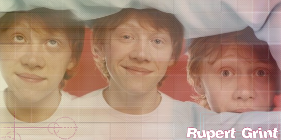  cc? |
|
|
|


|
Jul 12 2006, 03:26 PM
Post
#2
|
|
 Senior Member Group: Official Member Posts: 7,149 Joined: Aug 2005 Member No: 213,509 |
make the opacities of the patterns lower, or erase around them, fix the fonts, choose better ones,the last ones, get rif of the blue stuff and for the banner, choose a diff texture
|
|
|
|


|
Jul 12 2006, 04:08 PM
Post
#3
|
|
 the name is ada. Group: Official Member Posts: 4,688 Joined: Dec 2005 Member No: 334,608 |
These look much better..just mess with the opacity so that you can see the image clearer.
|
|
|
|
|
Jul 12 2006, 04:51 PM
Post
#4
|
|
 & my dreams fall down Group: Member Posts: 1,173 Joined: Nov 2005 Member No: 291,336 |
i like the 1st icon, its getting better.
|
|
|
|

|
Jul 12 2006, 04:54 PM
Post
#5
|
|
 show me a garden thats bursting to life Group: Staff Alumni Posts: 12,303 Joined: Mar 2005 Member No: 115,987 |
You're still overdoing the patterns and such. Just stick to colourizing them for now, and then move onto the patterns/textures.
|
|
|
|

|
Jul 12 2006, 06:57 PM
Post
#6
|
|
|
My peanut. Group: Member Posts: 948 Joined: Jul 2005 Member No: 187,456 |
geeze.. Idk why I try. :[
|
|
|
|
|
Jul 12 2006, 06:59 PM
Post
#7
|
|
|
show me a garden thats bursting to life Group: Staff Alumni Posts: 12,303 Joined: Mar 2005 Member No: 115,987 |
Because trying is practice and practice will eventually lead to a level of perfection. :)
|
|
|
|
| *This Confession* |
Jul 12 2006, 07:14 PM
Post
#8
|
|
Guest |
well I don't know the icons bother me actually, Maybe its because ive seen better and they just seem kind of simple. The blend is nice though, I like it a lot better than the icons

|
|
|
|
|
Jul 12 2006, 09:06 PM
Post
#9
|
|
|
My peanut. Group: Member Posts: 948 Joined: Jul 2005 Member No: 187,456 |
I think I do blends better than Icons too. THNX :]] someone should make a BLEND community, then I'd be happy.. :]
|
|
|
|
|
Jul 12 2006, 09:18 PM
Post
#10
|
|
 I intend to live forever-so far, so good. Group: Member Posts: 2,820 Joined: Mar 2005 Member No: 115,137 |
the patterns and such make your icons look a lil 'dull' as in theres no contrast. duplicating your icon when you're finished it and setting the top layer to overlay may help this *shrugs*
|
|
|
|

|
Jul 12 2006, 09:24 PM
Post
#11
|
|
 Krista. Group: Official Member Posts: 4,380 Joined: Apr 2006 Member No: 391,319 |
^ i agree with maryland. the icons just seem rather dull. the patterns/textures stand out too much for me. and the colors and styles of the fonts don't go well with them.
but keep on practicing! practice makes perfect. 
|
|
|
|

|
Jul 12 2006, 09:43 PM
Post
#12
|
|
|
t-t-t-toyaaa Group: Official Member Posts: 19,821 Joined: Apr 2004 Member No: 11,270 |
I agree with everyone about the icons. Sometimes pattern & brushless can come out better. I do like the second Icon, but not the pattern. The blends nice though.
|
|
|
|

|
2 User(s) are reading this topic (2 Guests and 0 Anonymous Users)
0 Members: