superman blend, in the works |
Resource Center Links
This Month's Contests | Hosts Looking for Hostees | Hostees looking for Hosts | BigBookofResources
Submission Guidelines
  |

 Jul 3 2006, 02:54 PM Jul 3 2006, 02:54 PM
Post
#1
|
|
 My peanut.  Group: Member Posts: 948 Joined: Jul 2005 Member No: 187,456 |
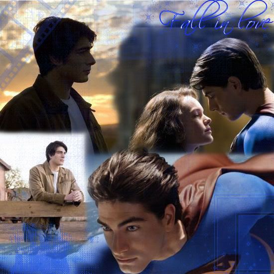 okay ya'll im looking for some suggestions on what I should do because this one could become better.. what do you think I should do to make it look better? |
|
|
|


| *Zatanna* |
Jul 3 2006, 02:59 PM
Post
#2
|
|
Guest |
If possible, get rid of the square looking thing you've got with the two bottom images (if that makes sense). Also, I don't mean to jump on the 'hate Scriptina' bandwagon, but the font doesn't look good with this blend. I also think that the blue in the font is a tad bright. I don't care much for the filmstrip brush on the top left corner.
Great start though. |
|
|
|
|
Jul 3 2006, 03:07 PM
Post
#3
|
|
|
My peanut. Group: Member Posts: 948 Joined: Jul 2005 Member No: 187,456 |
okay ya'll im looking for some suggestions on what I should do because this one could become better.. what do you think I should do to make it look better? |
|
|
|
|
Jul 3 2006, 03:18 PM
Post
#4
|
|
 Senior Member Group: Official Member Posts: 7,149 Joined: Aug 2005 Member No: 213,509 |
dont use that brush filrm strip brush or that brush in the bottom right hand corner for a start :]
|
|
|
|


| *Zatanna* |
Jul 3 2006, 03:23 PM
Post
#5
|
|
Guest |
I could have sworn I replied to this.
Oh wait, I think you made duplicate topics. Here's my thoughts: QUOTE(Zatanna @ Jul 3 2006, 12:59 PM)  If possible, get rid of the square looking thing you've got with the two bottom images (if that makes sense). Also, I don't mean to jump on the 'hate Scriptina' bandwagon, but the font doesn't look good with this blend. I also think that the blue in the font is a tad bright. I don't care much for the filmstrip brush on the top left corner.
Great start though. |
|
|
|
| *salcha4u* |
Jul 3 2006, 03:32 PM
Post
#6
|
|
Guest |
Feather a lot more.
|
|
|
|
|
Jul 3 2006, 03:33 PM
Post
#7
|
|
 show me a garden thats bursting to life Group: Staff Alumni Posts: 12,303 Joined: Mar 2005 Member No: 115,987 |
^ Definately. Use a jumbo eraser.
Merged the 2 topics. Please don't make duplicate topics. |
|
|
|

|
Jul 3 2006, 03:36 PM
Post
#8
|
|
 je hebt het niveau van een poffertje Group: Member Posts: 512 Joined: May 2004 Member No: 15,934 |
Use the eraser tool, and maybe set the opacity of the brush between 20%-50%. Erase the edges with like, 50%, and then set the brush lower to add a nice fade. Nice placement of the images though =) I also suggest you might try a different font, Scriptina isn't a great choice =/ Pretty much everything everyone else has already said.
|
|
|
|

|
Jul 3 2006, 03:51 PM
Post
#9
|
|
 What the fack. Group: Official Member Posts: 6,164 Joined: Mar 2004 Member No: 8,519 |
I think you should have it so that the edges of each picture aren't so..edgy. 'Cause you can still pretty much see the outline of each image. So just blend them together more and I think that'll make for a lot of improvement. :)
|
|
|
|

|
Jul 3 2006, 04:35 PM
Post
#10
|
|
 I intend to live forever-so far, so good. Group: Member Posts: 2,820 Joined: Mar 2005 Member No: 115,137 |
Everyone stole my ideas already. I like the placement of it though :flower: different color bushes would be nice, and I tink you should dl some better brushes too.
|
|
|
|

|
Jul 3 2006, 04:38 PM
Post
#11
|
|
 Senior Member Group: Posts: 8,274 Joined: Mar 2004 Member No: 8,001 |
redo it again.
use feather. use opacity. overlap the picture closely. increase the image quality. reduce the whole "boxy" image looking ... dont add brushes yet. let us know how are you doing so far.  good luck.  QUOTE(mizz_americaz @ Jul 3 2006, 2:35 PM) Everyone stole my ideas already. I like the placement of it though :flower: different color bushes would be nice, and I tink you should dl some better brushes too. everyone ... ? wtf. |
|
|
|
|
Jul 3 2006, 04:56 PM
Post
#12
|
|
|
I intend to live forever-so far, so good. Group: Member Posts: 2,820 Joined: Mar 2005 Member No: 115,137 |
^huh, I'm kinda confused. I was just saying that i have the same critique as everyone else
sry... |
|
|
|
|
Jul 3 2006, 05:25 PM
Post
#13
|
|
 & my dreams fall down Group: Member Posts: 1,173 Joined: Nov 2005 Member No: 291,336 |
i don't like it, but once again i agree with everyone else...get better pictures, do it over again, and it doesn't really look like a blend to me, b/c it looks like you just paste the pics on there..anywho if you use the advice in what we say..your blend should be great!
|
|
|
|

|
Jul 3 2006, 06:42 PM
Post
#14
|
|
|
My peanut. Group: Member Posts: 948 Joined: Jul 2005 Member No: 187,456 |
anyone have any suggestions on what font I should use?
and mizz americaz have any suggestions on which brushes I should dl? QUOTE(TATiisoHO0D @ Jul 3 2006, 5:25 PM) i don't like it, but once again i agree with everyone else...get better pictures, do it over again, and it doesn't really look like a blend to me, b/c it looks like you just paste the pics on there..anywho if you use the advice in what we say..your blend should be great! im asking you to not comment on any of my pictures anymore. thanks. |
|
|
|
|
Jul 3 2006, 07:38 PM
Post
#15
|
|
|
My peanut. Group: Member Posts: 948 Joined: Jul 2005 Member No: 187,456 |
 I re-did it how do you like it now? 
|
|
|
|
|
Jul 3 2006, 07:48 PM
Post
#16
|
|
|
& my dreams fall down Group: Member Posts: 1,173 Joined: Nov 2005 Member No: 291,336 |
QUOTE(RupertGrintluvr15 @ Jul 3 2006, 6:42 PM) anyone have any suggestions on what font I should use? and mizz americaz have any suggestions on which brushes I should dl? im asking you to not comment on any of my pictures anymore. thanks. well guess what? im not going to  i gave you my c&c accept it, like im learning to i gave you my c&c accept it, like im learning to
|
|
|
|
|
Jul 3 2006, 07:55 PM
Post
#17
|
|
|
Senior Member Group: Posts: 8,274 Joined: Mar 2004 Member No: 8,001 |
omfg. it got better !
pratice makes perfect. a picture of a girl and a guy holding a girl kind of need to be redo again. cut outt the white spot ! dont forget to use opacity. if you did, use more. i like those two picture on top. it fit realllllyyy well. and that's what i'm talking about, real nice blending. afterall, KEEP IT UP! 
|
|
|
|
|
Jul 3 2006, 08:00 PM
Post
#18
|
|
|
My peanut. Group: Member Posts: 948 Joined: Jul 2005 Member No: 187,456 |
QUOTE(Spiritual Winged Aura @ Jul 3 2006, 7:55 PM) omfg. it got better ! pratice makes perfect. a picture of a girl and a guy holding a girl kind of need to be redo again. cut outt the white spot ! dont forget to use opacity. if you did, use more. i like those two picture on top. it fit realllllyyy well. and that's what i'm talking about, real nice blending. afterall, KEEP IT UP! Its the background its not the picture cuz i cut it out already. its just the background of the new image thing.. (i hope that made sense...) uhh.. any suggestions on what to do with it? |
|
|
|
|
Jul 3 2006, 08:07 PM
Post
#19
|
|
 Mannequin. Group: Member Posts: 213 Joined: Jun 2006 Member No: 423,178 |
It got better, but there's something about it I don't really like. It's probavly the pictures or something. They have bad quality. I think the brushes are abit odd too. But you're betting better!

|
|
|
|
|
Jul 3 2006, 09:04 PM
Post
#20
|
|
 the name is ada. Group: Official Member Posts: 4,688 Joined: Dec 2005 Member No: 334,608 |
It got much better,I don`t really like the blue lines..maybe take that out.
|
|
|
|
|
Jul 3 2006, 09:06 PM
Post
#21
|
|
|
show me a garden thats bursting to life Group: Staff Alumni Posts: 12,303 Joined: Mar 2005 Member No: 115,987 |
QUOTE(hollywood. @ Jul 3 2006, 8:07 PM) It got better, but there's something about it I don't really like. It's probavly the pictures or something. They have bad quality. I think the brushes are abit odd too. But you're betting better! I can assure you it isn't the pictures. Those pictures, well most of them, are HQ to like..the fullest. I'd say it's the brushes. I'd say 86 (take out) the brushes and use textures! And color layers! But the blending did get better. |
|
|
|
|
Jul 3 2006, 09:06 PM
Post
#22
|
|
 Senior Member Group: Member Posts: 277 Joined: Jul 2005 Member No: 172,698 |
I'm sorry, but i agree with TATiisoHO0D, and if you ask someone not to comment on your work again because they said something bad about it, you cannot take any critcism. Get used to it.
/rant anyway, the new one looks ok to me. Try not to over do the brushes. I reccommend a light texture on this one. Yeah, thats about it. |
|
|
|
|
Jul 3 2006, 09:18 PM
Post
#23
|
|
 Krista. Group: Official Member Posts: 4,380 Joined: Apr 2006 Member No: 391,319 |
the edited one looks so much better, but i don't like those brushes. like kristina said, try some textures.
|
|
|
|

|
2 User(s) are reading this topic (2 Guests and 0 Anonymous Users)
0 Members: