Hilary Duff, i suck |
Resource Center Links
This Month's Contests | Hosts Looking for Hostees | Hostees looking for Hosts | BigBookofResources
Submission Guidelines
  |

 Feb 16 2006, 12:24 AM Feb 16 2006, 12:24 AM
Post
#1
|
|
 the name is ada.  Group: Official Member Posts: 4,688 Joined: Dec 2005 Member No: 334,608 |
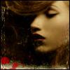
I know this is a bad image.
I suck at this  But hey i`m still learning. This one toke me a long time. I toke about an hour? Tell me what you think. 
|
|
|
|


|
Feb 16 2006, 12:27 AM
Post
#2
|
|
 Are You Kidding? Group: Member Posts: 1,714 Joined: Sep 2005 Member No: 237,747 |
The picture is so small. She looks like a kid in the middle picture.
I like the side pictures. I dont know about the font. Other then that its alright. EDIT: oops i meant the middle picture. Ditto with Cassandra (vogue!) I dont like the Miss also. |
|
|
|
|
Feb 16 2006, 01:06 AM
Post
#3
|
|
 lolz?! Group: Member Posts: 96 Joined: Feb 2006 Member No: 376,709 |
The pictures aren't small they are perfect!
:] I love it! Maybe just change the font. I also don't like how you put 'Miss' Good Job though. 
|
|
|
|
|
Feb 16 2006, 01:49 AM
Post
#4
|
|
 Senior Member Group: Member Posts: 779 Joined: Jan 2005 Member No: 90,808 |
its simple and cute. the border doesn't really match.
|
|
|
|

|
Feb 16 2006, 01:59 AM
Post
#5
|
|
|
the name is ada. Group: Official Member Posts: 4,688 Joined: Dec 2005 Member No: 334,608 |
Thanks.
Yeah I was thinking too hard about what I should make it say. so I just put whatever. 
|
|
|
|
|
Feb 16 2006, 02:54 PM
Post
#6
|
|
 Senior Member Group: Official Member Posts: 7,149 Joined: Aug 2005 Member No: 213,509 |
hmm...maybe make the middle image a little bit bigger.i really like the background,the font could be different or different in color,other than that.i like it.youre getting better :]
|
|
|
|

|
Feb 16 2006, 03:45 PM
Post
#7
|
|
 Senior Member Group: Member Posts: 3,055 Joined: Jul 2005 Member No: 174,796 |
Ehhh it's kind of simple.
But I guess you took a lot of effort into it since you say it took about an hour.... Suggestions: -Overlay the text it looks great overlayed =] -Do a darker color border; you want people to motice the blend not notice the border -Some brushes and a pattern never hurt! |
|
|
|

|
Feb 16 2006, 07:43 PM
Post
#8
|
|
 something more Group: Member Posts: 2,468 Joined: Mar 2004 Member No: 8,808 |
Its good.
Im not a big fan of the font and the words. A brush would be nice, but it's pretty ice already without brushes. |
|
|
|
| *lil_chubby_cheeks2* |
Feb 16 2006, 07:46 PM
Post
#9
|
|
Guest |
honestly, i think anyone could do this
 although i dont like hilary duff, it looks nice |
|
|
|
|
Feb 16 2006, 08:42 PM
Post
#10
|
|
 Yawn Group: Staff Alumni Posts: 9,530 Joined: Nov 2004 Member No: 65,772 |
It's not as bad as you think!
I really like how you positioned the pictures. You have a good eye for that. Overall it's really nice :) Great job! |
|
|
|

|
Feb 16 2006, 08:47 PM
Post
#11
|
|
 ladybugs are hot <3 Group: Member Posts: 1,169 Joined: Jan 2005 Member No: 93,802 |
i think its very simple and cutee but the image in the middle should be a little bit larger
 then it'll look muchh better then it'll look muchh better
|
|
|
|
|
Feb 16 2006, 09:39 PM
Post
#12
|
|
 when you smile, i melt inside Group: Member Posts: 1,325 Joined: Oct 2005 Member No: 267,089 |
it's not bad, but how you cut it out/erase the backrounds, it's kind of choppy. the border is a bit bright . but good job! :>
|
|
|
|


|
Feb 16 2006, 10:19 PM
Post
#13
|
|
 My name is really Matt... if you care. Group: Member Posts: 1,442 Joined: Oct 2005 Member No: 258,234 |
looks great, but quick suggestion:
puting ur name right in the center of the picture takes away from the blend... put it in a corner somewhere... and lower opacity? |
|
|
|
|
Feb 16 2006, 10:26 PM
Post
#14
|
|
 Senior Member Group: Member Posts: 170 Joined: Jan 2006 Member No: 351,851 |
Move the two images on the side a little closer to the middle. i dunno. It looks cute.
|
|
|
|
|
Feb 16 2006, 11:41 PM
Post
#15
|
|
|
the name is ada. Group: Official Member Posts: 4,688 Joined: Dec 2005 Member No: 334,608 |
Thanks.
I`ll work on this blend. |
|
|
|
|
Feb 17 2006, 12:06 AM
Post
#16
|
|
 speechless Group: Member Posts: 869 Joined: Jul 2005 Member No: 163,564 |
Thats really cute. I like it.
|
|
|
|

|
Feb 17 2006, 12:20 AM
Post
#17
|
|
|
the name is ada. Group: Official Member Posts: 4,688 Joined: Dec 2005 Member No: 334,608 |
Thanks.
I guess I am gettin` better if people say it looks good. |
|
|
|
|
Feb 17 2006, 03:09 AM
Post
#18
|
|
 Don't wake ghostie. Group: Official Member Posts: 3,546 Joined: Jan 2004 Member No: 2,405 |
I actually really like it
The only suggestion I would make is a different border colour. |
|
|
|
|
Feb 20 2006, 02:42 PM
Post
#19
|
|
|
the name is ada. Group: Official Member Posts: 4,688 Joined: Dec 2005 Member No: 334,608 |
^^Yeah I think it`s a bit light now tha I really look at it.
|
|
|
|
|
2 User(s) are reading this topic (2 Guests and 0 Anonymous Users)
0 Members: