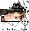
Vintage Glam [Blend], ft. Mischa Barton |
Resource Center Links
This Month's Contests | Hosts Looking for Hostees | Hostees looking for Hosts | BigBookofResources
Submission Guidelines
  |

 Feb 12 2006, 09:17 AM Feb 12 2006, 09:17 AM
Post
#1
|
|
 Senior Member  Group: Member Posts: 3,055 Joined: Jul 2005 Member No: 174,796 |
I like what I did w/ the font on this one
I didn't add any brushes b/c i couldn't find any that would really match it I'm not too sure about the pattern But I think I blended pretty good thumbed   c&c please! |
|
|
|


|
Feb 12 2006, 11:11 AM
Post
#2
|
|
 the name is ada. Group: Official Member Posts: 4,688 Joined: Dec 2005 Member No: 334,608 |
Omg wow..all your blends are hot.
I love the vintagey Look..the pattern seems fine. |
|
|
|
|
Feb 12 2006, 11:27 AM
Post
#3
|
|
|
Senior Member Group: Member Posts: 3,055 Joined: Jul 2005 Member No: 174,796 |
^Thankyou

|
|
|
|
|
Feb 12 2006, 11:37 AM
Post
#4
|
|
 Senior Member Group: Member Posts: 170 Joined: Jan 2006 Member No: 351,851 |
ohh i like that dress. good job on the blend.
|
|
|
|
|
Feb 12 2006, 11:57 AM
Post
#5
|
|
 lolz?! Group: Member Posts: 96 Joined: Feb 2006 Member No: 376,709 |
Eh its alright.
Think might add some color? I know its vintage but vintage can also have color :] But good job! |
|
|
|
|
Feb 12 2006, 01:37 PM
Post
#6
|
|
 My name is really Matt... if you care. Group: Member Posts: 1,442 Joined: Oct 2005 Member No: 258,234 |
-the outline on the text is too thick
and i think that its a good blend, but rather boring... its her three differnt times, but they're all just too similar. blending 3 differnt pictures of someone in 3 different poses/stances is a lot more appealing |
|
|
|
|
Feb 12 2006, 01:52 PM
Post
#7
|
|
 You'll find me in your dreams. Group: Official Member Posts: 8,536 Joined: Mar 2005 Member No: 114,010 |
Flip the pictures so that they're facing each other or something. &the pattern isn't fitting your theme here. Again, Carpenter ICG looks better all lowercase. The uppercase letters are way showy and that doesn't quite fit either. Also, blending large would help you. As in 600 by 450px in size.
You should also play with layer styles and modes. It's fun. |
|
|
|

|
Feb 12 2006, 07:02 PM
Post
#8
|
|
 Senior Member Group: Official Member Posts: 7,149 Joined: Aug 2005 Member No: 213,509 |
your blending is great. i agree with reili about the pattern not fitting well with this one. its better with out brushes, in all of your blends.good job on this one :]
|
|
|
|

|
2 User(s) are reading this topic (2 Guests and 0 Anonymous Users)
0 Members: