Random |
Resource Center Links
This Month's Contests | Hosts Looking for Hostees | Hostees looking for Hosts | BigBookofResources
Submission Guidelines
  |

 Feb 5 2006, 11:35 PM Feb 5 2006, 11:35 PM
Post
#1
|
|
 Senior Member  Group: Member Posts: 195 Joined: Aug 2005 Member No: 212,369 |
ahh ummm ierno something i did :]
Feedbacks? 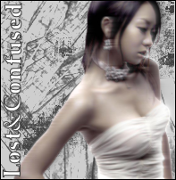 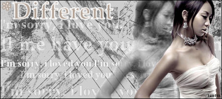
|
|
|
|


|
Feb 6 2006, 12:43 AM
Post
#2
|
|
 the name is ada. Group: Official Member Posts: 4,688 Joined: Dec 2005 Member No: 334,608 |
omg it`s beautiful! Love the pattern.
|
|
|
|
|
Feb 6 2006, 12:44 AM
Post
#3
|
|
 I like it like that Group: Member Posts: 1,248 Joined: Mar 2004 Member No: 5,961 |
omg that's beautiful! i love it :)
|
|
|
|
|
Feb 6 2006, 12:46 AM
Post
#4
|
|
 Pocketful of Sunshine Group: Staff Alumni Posts: 8,690 Joined: Nov 2005 Member No: 289,004 |
The background's kinda plain. I don't like it that much, but it's ok. The image of the girl is fine. Nothing really attracts me to the banner, though.
|
|
|
|


|
Feb 6 2006, 01:51 AM
Post
#5
|
|
 Are You Kidding? Group: Member Posts: 1,714 Joined: Sep 2005 Member No: 237,747 |
QUOTE(tic tac. @ Feb 5 2006, 9:46 PM) The background's kinda plain. I don't like it that much, but it's ok. The image of the girl is fine. Nothing really attracts me to the banner, though.  ditto. sorry. I dont like the repeated text. |
|
|
|
|
Feb 6 2006, 09:51 AM
Post
#6
|
|
 yan lin♥ Group: Staff Alumni Posts: 14,129 Joined: Apr 2004 Member No: 13,627 |
i like the picture of the girl you used.
|
|
|
|

|
Feb 6 2006, 03:02 PM
Post
#7
|
|
 Senior Member Group: Official Member Posts: 7,149 Joined: Aug 2005 Member No: 213,509 |
the first one is good, too much text in the second one (i agree with them above), the image is nice.
|
|
|
|

|
Feb 6 2006, 03:51 PM
Post
#8
|
|
 Senior Member Group: Member Posts: 3,055 Joined: Jul 2005 Member No: 174,796 |
It's kind of small but I think it looks really cute =]
I like the 2nd one better though. It has more details, but I'd use less text on it |
|
|
|

|
Feb 6 2006, 04:52 PM
Post
#9
|
|
 Senior Member Group: Member Posts: 124 Joined: Feb 2006 Member No: 370,115 |
oh so pretty.
i like everything about it. who's the girl? she's quiet pretty. |
|
|
|
|
Feb 6 2006, 05:12 PM
Post
#10
|
|
 Infinite sedation. Group: Member Posts: 36 Joined: Nov 2005 Member No: 284,967 |
umm i don`t really care too much for the first picture, it`s kinda plain. however i love the banner. i like how the words repeat in the background. not sure why
 it just does something for me it just does something for me 
|
|
|
|
|
Feb 6 2006, 05:52 PM
Post
#11
|
|
 My name is really Matt... if you care. Group: Member Posts: 1,442 Joined: Oct 2005 Member No: 258,234 |
the stroke on "Different" is a bit too think, other than that great job
|
|
|
|
|
Feb 6 2006, 06:42 PM
Post
#12
|
|
 I intend to live forever-so far, so good. Group: Member Posts: 2,820 Joined: Mar 2005 Member No: 115,137 |
yeah its cute
|
|
|
|

|
Feb 6 2006, 07:07 PM
Post
#13
|
|
|
Senior Member Group: Member Posts: 195 Joined: Aug 2005 Member No: 212,369 |
Thank you, i`ll be sure to use lesser text next graphics.
Oh the girl is Kumi,Koda. Credit to Massu.org for the image. Glad you guys liked it. xD |
|
|
|
|
Feb 6 2006, 11:36 PM
Post
#14
|
|
 say maydayism. Group: Staff Alumni Posts: 7,447 Joined: Jun 2004 Member No: 26,344 |
The text don't quite match with the girl... unless it's song lyrics, then it's okay. The background is quite nice.
|
|
|
|

|
2 User(s) are reading this topic (2 Guests and 0 Anonymous Users)
0 Members: