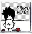
================================VALENTiNE`S LAY0UT, 100% made by me =) |
Resource Center Links
This Month's Contests | Hosts Looking for Hostees | Hostees looking for Hosts | BigBookofResources
Submission Guidelines
  |

 Feb 3 2006, 08:33 AM Feb 3 2006, 08:33 AM
Post
#1
|
|
 ßrøwñ Èÿé§  Group: Member Posts: 63 Joined: Jan 2004 Member No: 829 |
Hihi!! I MADE A NEW LAYOUT.. IN LIKE AGES, im soo HAPPYY!!!
If you leave comment, i will link you back in my next blog and comment you (yes, i actually DO read people's blogs =)) http://xanga.com/sarsiipops Oh please rate from 1-10?? =D i'd appreciate it, or just tell me what you think  ^_^ ^_^
|
|
|
|


|
Feb 3 2006, 10:02 AM
Post
#2
|
|
 Amberific. Group: Staff Alumni Posts: 12,913 Joined: Jul 2004 Member No: 29,772 |
You went overboard with the swirlies, IMO. It's very cute though. I'll give it a 6.5 because even though it's pretty, you used defaultish coding.
|
|
|
|


|
Feb 3 2006, 04:41 PM
Post
#3
|
|
 crushed. Group: Staff Alumni Posts: 9,432 Joined: Jun 2004 Member No: 20,026 |
^Agreed. Waay too many of the swirly brush, but it's still kinda cute.
|
|
|
|

|
Feb 4 2006, 01:50 PM
Post
#4
|
|
 Diana =] Group: Member Posts: 1,318 Joined: Jul 2005 Member No: 174,147 |
^ Yup, too much swirly stuff.
|
|
|
|
|
Feb 4 2006, 04:53 PM
Post
#5
|
|
 Senior Member Group: Posts: 8,274 Joined: Mar 2004 Member No: 8,001 |
It depends on your resolution, guys. It looks pretty good in huge resolution, not in small/medium resolution.
Anyways, your layout is dam awesome. you should start making custom module and better coding. you're good enough with graphic for your level, i think. Really, it's time for you to move on! 
|
|
|
|
|
Feb 4 2006, 05:55 PM
Post
#6
|
|
 When the sun sleeps. Group: Member Posts: 532 Joined: Nov 2005 Member No: 289,628 |
I personally lyke the swirl effect.
|
|
|
|
|
Feb 4 2006, 08:05 PM
Post
#7
|
|
 Senior Member Group: Member Posts: 136 Joined: Jan 2006 Member No: 366,312 |
seriously, it is an extremely beautiful layout. I believe its very original, and the image quality is simple excellent. And no, you didn't go overboard with the swirl brush, I believe it looks fantastic. Good job!
|
|
|
|
|
Feb 4 2006, 09:34 PM
Post
#8
|
|
|
Ill get around to doing that.... Group: Member Posts: 518 Joined: Oct 2005 Member No: 275,913 |
Its way to default
|
|
|
|
|
Feb 5 2006, 05:23 PM
Post
#9
|
|
|
Sam Group: Member Posts: 40 Joined: Jan 2006 Member No: 350,573 |
more custom modules, too default in that category. too many swirls, like whoa. besides that its good, just too much going on; less is more.
|
|
|
|
|
Feb 5 2006, 07:31 PM
Post
#10
|
|
 ;) Group: Staff Alumni Posts: 9,573 Joined: Feb 2005 Member No: 99,124 |
I like this layout, it's very nice. The swirls are a bit much and old-school. But you still did a good job.
|
|
|
|


|
Feb 5 2006, 07:34 PM
Post
#11
|
|
 :D Group: Member Posts: 530 Joined: Dec 2005 Member No: 337,031 |
I really like it, I rate it 8 (10 is the highest right? that's how I rated it.)
|
|
|
|

|
Feb 5 2006, 07:36 PM
Post
#12
|
|
 Pocketful of Sunshine Group: Staff Alumni Posts: 8,690 Joined: Nov 2005 Member No: 289,004 |
Not bad. There's a lot of swirls, but I still like it. Though, I do think you should have maybe a custom module instead of the default ones. But otherwise, it's ok.
|
|
|
|

|
Feb 5 2006, 08:54 PM
Post
#13
|
|
|
Senior Member Group: Posts: 8,274 Joined: Mar 2004 Member No: 8,001 |
QUOTE(drilotedahl @ Feb 4 2006, 6:34 PM) Its way to default  You're wrong, actually. It's not waaay to default. If it was, there shouldnt be good amount of swirly or .. shitty banner.  How old are you ? i always read your post without thinking. it annoys me. How old are you ? i always read your post without thinking. it annoys me.
|
|
|
|
|
Feb 6 2006, 12:29 PM
Post
#14
|
|
 Fuck you Group: Member Posts: 244 Joined: Nov 2005 Member No: 302,735 |
i personally like the swirlys... but bleh that's just me O.o, i say goodjob it's simple and clean but has a nice theme to it

|
|
|
|
|
Feb 7 2006, 09:31 AM
Post
#15
|
|
|
ßrøwñ Èÿé§ Group: Member Posts: 63 Joined: Jan 2004 Member No: 829 |
QUOTE(Spiritual Winged Aura @ Feb 5 2006, 8:54 PM) You're wrong, actually. It's not waaay to default. If it was, there shouldnt be good amount of swirly or .. shitty banner. How old are you ? i always read your post without thinking. it annoys me.im 16 =) |
|
|
|
|
Feb 7 2006, 09:32 AM
Post
#16
|
|
|
ßrøwñ Èÿé§ Group: Member Posts: 63 Joined: Jan 2004 Member No: 829 |
btw guys, if you view in small resolution, then it will look liek i did over use swirls
larger resolutions are best ^_^ and i did that on purpose btw, i did not over use it, if everybody had a limit on using swirlys, then call me a rebel =] |
|
|
|
|
Feb 8 2006, 11:12 PM
Post
#17
|
|
 ladybugs are hot <3 Group: Member Posts: 1,169 Joined: Jan 2005 Member No: 93,802 |
its nice but its defaultish
 it would look so much better with custom modules and stuff it would look so much better with custom modules and stuff
|
|
|
|
|
Feb 9 2006, 08:41 PM
Post
#18
|
|
|
Senior Member Group: Posts: 8,274 Joined: Mar 2004 Member No: 8,001 |
QUOTE(fenayah @ Feb 7 2006, 6:31 AM) im 16 =) Um. i'm not referring to you. i'm referring to the other guy. 
|
|
|
|
|
Feb 10 2006, 06:52 PM
Post
#19
|
|
 Member Group: Member Posts: 25 Joined: Aug 2005 Member No: 219,116 |
It's pretty and simple. You could've laid off the swirlies a bit, but it still looks good. The pictures don't fit with the banner because the coloring's off. The modules do look default-ish, IMO. Overall, I like it.
|
|
|
|
|
2 User(s) are reading this topic (2 Guests and 0 Anonymous Users)
0 Members: