Silverstein |
Resource Center Links
This Month's Contests | Hosts Looking for Hostees | Hostees looking for Hosts | BigBookofResources
Submission Guidelines
  |

 Jan 26 2006, 08:30 AM
Post
#1
|
|
 When the sun sleeps.  Group: Member Posts: 532 Joined: Nov 2005 Member No: 289,628  |
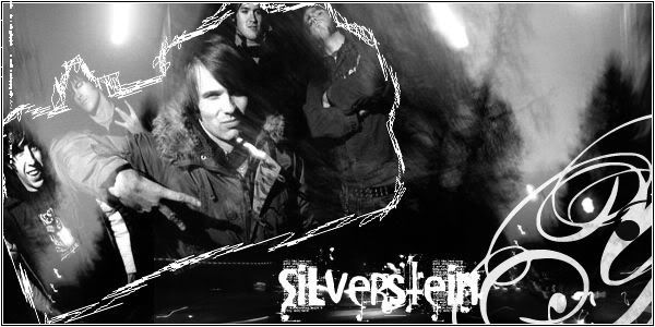 another easy project. |
|
|
|




|
Jan 26 2006, 10:09 AM
Post
#2
|
|
 the name is ada. Group: Official Member Posts: 4,688 Joined: Dec 2005 Member No: 334,608 |
Love the sketchy affecy.The font too
|
|
|
|
|
Jan 26 2006, 11:03 AM
Post
#3
|
|
 Are You Kidding? Group: Member Posts: 1,714 Joined: Sep 2005 Member No: 237,747 |
Kinda simple, but i like the background and the sketchy border.
|
|
|
|
|
Jan 26 2006, 11:19 AM
Post
#4
|
|
 Senior Member Group: Member Posts: 170 Joined: Jan 2006 Member No: 351,851 |
This is nice. I like the font that u used.
|
|
|
|
|
Jan 26 2006, 11:46 AM
Post
#5
|
|
|
When the sun sleeps. Group: Member Posts: 532 Joined: Nov 2005 Member No: 289,628 |
Yeah it is simple but i had no ideas of what to do something...this was my first one in awhile..Lyke 5 months.
|
|
|
|
|
Jan 26 2006, 12:22 PM
Post
#6
|
|
 Senior Member Group: Official Member Posts: 7,149 Joined: Aug 2005 Member No: 213,509 |
simple and plain, pretty good
i like the sketchy effect too and the colors. |
|
|
|

|
Jan 26 2006, 12:49 PM
Post
#7
|
|
|
When the sun sleeps. Group: Member Posts: 532 Joined: Nov 2005 Member No: 289,628 |
Thankyous.
|
|
|
|
|
Jan 26 2006, 04:05 PM
Post
#8
|
|
 Senior Member Group: Member Posts: 3,055 Joined: Jul 2005 Member No: 174,796 |
That is so cool
 I love the font and the skribbles and the pics you used are decent =] The only thing I'd do w/o is the swirly brush on the corner. Good work otherwise |
|
|
|

|
Jan 26 2006, 04:08 PM
Post
#9
|
|
|
RJL<3 Group: Member Posts: 1,194 Joined: Dec 2004 Member No: 71,019 |
QUOTE(skp86 @ Jan 26 2006, 4:05 PM) That is so cool I love the font and the skribbles and the pics you used are decent =] The only thing I'd do w/o is the swirly brush on the corner. Good work otherwise  i agree completely. and silverstein rocks, mad props!! |
|
|
|

|
Jan 26 2006, 05:25 PM
Post
#10
|
|
|
When the sun sleeps. Group: Member Posts: 532 Joined: Nov 2005 Member No: 289,628 |
When i get back from volleyball practice and i can take the swirl out and move the font over so there isnt just a big black space.
|
|
|
|
|
Jan 26 2006, 08:50 PM
Post
#11
|
|
 ^ignore. read> Maria. Group: Member Posts: 710 Joined: Dec 2005 Member No: 323,799 |
^guys do volleyball
 ??? eh, anyways, wow. im the only 1 going against the scribbly stuff. i never really appreciated them. :P but i like how its looking. especially around the SILVERSTEIN area. i like the buildings too :) |
|
|
|
|
Jan 26 2006, 09:30 PM
Post
#12
|
|
|
When the sun sleeps. Group: Member Posts: 532 Joined: Nov 2005 Member No: 289,628 |
I dont use it much i just thought the messy look could go with this.
|
|
|
|
|
Jan 27 2006, 11:51 AM
Post
#13
|
|
 I intend to live forever-so far, so good. Group: Member Posts: 2,820 Joined: Mar 2005 Member No: 115,137 |
you could even crop more of the right side off, [well unless the background has a meaning towards the total effect of the picture]
its a very pretty banner =) i love the grayscale effect. its simplistic but i gives off a semi-complex look. in replace of the swilrz do something more grungy and scribbly to match the grungy theme you have going. and i said to crop the right side more because there something about this banner that juss doesnt seemed balanced. im pretty sure if you crop it near to where the "n" is then it should look even more awesome nice job |
|
|
|

|
Jan 27 2006, 03:16 PM
Post
#14
|
|
|
When the sun sleeps. Group: Member Posts: 532 Joined: Nov 2005 Member No: 289,628 |
Thanx for the comments, after im done working with cinema 4d i might do that u said ^
|
|
|
|
| *Zatanna* |
Jan 27 2006, 03:23 PM
Post
#15
|
|
Guest |
Looks great. The font is perfect. The swirlies at the left hand corner seem out of place though.
|
|
|
|
|
Jan 27 2006, 08:55 PM
Post
#16
|
|
 I love you Group: Member Posts: 194 Joined: Mar 2005 Member No: 116,447 |
thats cool
|
|
|
|


|
Jan 27 2006, 08:57 PM
Post
#17
|
|
 :D Group: Member Posts: 530 Joined: Dec 2005 Member No: 337,031 |
It's nice. I'm not really a fan of them. But, heh, it's a nice image.
|
|
|
|

|
Jan 28 2006, 12:24 PM
Post
#18
|
|
|
When the sun sleeps. Group: Member Posts: 532 Joined: Nov 2005 Member No: 289,628 |
Thanx, i love them.
|
|
|
|
|
2 User(s) are reading this topic (2 Guests and 0 Anonymous Users)
0 Members: