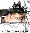
memoirs of a geisha blend. ;] |
Resource Center Links
This Month's Contests | Hosts Looking for Hostees | Hostees looking for Hosts | BigBookofResources
Submission Guidelines
  |

 Jan 22 2006, 05:56 AM Jan 22 2006, 05:56 AM
Post
#1
|
|
 say maydayism.  Group: Staff Alumni Posts: 7,447 Joined: Jun 2004 Member No: 26,344 |
(click on thumbnail to enlarge)
 I think it looks a little too crowded and the pictures don't really match too well... what do you think? P.S. it's the banner on my xanga (if you wanted to know, but my xanga layout sucks...  ) )
|
|
|
|


|
Jan 22 2006, 07:35 AM
Post
#2
|
|
 yan lin♥ Group: Staff Alumni Posts: 14,129 Joined: Apr 2004 Member No: 13,627 |
the blending is good, but i agree with the part that it's too crowded. the pictures are too close together, and they don't completely match.
|
|
|
|


|
Jan 22 2006, 07:41 AM
Post
#3
|
|
 Senior Member Group: Official Designer Posts: 4,591 Joined: Dec 2004 Member No: 77,305 |
It's good actually, but the image at the top left bothers me.
|
|
|
|


|
Jan 22 2006, 08:30 AM
Post
#4
|
|
|
Senior Member Group: Member Posts: 3,551 Joined: Feb 2005 Member No: 102,857 |
OWinnie, I like it. It's very good. You blended it well. I agree, well how one side is less crowded and the other is.
|
|
|
|
|
Jan 22 2006, 09:38 AM
Post
#5
|
|
 Senior Member Group: Member Posts: 3,055 Joined: Jul 2005 Member No: 174,796 |
It's pretty good. But I agree that the left side is too crowded. I like the texture/filter,though, and your blending style. But the font doesn't really match
|
|
|
|

|
Jan 22 2006, 12:56 PM
Post
#6
|
|
 i've never wanted anything rationale. Group: Staff Alumni Posts: 8,449 Joined: May 2004 Member No: 19,045 |
QUOTE(Szeh @ Jan 22 2006, 6:41 AM) It's good actually, but the image at the top left bothers me.  My thoughts exactly. I think it is because the picture is very bright/white compared to the others. |
|
|
|

|
Jan 22 2006, 12:56 PM
Post
#7
|
|
 Amberific. Group: Staff Alumni Posts: 12,913 Joined: Jul 2004 Member No: 29,772 |
There's something not quite blend-y about the images on the far right. And the pictures don't really have to "match" if they're from the same movie, IMO, because the feeling is still there.
|
|
|
|

|
Jan 22 2006, 01:34 PM
Post
#8
|
|
 Are You Kidding? Group: Member Posts: 1,714 Joined: Sep 2005 Member No: 237,747 |
I like it, Awesome job.
|
|
|
|
|
Jan 22 2006, 02:39 PM
Post
#9
|
|
 I intend to live forever-so far, so good. Group: Member Posts: 2,820 Joined: Mar 2005 Member No: 115,137 |
your blending is good =) i like it. it would have been really cool if you didnt make all your pictures the same height, and like make a couple larger and yeahh, that way when you blend it, it wouldnt look as cluttered and i guess, it wouldnt look as square.
try different blending styles, im pretty sure you have the skills to switch it up haha yup, i like this blend it really well done |
|
|
|

|
Jan 22 2006, 02:50 PM
Post
#10
|
|
 crushed. Group: Staff Alumni Posts: 9,432 Joined: Jun 2004 Member No: 20,026 |
Yes, I agree with what has been said before me. It looks a little bit too crowded, but the blending is pretty okay. And add a border next time :)
edit//also, take out the outlines of the pictures, so they don't show. Like on the bottom left on the banner, the picture sticks out a little. |
|
|
|

|
Jan 22 2006, 02:52 PM
Post
#11
|
|
 Senior Member Group: Member Posts: 170 Joined: Jan 2006 Member No: 351,851 |
Its well blended but I think u just need to make the text and the whole thing brighter. Good job on it tho. :) I absolutley loved the book and the movie.
|
|
|
|
|
Jan 22 2006, 03:42 PM
Post
#12
|
|
 the name is ada. Group: Official Member Posts: 4,688 Joined: Dec 2005 Member No: 334,608 |
Ohh it`s nice.I like the pic on the left most.
|
|
|
|
|
Jan 22 2006, 06:05 PM
Post
#13
|
|
 durian Group: Staff Alumni Posts: 13,124 Joined: Feb 2004 Member No: 3,860 |
Oooh I like! :D I love the pictures you chose! I do kind of admit that it is a little crowded on the left... Her face on the top left looks cute off, but that picture's the one that stands out the most, imo.
I like the effect of the blend. :] I noticed that it's faded a certain way.. like horizontal bars streaming across it, where it's fadded, then the true color of the pictures show through the non-faded areas. Does that make any sense? =X <33 Memoirs of a Geisha |
|
|
|

|
2 User(s) are reading this topic (2 Guests and 0 Anonymous Users)
0 Members: