
for your eyes only: a colourization |
Resource Center Links
This Month's Contests | Hosts Looking for Hostees | Hostees looking for Hosts | BigBookofResources
Submission Guidelines
  |
 Jan 15 2006, 05:33 PM Jan 15 2006, 05:33 PM
Post
#1
|
|
 in a matter of time  Group: Staff Alumni Posts: 7,151 Joined: Aug 2005 Member No: 191,357 |
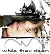
BWgreyscale for the scan, and The Blooming Effect Textures for the texture.
 Please excuse the texture part, I was just experimenting and I was too lazy to make it look good. So it's a bit of a mess. Colourization (createBlog-friendly version)  Colourization (larger; thumbnail):  Original in Colour Original in grayscale |
|
|
|


|
Jan 15 2006, 05:38 PM
Post
#2
|
|
 Senior Member Group: Member Posts: 46 Joined: Jan 2006 Member No: 339,692 |
Wow! thats gorgeous. I love the eyeshadow and the lips! Great job

|
|
|
|
|
Jan 15 2006, 05:57 PM
Post
#3
|
|
|
t-t-t-toyaaa Group: Official Member Posts: 19,821 Joined: Apr 2004 Member No: 11,270 |
Amazing, I love the eyes .
|
|
|
|


|
Jan 15 2006, 05:59 PM
Post
#4
|
|
 Senior Member Group: Member Posts: 3,055 Joined: Jul 2005 Member No: 174,796 |
Looks very realistic =]
The only thing I don't really like is the eye shadow... But great job 
|
|
|
|

|
Jan 15 2006, 06:19 PM
Post
#5
|
|
|
in a matter of time Group: Staff Alumni Posts: 7,151 Joined: Aug 2005 Member No: 191,357 |
^ Hmm...how about being a little constructive? What exactly don't you like about it?
Thanks. =] |
|
|
|
|
Jan 15 2006, 06:20 PM
Post
#6
|
|
 Senior Member Group: Member Posts: 170 Joined: Jan 2006 Member No: 351,851 |
thats sexy.
|
|
|
|
| *wind&fire* |
Jan 15 2006, 07:09 PM
Post
#7
|
|
Guest |
what i dont like?
the font and her top lip, it looks too solid... the rest is awesome |
|
|
|
|
Jan 15 2006, 07:13 PM
Post
#8
|
|
 ^ignore. read> Maria. Group: Member Posts: 710 Joined: Dec 2005 Member No: 323,799 |
^i agree about the font. i dont think it matches..... and the upper lip... i never noticed that so its practically unnoticable. it looks REALLy great though! ur too great at this :)
|
|
|
|
|
Jan 15 2006, 07:24 PM
Post
#9
|
|
|
in a matter of time Group: Staff Alumni Posts: 7,151 Joined: Aug 2005 Member No: 191,357 |
She's not wearing gloss on her lips, so her upper lip is going to be more solid-looking. If I bumped up the contrast there it would look a bit strange, but I'll try it and see how it comes out.
I used that font because, well. It's pretty. That's a side thing, anyway. I don't want you guys to think that I won't accept criticism but can we all stay focused on the colourization aspect? Really, I rushed majorly on everything besides the actual colourization, so...yeah. =\ Hah. But thank you all so so much. =] 
|
|
|
|
| *stephinika* |
Jan 15 2006, 10:50 PM
Post
#10
|
|
Guest |
gorgeous. i love your colourizations gigi.

|
|
|
|
|
Jan 15 2006, 11:33 PM
Post
#11
|
|
 crushed. Group: Staff Alumni Posts: 9,432 Joined: Jun 2004 Member No: 20,026 |
Oh, I love it. So breathtakingly beautiful Gigi
May I ask what font you used? It's so pretty!
|
|
|
|

|
Jan 15 2006, 11:43 PM
Post
#12
|
|
 Are You Kidding? Group: Member Posts: 1,714 Joined: Sep 2005 Member No: 237,747 |
I like it. The skin looks better than the original one. Awesome Job.
I like the font. What font is it? |
|
|
|
|
Jan 15 2006, 11:56 PM
Post
#13
|
|
 Call me C.Annie Group: Member Posts: 366 Joined: Mar 2005 Member No: 115,994 |
Holy.. Im in love with it! I love the eyeshadow and lips! The colorization itself looks so realistic! You chose a great skin color.
|
|
|
|
|
Jan 16 2006, 12:43 AM
Post
#14
|
|
 ladybugs are hot <3 Group: Member Posts: 1,169 Joined: Jan 2005 Member No: 93,802 |
its gorgeous =)
|
|
|
|
|
Jan 16 2006, 09:18 AM
Post
#15
|
|
 Senior Member Group: Official Member Posts: 7,149 Joined: Aug 2005 Member No: 213,509 |
that looks AWESOME
i love te colors you used font fits well gerat jobbb |
|
|
|

|
Jan 16 2006, 10:30 AM
Post
#16
|
|
 Senior Member Group: Member Posts: 2,152 Joined: Oct 2004 Member No: 57,818 |
LOVEITTT. Love the eyes.
|
|
|
|
|
Jan 16 2006, 11:25 AM
Post
#17
|
|
 i am mean. fear me. Group: Member Posts: 178 Joined: Nov 2005 Member No: 300,587 |
wow nice
what font did you use? |
|
|
|
|
Jan 16 2006, 05:31 PM
Post
#18
|
|
 My name is really Matt... if you care. Group: Member Posts: 1,442 Joined: Oct 2005 Member No: 258,234 |
holy hell! thats amzing!
how did u do the eye shadow!? |
|
|
|
|
Jan 16 2006, 08:26 PM
Post
#19
|
|
 the name is ada. Group: Official Member Posts: 4,688 Joined: Dec 2005 Member No: 334,608 |
The eyes and colors are beautiful!!!
|
|
|
|
|
Jan 17 2006, 12:49 AM
Post
#20
|
|
|
in a matter of time Group: Staff Alumni Posts: 7,151 Joined: Aug 2005 Member No: 191,357 |
Heh, thanks. The font's called Little Days.
Er, for the eyeshadow - I made a new layer, made a base of the eyeshadow of a low saturation of blue on the eye, and set it to colour. - Using the lasso tool set to around 15-20 px, I selected parts of the overlay layer and change the hue and saturation around to get my pink-ish/purple-y part. - For the yellow, I set the feathering on the lasso tool to about 5, selected the part of the eye, coloured it with a low saturated yellow, and set it to overlay so it would pop some more. |
|
|
|
|
Jan 17 2006, 10:29 AM
Post
#21
|
|
 yan lin♥ Group: Staff Alumni Posts: 14,129 Joined: Apr 2004 Member No: 13,627 |
that's amazing!

|
|
|
|

| *wind&fire* |
Jan 17 2006, 09:01 PM
Post
#22
|
|
Guest |
QUOTE(gigiopolis @ Jan 16 2006, 11:24 AM) She's not wearing gloss on her lips, so her upper lip is going to be more solid-looking. If I bumped up the contrast there it would look a bit strange, but I'll try it and see how it comes out. i just thought that it looked like a different texture than that of the bottom lip... |
|
|
|
|
Jan 17 2006, 09:15 PM
Post
#23
|
|
 something more Group: Member Posts: 2,468 Joined: Mar 2004 Member No: 8,808 |
That looks really awsome. The eyes are amazing. The skin is amazing.
If you don't mind me asking, how did you make the color of the skin so perfect?
|
|
|
|
|
Jan 17 2006, 09:23 PM
Post
#24
|
|
|
in a matter of time Group: Staff Alumni Posts: 7,151 Joined: Aug 2005 Member No: 191,357 |
QUOTE(wind&fire @ Jan 17 2006, 6:01 PM) i just thought that it looked like a different texture than that of the bottom lip...  It might be because of the setting I set it to. I'll check it out when I'm not totally lazy. =p I'll just go through a simple rundown of how I do the skin (it works better with a lower-contrast original): - take the original image and colourize to a low saturation of an orangey-red. - duplicate that layer, set the layer option to "overlay" or "soft light". - using "Color Balance", I fiddle around with all the things on there to get a more realistic skin tone At this point you'll see that the lighter areas of the skin are a bit gray, so I do this: - Using the eyedropper tool, I'll select a colour from the current colourized skin, a mid-tone shade. - Create a new layer - Using the lasso tool, I'll set the feathering to around 20px (depending on the size of the subject), select the lighter, grayer areas of the skin. - Fill in with the colour you eyedropped in the new layer - Set the layer option to "Colour" and sometimes I use "Soft Light" Yeah...if it looks weird then change the colour and saturation around to make it blend in to the original better. If some parts are too saturated, then I'll select using the lasso tool again, set to 10-20 px for feathering, then either use color balance to adjust or hue/saturation adjustment. Yeah so that's pretty much it. Then all the makeup and stuff, but that's really quite easy compared to the skin. That looks oh-so confusing...sorry. |
|
|
|
|
Jan 18 2006, 12:11 AM
Post
#25
|
|
 Yawn Group: Staff Alumni Posts: 9,530 Joined: Nov 2004 Member No: 65,772 |
Oh that eye makeup is hott!
Awesome job with this gigi :) |
|
|
|

|
2 User(s) are reading this topic (2 Guests and 0 Anonymous Users)
0 Members: