BoA* |
Resource Center Links
This Month's Contests | Hosts Looking for Hostees | Hostees looking for Hosts | BigBookofResources
Submission Guidelines
  |

 Jan 14 2006, 11:52 PM Jan 14 2006, 11:52 PM
Post
#1
|
|
 Member  Group: Member Posts: 19 Joined: Jan 2006 Member No: 351,346 |
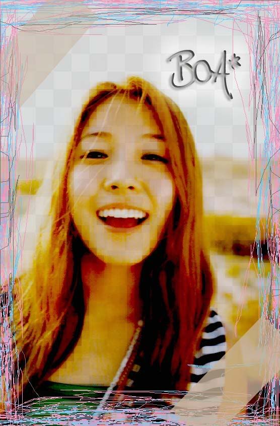 hmm okay. well... what do u guys think of it...? i got really bored yesterday so yeah... |
|
|
|


|
Jan 15 2006, 12:13 AM
Post
#2
|
|
 the name is ada. Group: Official Member Posts: 4,688 Joined: Dec 2005 Member No: 334,608 |
i can see you made it transparent.looks kinda pixely.its nice though.the border and colors and especially the pic is cute!

|
|
|
|
|
Jan 15 2006, 12:25 AM
Post
#3
|
|
 HAAAAAAAA. Group: Member Posts: 4,472 Joined: Dec 2004 Member No: 75,068 |
The border doesn't match.
Nice try though. |
|
|
|


|
Jan 15 2006, 12:47 AM
Post
#4
|
|
|
Member Group: Member Posts: 19 Joined: Jan 2006 Member No: 351,346 |
lol i purposely made it kinda pixely...
and its the first time ive tried making one of these... lol its not tht gud i know |
|
|
|
|
Jan 15 2006, 12:49 AM
Post
#5
|
|
 My name is really Matt... if you care. Group: Member Posts: 1,442 Joined: Oct 2005 Member No: 258,234 |
uh... honestly... its not that appealing... maybe cuz u did it when u were bored?
|
|
|
|
|
Jan 15 2006, 12:58 AM
Post
#6
|
|
 Peggy. Group: Member Posts: 2,508 Joined: Aug 2005 Member No: 214,025 |
Nice try for the border. But it doesn't match with this pixely picture.
|
|
|
|

|
Jan 15 2006, 01:42 AM
Post
#7
|
|
 What a hypocrite. Group: Member Posts: 2,754 Joined: Apr 2005 Member No: 128,150 |
Eh, it's okay. :D I like the picture you chose of Boa, but the scribbles are sort of overused.
|
|
|
|
|
Jan 15 2006, 01:47 AM
Post
#8
|
|
 Are You Kidding? Group: Member Posts: 1,714 Joined: Sep 2005 Member No: 237,747 |
I dont like it. But i like the font u used 4 the BoA*
|
|
|
|
|
Jan 15 2006, 03:52 AM
Post
#9
|
|
 yan lin♥ Group: Staff Alumni Posts: 14,129 Joined: Apr 2004 Member No: 13,627 |
the border doesn't match the colors, nor does it match up with the transparency and the pixellation.
|
|
|
|

|
Jan 15 2006, 03:55 AM
Post
#10
|
|
 :D Group: Member Posts: 530 Joined: Dec 2005 Member No: 337,031 |
I love the font, that is cool, I think you should take away the pixely affect on the face, but you can leave it for the rest, and the border, quite frankly, it is almost the worst border, sorry, when you have pixelated, and then that kind of border, it doesn't really work out too well.
|
|
|
|

| *mzkandi* |
Jan 15 2006, 04:43 AM
Post
#11
|
|
Guest |
Well, if you were bored and uninspired when you did this it currently shows (no offense). It's not appealing or well put together at all.
|
|
|
|
|
Jan 15 2006, 12:23 PM
Post
#12
|
|
 Senior Member Group: Member Posts: 3,055 Joined: Jul 2005 Member No: 174,796 |
I don't like how it's all pixely.
The border is easy to do and looks weird. I think you should try to do a different style of this. |
|
|
|

|
Jan 15 2006, 08:02 PM
Post
#13
|
|
 ^ignore. read> Maria. Group: Member Posts: 710 Joined: Dec 2005 Member No: 323,799 |
it looks strange. you made her look weird w/ the pixely stuff. maybe you can try different effects?? but points on using boa! :)
|
|
|
|
|
2 User(s) are reading this topic (2 Guests and 0 Anonymous Users)
0 Members: