Now Way I'm In Love, 3rd div layout! |
Resource Center Links
This Month's Contests | Hosts Looking for Hostees | Hostees looking for Hosts | BigBookofResources
Submission Guidelines
  |

 Jan 12 2006, 06:02 PM Jan 12 2006, 06:02 PM
Post
#1
|
|
|
Call me Elsie Mae  Group: Member Posts: 936 Joined: Aug 2005 Member No: 207,655 |
Myspace..
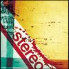
welps. My 3rd divlayout. Kinda Plain. and Simple. But i hope you all enjoy it. Criticizm (sp?) and Comments are welcomed! Thanks! : 
|
|
|
|


|
Jan 12 2006, 06:18 PM
Post
#2
|
|
|
Member Group: Member Posts: 24 Joined: Mar 2005 Member No: 119,873 |
misaligned
still shows normal myspace.. and you may want to find a better quality picture next time |
|
|
|
|
Jan 12 2006, 11:28 PM
Post
#3
|
|
|
Call me Elsie Mae Group: Member Posts: 936 Joined: Aug 2005 Member No: 207,655 |
QUOTE(Holly14ann @ Jan 12 2006, 3:18 PM) misaligned still shows normal myspace.. and you may want to find a better quality picture next time  the cartoon piktre? if thats what your talking about.. that the quality that i'm looking for.. i don't want something too.. "great" lol.. its kinda a different technique i'm doing.. but what parts of the myspace is still showing? (it would kinda help if you screen shot it) |
|
|
|
|
Jan 12 2006, 11:40 PM
Post
#4
|
|
 Senior Member Group: Member Posts: 139 Joined: Jan 2006 Member No: 346,534 |
Here's what I see.

|
|
|
|
|
Jan 15 2006, 02:39 AM
Post
#5
|
|
|
Senior Member Group: Member Posts: 52 Joined: Dec 2005 Member No: 330,741 |
I agree. You really need to find a better graphic to use. Umm you need to adjust some of the settings . The Navigation bar , i recommend you hide it .
|
|
|
|

| *mzkandi* |
Jan 15 2006, 03:10 AM
Post
#6
|
|
Guest |
I agree with what some others have stated, a better quality pic would be nice and would do your overall layout much more justice.
|
|
|
|
|
Jan 15 2006, 03:07 PM
Post
#7
|
|
 Senior Member Group: Member Posts: 45 Joined: Jan 2006 Member No: 353,277 |
yea i have to agree with some other people. you should use a better quality picture. it would make everything look better on your page. and yea, it is really plain.
|
|
|
|
|
2 User(s) are reading this topic (2 Guests and 0 Anonymous Users)
0 Members: