kelly clarkson, just playing around w/ my psp |
Resource Center Links
This Month's Contests | Hosts Looking for Hostees | Hostees looking for Hosts | BigBookofResources
Submission Guidelines
  |

 Nov 24 2005, 08:59 PM Nov 24 2005, 08:59 PM
Post
#1
|
|
 Senior Member  Group: Member Posts: 3,055 Joined: Jul 2005 Member No: 174,796 |
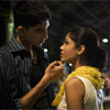
I was just playing w/ my psp and made this:
 before picture:  I know a bit choppy (okay not a bit alot), but what do you think? edit// okay I looked at all of you guy's comments and I decided to make a new one. There are no more grids on the face or on the body and I made a fake vector just to make it more interesting. It's pretty simple, but what do you think? Is it better or worse then the old one? New image: 
|
|
|
|


|
Nov 24 2005, 09:13 PM
Post
#2
|
|
 who ma bitch? you ma bitch, bitch. Group: Member Posts: 1,920 Joined: Oct 2004 Member No: 55,278 |
i dont like the grids on her face...
and it looks like you stretched her face 
|
|
|
|
|
Nov 24 2005, 09:28 PM
Post
#3
|
|
|
Senior Member Group: Member Posts: 3,055 Joined: Jul 2005 Member No: 174,796 |
QUOTE(CUTEBUNNY160 @ Nov 24 2005, 10:13 PM) i dont like the grids on her face... and it looks like you stretched her face  I know I tried to make the grid lighter but my psp is stupid and her face is just normal I didn't stretch it.... |
|
|
|
|
Nov 24 2005, 10:47 PM
Post
#4
|
|
 I intend to live forever-so far, so good. Group: Member Posts: 2,820 Joined: Mar 2005 Member No: 115,137 |
yeahh you should always try to keep the face clean lol the font is a lil pixelly.. use anti-alias! looool yep try to use the dimensions of the original brush... dont resize.. know what i mean. it makes your image quality look bad.
nice tho, those are juss a few tips 
|
|
|
|

|
Nov 24 2005, 10:55 PM
Post
#5
|
|
 Sing to Me Group: Member Posts: 1,825 Joined: Apr 2004 Member No: 10,808 |
the after picture is really pixelly. the brushes are nice. you should try to put the grids on a separate layer.
|
|
|
|

| *Retro_Love* |
Nov 25 2005, 02:09 AM
Post
#6
|
|
Guest |
Yeah I love the brushes its just the grids that throw me off but Good Job though!

|
|
|
|
|
Nov 25 2005, 11:08 AM
Post
#7
|
|
|
Senior Member Group: Member Posts: 3,055 Joined: Jul 2005 Member No: 174,796 |
QUOTE(mizz_americaz @ Nov 24 2005, 11:47 PM) yeahh you should always try to keep the face clean lol the font is a lil pixelly.. use anti-alias! looool yep try to use the dimensions of the original brush... dont resize.. know what i mean. it makes your image quality look bad. nice tho, those are juss a few tips what is anti-alias? How can you do that? |
|
|
|
|
Nov 25 2005, 06:53 PM
Post
#8
|
|
 Peggy. Group: Member Posts: 2,508 Joined: Aug 2005 Member No: 214,025 |
I don't like grids over her face. Also, you streched the picture so she looks fat now.
|
|
|
|


|
Nov 25 2005, 06:55 PM
Post
#9
|
|
 oanh is awesome *nods* Group: Member Posts: 470 Joined: Aug 2005 Member No: 190,637 |
I don't have psp, so Im not sure if you can lower the opacity of the grid...
it would look alot better if it wasn't on her face though.. the brushes are pretty good though. |
|
|
|

|
Nov 25 2005, 07:27 PM
Post
#10
|
|
 i am mean. fear me. Group: Member Posts: 178 Joined: Nov 2005 Member No: 300,587 |
i think you kind of ODed on the checker boxes
|
|
|
|
|
Nov 25 2005, 07:31 PM
Post
#11
|
|
 <33 Group: Member Posts: 2,745 Joined: Mar 2005 Member No: 114,234 |
I honestly think it's alright. I love the brushes, and I like the font...but I don't like grids on her face. it's blocking her face! and it does seem a little choppy. but, good job! I still like it and think it's okay.
|
|
|
|

|
Nov 25 2005, 08:26 PM
Post
#12
|
|
|
Senior Member Group: Member Posts: 3,055 Joined: Jul 2005 Member No: 174,796 |
QUOTE(BrokenDream @ Nov 25 2005, 8:31 PM) I honestly think it's alright. I love the brushes, and I like the font...but I don't like grids on her face. it's blocking her face! and it does seem a little choppy. but, good job! I still like it and think it's okay. Thankyou 
|
|
|
|
|
Nov 25 2005, 11:08 PM
Post
#13
|
|
 skate.like.sasha Group: Member Posts: 75 Joined: Nov 2004 Member No: 63,612 |
the new image is much much beter.
|
|
|
|
|
Nov 25 2005, 11:09 PM
Post
#14
|
|
 "my girls rock balenciaga and smoke mad marijuana" Group: Member Posts: 2,089 Joined: Dec 2004 Member No: 70,049 |
i like the revised one better!! nice job. vector?
|
|
|
|

|
Nov 26 2005, 12:07 AM
Post
#15
|
|
 My name is really Matt... if you care. Group: Member Posts: 1,442 Joined: Oct 2005 Member No: 258,234 |
-text is pixly
-she is bombarded with too many effects |
|
|
|
|
Nov 26 2005, 12:54 AM
Post
#16
|
|
 i lost weight with Mulder! Group: Official Designer Posts: 4,070 Joined: Jan 2005 Member No: 79,019 |
-try to experiment with colors and textures.
-remember that you still want to see her face. -dont rely on effects. -don't overdo it. the second one is MUCH better. |
|
|
|

|
1 User(s) are reading this topic (1 Guests and 0 Anonymous Users)
0 Members: