Was my Entry, Until... |
Resource Center Links
This Month's Contests | Hosts Looking for Hostees | Hostees looking for Hosts | BigBookofResources
Submission Guidelines
  |

 Jun 22 2005, 01:56 PM Jun 22 2005, 01:56 PM
Post
#1
|
|
 show me a garden thats bursting to life  Group: Staff Alumni Posts: 12,303 Joined: Mar 2005 Member No: 115,987 |
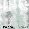
This was going to be my entry to the Manip Contest, but instead i decided to add Animation to it. Um. I really dont think that that would still qualify under manipulation but oh well, it doens't bother me too much.
The Link I had to put it on my webspace it was so huge  OH!! I forgot to put the credit for the text, which I WILL do later, but the text is from the book 'Stargirl' by Jerry Spinelli. I <3 that book. I gotta make a credit though. |
|
|
|


|
Jun 22 2005, 02:00 PM
Post
#2
|
|
 You'll find me in your dreams. Group: Official Member Posts: 8,536 Joined: Mar 2005 Member No: 114,010 |
Animation manipulates the original picture. ^_^
And... I like it, but I don't like that font. =/ Hard for me to read. |
|
|
|


|
Jun 22 2005, 02:46 PM
Post
#3
|
|
 to be loved by someone you love is.. everything Group: Member Posts: 1,207 Joined: Sep 2004 Member No: 51,205 |
i think you should make some areas go slower and others vice versa
|
|
|
|
|
Jun 22 2005, 05:41 PM
Post
#4
|
|
 RAWR. Group: Member Posts: 2,585 Joined: Feb 2005 Member No: 102,641 |
Its too fast I cant read it!! BUT, the picture looks nice, so kudos for that. Next time tho, slow it down, or pick an easier to read font.
|
|
|
|

|
Jun 22 2005, 07:17 PM
Post
#5
|
|
 ;) Group: Staff Alumni Posts: 9,573 Joined: Feb 2005 Member No: 99,124 |
I love the animation, the transitions. It's kind of hard to read, but I think it would look 100% better if you changed the font to something other than what you have right now.
|
|
|
|


|
Jun 22 2005, 07:44 PM
Post
#6
|
|
|
show me a garden thats bursting to life Group: Staff Alumni Posts: 12,303 Joined: Mar 2005 Member No: 115,987 |
_deleted
|
|
|
|
|
Jun 22 2005, 09:16 PM
Post
#7
|
|
|
show me a garden thats bursting to life Group: Staff Alumni Posts: 12,303 Joined: Mar 2005 Member No: 115,987 |
Update-----------
Changed Text & Added the Credit to Jerry Spinelli |
|
|
|
|
Jun 22 2005, 09:20 PM
Post
#8
|
|
 No Day But Today. Group: Member Posts: 1,405 Joined: Feb 2005 Member No: 99,184 |
It looks really good! Great job

|
|
|
|
|
Jun 23 2005, 10:32 PM
Post
#9
|
|
|
mood: content Group: Member Posts: 2,063 Joined: Aug 2004 Member No: 42,325 |
It's really pretty and I love the butterfly + the book [it made me cry :(] but why is the tweening of the words so rocky?
|
|
|
|
|
Jun 23 2005, 11:29 PM
Post
#10
|
|
 ...who created this mess...? Group: Member Posts: 451 Joined: Feb 2005 Member No: 97,244 |
That's so amazing! It's beautiful, yet so sad. Very nice job! =]
|
|
|
|
|
Jun 24 2005, 02:06 AM
Post
#11
|
|
 Zzzz Group: Member Posts: 36 Joined: Jul 2004 Member No: 28,825 |
yea, the book is really good, would recommened it to anyone who hasn't read it =] good job on the pic =] I think itz the right speed....
|
|
|
|
|
Jun 24 2005, 10:03 AM
Post
#12
|
|
|
show me a garden thats bursting to life Group: Staff Alumni Posts: 12,303 Joined: Mar 2005 Member No: 115,987 |
QUOTE It's really pretty and I love the butterfly + the book [it made me cry :(] but why is the tweening of the words so rocky? You might need to zoom in when you watch it. like that thing in the bottom right corner that makes it to it's full size..yea. |
|
|
|
|
Jun 24 2005, 12:15 PM
Post
#13
|
|
 What a hypocrite. Group: Member Posts: 2,754 Joined: Apr 2005 Member No: 128,150 |
Wow, I love it so much, and the animation creates a nice effect to the banner.
Good luck! 
|
|
|
|
|
Jun 24 2005, 12:41 PM
Post
#14
|
|
 that heaven is overrated Group: Member Posts: 5,096 Joined: Oct 2004 Member No: 53,124 |
I think everything looks nice except for the animated text. I think you should've chosen a better font and made the animation a little smoother. Maybe you could've made the words fade out a little more before changing? But still, I love the manipulation of the photo. Good job.
|
|
|
|

|
Jun 24 2005, 12:52 PM
Post
#15
|
|
 mmm hmmm Group: Member Posts: 1,591 Joined: Sep 2004 Member No: 47,325 |
it's nice. The animation font just needs work though. It should blend in more with the banner. Not so white.
|
|
|
|
|
Jun 24 2005, 02:23 PM
Post
#16
|
|
|
show me a garden thats bursting to life Group: Staff Alumni Posts: 12,303 Joined: Mar 2005 Member No: 115,987 |
--Update
Well. Souldreamers was right. The font was too white and it stood out too much, so I lowered the opacity on that. -AND- I changed the font. It was originally Saginaw and that looked too, well, happy for the pic so I changed it to something else more cursive-y. Scriptina is the worst font ever. |
|
|
|
|
Jun 24 2005, 10:10 PM
Post
#17
|
|
 dizzy me up. Group: Member Posts: 3,191 Joined: Apr 2004 Member No: 11,139 |
gaspp i love the butterfly animation !
|
|
|
|
|
Jun 25 2005, 10:10 PM
Post
#18
|
|
 Senior Member Group: Posts: 8,274 Joined: Mar 2004 Member No: 8,001 |
Can you make the animation slower. i cant read that fast. lmao. i thin it woud be nicer if the sentence is long, make the animation slower.
|
|
|
|
|
1 User(s) are reading this topic (1 Guests and 0 Anonymous Users)
0 Members: