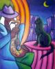
Cry, The Value of Losing (photo manip) |
Resource Center Links
This Month's Contests | Hosts Looking for Hostees | Hostees looking for Hosts | BigBookofResources
Submission Guidelines
  |

 Jun 20 2005, 08:34 PM Jun 20 2005, 08:34 PM
Post
#1
|
|
 Sunlight--shine on me.  Group: Member Posts: 433 Joined: Jun 2005 Member No: 149,201 |
Okay so it seemed like everyone was posting their entries for the PhotoManip contest in the digital art thread already just to get some opinions ahead of time and I know I kind of already sent mine in, but I'd still LOVE opinions anyway...it would be weird to get them after the contest I guess...who knows... But they always help me to improve (I Promise. I really do take them into consideration. Especially since my text ability really fluctuates from picture to picture...actually everything about me fluctuates).
Anyway....this is what I entered.... .::Clickie::. Yes, I think the text could have used a little work on the bottom...I tried like everything I could think of though at the time. I just want to know though if there's anything you think I could do to improve for the next contest. I don't know...Maybe I just have really really low self-esteem or something...Kind of why I picked the theme of Losing/Shock/Crying because winning means so much to so many people, but improvement is more important to me. I mean I don't know if we even get anything if we win this contest? I have my own server anyway...I don't need space or anything. I just...have to be an artist...somehow. It looked like fun. Blah I'll be quiet now. |
|
|
|


|
Jun 20 2005, 08:48 PM
Post
#2
|
|
 You'll find me in your dreams. Group: Official Member Posts: 8,536 Joined: Mar 2005 Member No: 114,010 |
If it were slightly more effected, I think you would do a lot better. =/ A very light pattern.... Or a texture.... Something low-key like that.
Also.... Anything but the main text.... Make it lighter. More transparent. I think that's just a pet peeve of mine tho... I hate having anything but the focused text bright. That includes credits for me... >.< Yeah. You did better than I did though. Mine sucks. |
|
|
|

|
Jun 20 2005, 08:50 PM
Post
#3
|
|
 Froggie! Woof woof. :D Group: Member Posts: 1,423 Joined: Nov 2004 Member No: 66,146 |
yah. adding a texture would be nice. i love the eyes on the right pic. they are beautiful
|
|
|
|

|
Jun 20 2005, 10:00 PM
Post
#4
|
|
 ramble on... sing my song.. Group: Member Posts: 175 Joined: May 2005 Member No: 145,976 |
QUOTE(TheSpoon @ Jun 20 2005, 8:50 PM) i love the eyes on the right pic. they are beautiful  i agree. good job overall though! |
|
|
|
|
Jun 20 2005, 10:17 PM
Post
#5
|
|
 ich heisse Meli. Group: Member Posts: 909 Joined: Apr 2005 Member No: 122,016 |
Would it be cheating or something bad for me to comment?
I really like the blue and green, I think those colors look so cool (!), but the thing that I don't like about the colors is how the girl on the left is blue and the girl on the right is green. The blue girl looks very innocent and pure, like she's bathed in moonlight or something, but the other girl looks like death or something in a scary movie. But otherwise I lovelove this blend and agree with the people above! |
|
|
|
|
Jun 20 2005, 10:19 PM
Post
#6
|
|
|
t-t-t-toyaaa Group: Official Member Posts: 19,821 Joined: Apr 2004 Member No: 11,270 |
QUOTE(TheSpoon @ Jun 20 2005, 5:50 PM) yah. adding a texture would be nice. i love the eyes on the right pic. they are beautiful yea i agree about adding a texture or something but its really good . |
|
|
|


|
Jun 20 2005, 10:24 PM
Post
#7
|
|
|
Sunlight--shine on me. Group: Member Posts: 433 Joined: Jun 2005 Member No: 149,201 |
QUOTE(ChasingLife87 @ Jun 20 2005, 9:17 PM) Would it be cheating or something bad for me to comment? but the thing that I don't like about the colors is how the girl on the left is blue and the girl on the right is green Errr can I reply?? Like if I can't then don't like read this haha. I kind of did it that way for like a paradox (I agree with the people above me though about the text/effects [texture] I need to work on), but I kind of did the blue and then green for a purpose. The Explanation I feel is necessary now; should have said it before: Whoops--> Blue to a lot of people means calmness, but sadness at the same time-emphasizing strength, but shock. Then when you lose you look at the right Green to a lot of people symbolizes growth, reality, rebirth (like plants....the recycle symbol, etc). It's kind of like a change from one thing to the other when you lose-->From sadness and strength, to overcoming and rebirth. I donno...But crying kind of sums it up because it's a form of release and how you feel at the same time. I write and color correct films for me and my mom so I work/analyze that kind of stuff ALOT. I LOVE to use blue and green. I mean I can see where you're coming from, but I guess I didn't really explain it...That's what's horrible about stills...you can't explain them with audio/motion, you can only explain them with minimal text. Blah. OH...Hence, The sig. haha. |
|
|
|
|
Jun 20 2005, 10:51 PM
Post
#8
|
|
|
Senior Member Group: Member Posts: 988 Joined: Feb 2005 Member No: 98,884 |
it's actually pwetty amazing, i mean, the colors are very nice, and the blend is good itself. great job on it.
|
|
|
|
|
Jun 21 2005, 10:26 AM
Post
#9
|
|
 ...who created this mess...? Group: Member Posts: 451 Joined: Feb 2005 Member No: 97,244 |
Your art is always so beautiful.
 I really like this one, especially how you made the colors actually symbolize something. Very nice work. I really like this one, especially how you made the colors actually symbolize something. Very nice work.
|
|
|
|
|
Jun 21 2005, 10:28 AM
Post
#10
|
|
 rainy days fade away.. Group: Member Posts: 566 Joined: Oct 2004 Member No: 58,261 |
wow. that is really good! and i do agree w/ everyone. the eyes are amazing!
|
|
|
|

|
Jun 21 2005, 10:57 AM
Post
#11
|
|
 Go to Tahiti, and make out with a native. Group: Duplicate Posts: 914 Joined: Apr 2004 Member No: 10,267 |
i really like it. i agree it could use some texture and the font could be a bit better. the part where it says art by should be smaller. it just takes away when it ginormous
|
|
|
|
|
Jun 21 2005, 03:25 PM
Post
#12
|
|
 The Texan Group: Member Posts: 430 Joined: May 2005 Member No: 136,431 |
I personally like the picture,(even though that right girl scares me with or without manipulation, she looks pissed or jealous.) I still think you should add an effect here and there, just to give you more points ^_^.
|
|
|
|
|
Jun 22 2005, 08:34 PM
Post
#13
|
|
|
Sunlight--shine on me. Group: Member Posts: 433 Joined: Jun 2005 Member No: 149,201 |
Thanks guys for all the comments!! I can't change it before the deadline for the photo-manip contest because I have to work on the layout for my mom's professional site with my twin brother *sigh*....which is gonna be soooo awesome...In fact I'll have to post a link later in separate section [not digital art]
Anyway!! I'm still gonna keep all your comments in mind for the next art thing I do. *shrug* Normally I use a lot of brushes. I was feeling brushed out. But now I understand that they add a LOT to a picture. They can change the entire feeling which in some cases is bad and others is not (depends on the brush)... Anyway blah. I have to keep that picture the way it is. I'm also very very sick so I've been sleeping for the past few days with only waking up for a couple of hours in between because i'm on so many antibiotics. But I thank all you guys for the comments!! (Sorry I like died on the forum/thread for like mmm 3 days).  Anyway I don't think i need anymorre comments cause I understand I need to work on text/brushes (textures). Will do. After I sort out my schedule: the sickness, senior photoshoot, layout, film ad, summer play...are all kind of not fitting together right now. Things keep overlapping that shouldn't. Anyway I don't think i need anymorre comments cause I understand I need to work on text/brushes (textures). Will do. After I sort out my schedule: the sickness, senior photoshoot, layout, film ad, summer play...are all kind of not fitting together right now. Things keep overlapping that shouldn't.Thanks though!---<3 always. Eria. |
|
|
|
|
Jun 22 2005, 08:44 PM
Post
#14
|
|
 show me a garden thats bursting to life Group: Staff Alumni Posts: 12,303 Joined: Mar 2005 Member No: 115,987 |
I agree completely with crazay, otherwise it looks faboulas!
|
|
|
|

|
Jun 22 2005, 10:13 PM
Post
#15
|
|
|
hojax to the max Group: Member Posts: 330 Joined: Feb 2005 Member No: 98,858 |
it looks gorgeous!

|
|
|
|
|
Jun 22 2005, 10:39 PM
Post
#16
|
|
 :hammer: Group: Staff Alumni Posts: 9,849 Joined: Mar 2004 Member No: 7,700 |
You have a twin brother ? Meaning.. fraternal twin brother ? Me toooooooo XD !!
Anyways, I love the colors and the somewhat darkness. And the freckles, haha. Except for the font that says "Just Cry".. looks really weird with the overall mood of the manipulation. |
|
|
|

|
Jun 22 2005, 10:53 PM
Post
#17
|
|
 yan lin♥ Group: Staff Alumni Posts: 14,129 Joined: Apr 2004 Member No: 13,627 |
that's really nice, except the font for "just cry" doesnt really fit.
|
|
|
|

|
Jun 23 2005, 09:45 AM
Post
#18
|
|
 to be loved by someone you love is.. everything Group: Member Posts: 1,207 Joined: Sep 2004 Member No: 51,205 |
i like the colors, I think you could've used a texture overtop.. and the "cry" part doesnt fit, because I dont see any tears..

|
|
|
|
|
Jun 23 2005, 09:54 AM
Post
#19
|
|
|
Member Group: Member Posts: 28 Joined: Jun 2005 Member No: 150,146 |
nice blend. i like the colors. great job

|
|
|
|
|
2 User(s) are reading this topic (2 Guests and 0 Anonymous Users)
0 Members: