Siggy =D |
Resource Center Links
This Month's Contests | Hosts Looking for Hostees | Hostees looking for Hosts | BigBookofResources
Submission Guidelines
  |

 Jun 14 2005, 07:06 AM
Post
#1
|
|
 Like i care. ♥  Group: Member Posts: 780 Joined: Apr 2005 Member No: 124,706  |
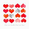
 What do you guys think? :D |
|
|
|


| *stephinika* |
Jun 14 2005, 07:36 AM
Post
#2
|
|
Guest |
its cute, i like it. the colours are awesome too.

|
|
|
|
|
Jun 14 2005, 09:16 AM
Post
#3
|
|
 just a girl Group: Member Posts: 41 Joined: Jun 2005 Member No: 149,279 |
its ok i guess.. its like a regular blend =) but nice
|
|
|
|

|
Jun 14 2005, 11:22 AM
Post
#4
|
|
|
Like i care. ♥ Group: Member Posts: 780 Joined: Apr 2005 Member No: 124,706 |
Hehe thnx all ^^ how do you mean a blend?
|
|
|
|
|
Jun 14 2005, 11:31 AM
Post
#5
|
|
|
Senior Member Group: Member Posts: 359 Joined: Feb 2005 Member No: 101,275 |
the text doesnt really blend in, or match with the banner, besides that its a good abstract//render signature.
|
|
|
|

|
Jun 14 2005, 12:43 PM
Post
#6
|
|
|
Senior Member Group: Member Posts: 122 Joined: Jun 2005 Member No: 148,214 |
that looks cute.
|
|
|
|
|
Jun 14 2005, 04:27 PM
Post
#7
|
|
 Go to Tahiti, and make out with a native. Group: Duplicate Posts: 914 Joined: Apr 2004 Member No: 10,267 |
i like the colors of it. you did a really good job
|
|
|
|
|
Jun 18 2005, 07:49 PM
Post
#8
|
|
|
Senior Member Group: Member Posts: 988 Joined: Feb 2005 Member No: 98,884 |
i don't like the text, it should be soft lighted or whatever. so you can see some transperency, or at least change it to a color, cause it would look better. i like the whole thing though.
|
|
|
|
|
Jun 18 2005, 08:05 PM
Post
#9
|
|
 that heaven is overrated Group: Member Posts: 5,096 Joined: Oct 2004 Member No: 53,124 |
I love the colors.
 I'd lower the opacity of the pattern or whatever you used a little, and I'd try overlaying the text to make it blend into the image a little more. Good job, though. |
|
|
|


|
Jun 18 2005, 08:13 PM
Post
#10
|
|
 NO. I'm not 13. or 14. or 15. or 16. Group: Member Posts: 4,616 Joined: Jul 2004 Member No: 30,577 |
I would lower the opacity of the pattern and change the font, but I love the colors and the light effects on the right side =]
|
|
|
|

|
2 User(s) are reading this topic (2 Guests and 0 Anonymous Users)
0 Members: