things i'll never say, a blend. |
Resource Center Links
This Month's Contests | Hosts Looking for Hostees | Hostees looking for Hosts | BigBookofResources
Submission Guidelines
  |

 May 28 2005, 06:24 PM May 28 2005, 06:24 PM
Post
#1
|
|
|
Lauren loves YOU.  Group: Member Posts: 2,357 Joined: Jul 2004 Member No: 32,793 |
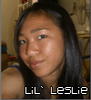
oh my. it has been a while since i've done one of these. tell me what you think. =]
3 versions: blue, pink and green. images by gettyimages.com    **edit** thanks! advice taken. the new ones.   
|
|
|
|


|
May 28 2005, 06:26 PM
Post
#2
|
|
 I need you just as much as you need her Group: Member Posts: 723 Joined: Dec 2004 Member No: 72,175 |
That looks very pretty. The phrase or quote goes well with the pic. Nicely done. Good Job.
|
|
|
|

|
May 28 2005, 06:30 PM
Post
#3
|
|
 Your love is a razorblade kiss ♥ Group: Member Posts: 1,794 Joined: Apr 2004 Member No: 9,959 |
wow, pretty. the pink one looks the best
|
|
|
|
|
May 28 2005, 06:34 PM
Post
#4
|
|
 that heaven is overrated Group: Member Posts: 5,096 Joined: Oct 2004 Member No: 53,124 |
Wow, that's very pretty. The images are blended nicely, but maybe it would look better if you lowered the opacity of the pattern and of the words at the top-right, so it would create more of a faded look. Also, maybe you could overlay the words 'thing i'll never say', so it would bring more of a softness to the blend. A border would be nice, too.
 Oh, and those are only suggestions. The blend still looks nice. Oh, and those are only suggestions. The blend still looks nice. 
|
|
|
|

|
May 28 2005, 07:51 PM
Post
#5
|
|
 Um....Its meeee Group: Member Posts: 2,218 Joined: Mar 2004 Member No: 8,264 |
those are pretty. Couldn't choose what color fit best. They are all nice.
|
|
|
|
|
May 28 2005, 08:00 PM
Post
#6
|
|
 This bitch better work! Group: Staff Alumni Posts: 13,681 Joined: Jul 2004 Member No: 28,095 |
the blue is my favorite and the lowering of the opacities are a really great touch!
|
|
|
|


| *XLilAznGrl592X* |
May 28 2005, 08:05 PM
Post
#7
|
|
Guest |
ooo lowering the opacity made it much better! i like the pink one best =]
|
|
|
|
|
May 28 2005, 08:07 PM
Post
#8
|
|
 Senior Member Group: Member Posts: 2,152 Joined: Oct 2004 Member No: 57,818 |
i love that song.. "things i'll never say"
i like the pink one.. |
|
|
|
|
May 28 2005, 08:10 PM
Post
#9
|
|
|
that heaven is overrated Group: Member Posts: 5,096 Joined: Oct 2004 Member No: 53,124 |
QUOTE(Frankie @ May 28 2005, 6:00 PM) the blue is my favorite and the lowering of the opacities are a really great touch!  Frankie..there is no blue one...  Anyways, I'm glad you took my advice! Haha. It's a big improvement. Good job. I like the pink one most. |
|
|
|
|
May 29 2005, 12:37 AM
Post
#10
|
|
 boo Group: Member Posts: 5,512 Joined: Dec 2004 Member No: 71,765 |
I love them all. You're good at this.
|
|
|
|
|
May 29 2005, 12:49 AM
Post
#11
|
|
 ^-^ Group: Member Posts: 1,676 Joined: Feb 2005 Member No: 107,668 |
ooohhh, I likme hte second ones much better...they're so beautiful! and the picture is so smooth looking, you jsut want to stare at it for minutes, I just love hte feeling it gives you...so soft and comforting.
very very VERY good job! bravo!  QUOTE(sharerol @ May 28 2005, 5:10 PM) Frankie..there is no blue one... Anyways, I'm glad you took my advice! Haha. It's a big improvement. Good job. I like the pink one most. sure there is... "3 versions: blue, pink and green. images by gettyimages.com" told ya so.  I agree with frankie, I like the grey/blue one, adding the extra color jsut doens't work for me...althouhg if I had to choose a seocnd favorite I'd say the green. mmm, they are all so lovely!!
|
|
|
|

|
May 29 2005, 01:50 AM
Post
#12
|
|
 Senior Member Group: Posts: 8,274 Joined: Mar 2004 Member No: 8,001 |
Wow, outstanding icon work !
|
|
|
|
|
May 29 2005, 01:55 AM
Post
#13
|
|
|
that heaven is overrated Group: Member Posts: 5,096 Joined: Oct 2004 Member No: 53,124 |
^x2 Oooookay.. Well, it looked just gray on my computer.
But whatever.
|
|
|
|
|
May 29 2005, 02:25 PM
Post
#14
|
|
|
Lauren loves YOU. Group: Member Posts: 2,357 Joined: Jul 2004 Member No: 32,793 |
thanks so much for the advice, sharerol. it made all the difference. =]
and thanks for the comments, guys. they made me happy.
|
|
|
|
|
May 29 2005, 02:27 PM
Post
#15
|
|
 skaters gonna skate. Group: Official Member Posts: 6,861 Joined: Mar 2004 Member No: 6,336 |
cool i like the green one.

|
|
|
|

|
Jun 3 2005, 10:44 PM
Post
#16
|
|
 Go to Tahiti, and make out with a native. Group: Duplicate Posts: 914 Joined: Apr 2004 Member No: 10,267 |
the blending is so nice...as if the picture was taken like that and everything flows together
|
|
|
|
|
Dec 28 2005, 07:36 PM
Post
#17
|
|
 Senior Member Group: Member Posts: 3,055 Joined: Jul 2005 Member No: 174,796 |
I love it
You should make a layout with it
|
|
|
|

| *stephinika* |
Dec 28 2005, 07:44 PM
Post
#18
|
|
Guest |
ooh lovely work! i love the redone versions. great work.
|
|
|
|
|
Dec 28 2005, 08:31 PM
Post
#19
|
|
 ^ignore. read> Maria. Group: Member Posts: 710 Joined: Dec 2005 Member No: 323,799 |
really pretty! i like em!
|
|
|
|
|
2 User(s) are reading this topic (2 Guests and 0 Anonymous Users)
0 Members: