Website |
Resource Center Links
This Month's Contests | Hosts Looking for Hostees | Hostees looking for Hosts | BigBookofResources
Submission Guidelines

 Aug 5 2010, 05:16 PM Aug 5 2010, 05:16 PM
Post
#1
|
|
 Sniff, sniff, hooray!  Group: Member Posts: 71 Joined: Mar 2006 Member No: 388,396 |
|
|
|
|


 |
Replies
|
Aug 10 2010, 10:40 AM
Post
#2
|
|
|
Sniff, sniff, hooray! Group: Member Posts: 71 Joined: Mar 2006 Member No: 388,396 |
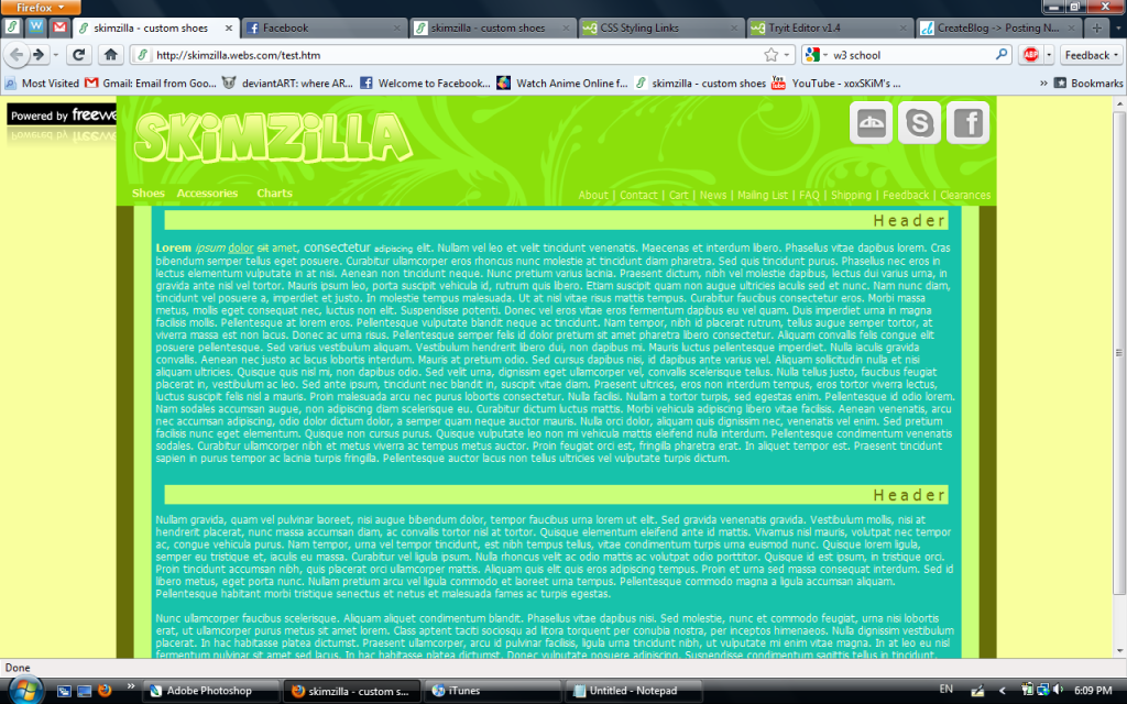
QUOTE(schizo @ Aug 9 2010, 11:42 PM)  I actually don't think the font is too bad. I'm not that great with fonts either, but I would try Sansation or any of these techno fonts. I would also change the header font. It's a little blah. If you want to stick to arial (or whatever it is you're using), I would set it to uppercase and lower the letter spacing a tad. Overall, it's MUCH better than you're first version. :) Hmm.. would those fonts match the rest of the layout? I changed the header. Does it look better? Thanks  I went with a totally different approach haha. I went with a totally different approach haha.QUOTE(shadowfax @ Aug 9 2010, 11:50 PM) I think the font choice is poor; it doesn't match the rest of the layout, which is more simple. Sorry I can't recommend a font. It used to take me forever trying to pick a font that best fit a layout and I'd go through my whole list before choosing one.  For such a simple banner, it takes up a lot of space. I like minimalism but in this case, its size doesn't flatter the layout. Can you change the black background to the dark gray you're already using? Also, the navigation on the top left (Shoes>Accessories>Charts) should be the same style as on the right (About/Contact/Cart/etc). Keep it uniform. :) I don't really remember why I chose such a large size... haha. I changed the background color, but it sort of looks weird. Maybe if I put a purple border around the banner, it won't look so weird. Well, they weren't the same style because the ones on the left drop down. But I changed the background color of that navigation to that grey color. |
|
|
|
|
Aug 10 2010, 11:22 AM
Post
#3
|
|
 Senior Member Group: Staff Alumni Posts: 2,435 Joined: Feb 2007 Member No: 506,205 |
QUOTE(Saraaaah @ Aug 10 2010, 10:40 AM) Hmm.. would those fonts match the rest of the layout? I changed the header. Does it look better? Thanks I went with a totally different approach haha.I wouldn't have suggested them if I didn't think they would match. You definately need a sans serif font...maybe not one of the ones I gave you, but I just don't see serif fonts working with the rest of the layout. |
|
|
|

Posts in this topic
 Saraaaah Website Aug 5 2010, 05:16 PM
 Cum The only thing I'm not digging is the banner. ... Aug 5 2010, 05:37 PM manny-the-dino Too many bright colors plus they don't really ... Aug 5 2010, 05:40 PM brooklyneast05 not a fan of the colors
also not a fan of the te... Aug 5 2010, 05:45 PM Saraaaah QUOTE(Cum @ Aug 5 2010, 06:37 PM) The onl... Aug 5 2010, 06:19 PM
Cum The only thing I'm not digging is the banner. ... Aug 5 2010, 05:37 PM manny-the-dino Too many bright colors plus they don't really ... Aug 5 2010, 05:40 PM brooklyneast05 not a fan of the colors
also not a fan of the te... Aug 5 2010, 05:45 PM Saraaaah QUOTE(Cum @ Aug 5 2010, 06:37 PM) The onl... Aug 5 2010, 06:19 PM
 schizo QUOTE(Saraaaah @ Aug 5 2010, 06:19 PM) I ... Aug 5 2010, 11:14 PM Saraaaah QUOTE(schizo @ Aug 6 2010, 12:14 AM) Colo... Aug 6 2010, 12:08 PM Saraaaah Is this any better?
click to enlarge
live preview Aug 7 2010, 11:03 PM Firiath It looks a lot better than the first one imo but I... Aug 8 2010, 12:01 AM Saraaaah QUOTE(Firiath @ Aug 8 2010, 01:01 AM) It ... Aug 8 2010, 11:28 AM Firiath I really don't know - I don't tend to do t... Aug 9 2010, 08:19 AM Saraaaah Hmm... I guess I'll just look around for some ... Aug 9 2010, 03:21 PM schizo I actually don't think the font is too bad. I... Aug 9 2010, 10:42 PM shadowfax I think the font choice is poor; it doesn't ma... Aug 9 2010, 10:50 PM shadowfax Much better! :) "Sizes" and "1... Aug 10 2010, 11:20 AM Saraaaah QUOTE(shadowfax @ Aug 10 2010, 12:20 PM) ... Aug 10 2010, 04:14 PM jiyong It still feels a little stretched out. You could t... Aug 13 2010, 02:02 PM Saraaaah oOo, that's a good idea. I'll work on that... Aug 14 2010, 08:20 PM
schizo QUOTE(Saraaaah @ Aug 5 2010, 06:19 PM) I ... Aug 5 2010, 11:14 PM Saraaaah QUOTE(schizo @ Aug 6 2010, 12:14 AM) Colo... Aug 6 2010, 12:08 PM Saraaaah Is this any better?
click to enlarge
live preview Aug 7 2010, 11:03 PM Firiath It looks a lot better than the first one imo but I... Aug 8 2010, 12:01 AM Saraaaah QUOTE(Firiath @ Aug 8 2010, 01:01 AM) It ... Aug 8 2010, 11:28 AM Firiath I really don't know - I don't tend to do t... Aug 9 2010, 08:19 AM Saraaaah Hmm... I guess I'll just look around for some ... Aug 9 2010, 03:21 PM schizo I actually don't think the font is too bad. I... Aug 9 2010, 10:42 PM shadowfax I think the font choice is poor; it doesn't ma... Aug 9 2010, 10:50 PM shadowfax Much better! :) "Sizes" and "1... Aug 10 2010, 11:20 AM Saraaaah QUOTE(shadowfax @ Aug 10 2010, 12:20 PM) ... Aug 10 2010, 04:14 PM jiyong It still feels a little stretched out. You could t... Aug 13 2010, 02:02 PM Saraaaah oOo, that's a good idea. I'll work on that... Aug 14 2010, 08:20 PM |
1 User(s) are reading this topic (1 Guests and 0 Anonymous Users)
0 Members: