Nightclub Scene, took a lot of time, please view |
Rating


|
Resource Center Links
This Month's Contests | Hosts Looking for Hostees | Hostees looking for Hosts | BigBookofResources
Submission Guidelines
 May 31 2010, 10:55 AM May 31 2010, 10:55 AM
Post
#1
|
|
 LOVE is our resistance  Group: Member Posts: 157 Joined: Aug 2007 Member No: 556,214 |
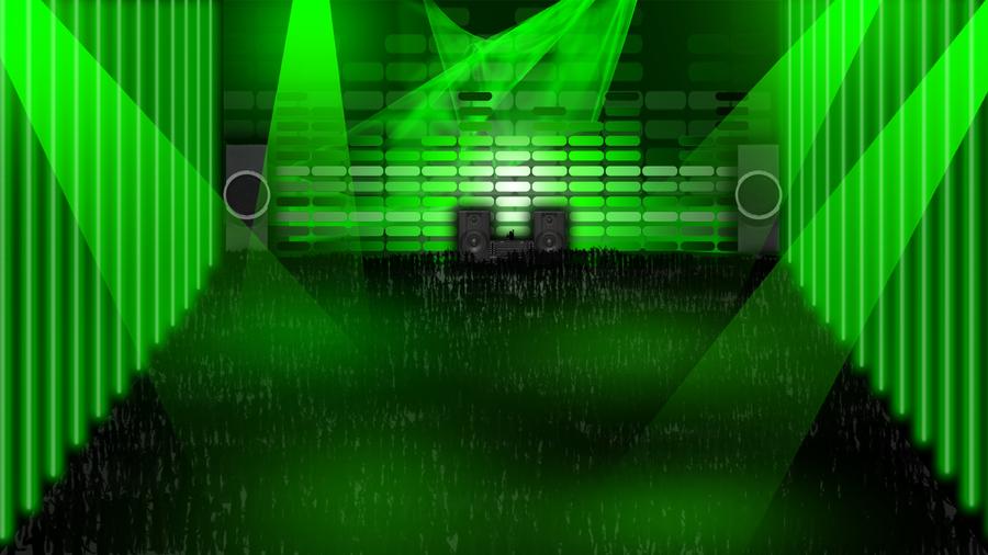 this took about 2 and a half hours to make, i personally love it... what do you guys think? |
|
|
|


 |
Replies
|
Jun 2 2010, 12:02 AM
Post
#2
|
|
 Senior Member Group: Administrator Posts: 8,629 Joined: Jan 2007 Member No: 498,468 |
I second Mike's critique. Also everything looks too soft, imo. Like the lights on the sides, the huge speakers front and center and the crowd as well.
|
|
|
|


|
Jun 2 2010, 12:25 AM
Post
#3
|
|
 Mel Blanc was allergic to carrots. Group: Official Designer Posts: 6,371 Joined: Aug 2008 Member No: 676,291 |
QUOTE(manny-the-dino @ Jun 2 2010, 01:02 AM)  Also everything looks too soft, imo. Oh, yeah. This, too, because like the DJ area is pretty rough while the rest is smooth. I would think you would have used a kind of vectored, black silhouette or something for the DJ, to match with the crowd. As for your color issue, I suggest using soft colors that would go well with that green you're using. Maybe like some nice teals, vibrant-ish yellows/oranges for most of the light areas. As for that "screen", I think some soft reds (and if you can work with it somehow, maybe some light but dull [oxymoron?  ] purples) would go well on that. ] purples) would go well on that.Or, you can try experimenting with gradient maps and/or blending options to mess around with colors and lighting effects. |
|
|
|

Posts in this topic
 xblast196 Nightclub Scene May 31 2010, 10:55 AM
 Mikeplyts Um, it's not too shabby, but not great. I kind... May 31 2010, 11:25 AM xblast196 this was more of a way for me to just get the conc... May 31 2010, 08:07 PM Cum i basically agree with mike's post. for a col... May 31 2010, 08:41 PM ButtsexV2 OP's obviously never been to a night club Jun 2 2010, 12:45 AM
 Mikeplyts QUOTE(ButtsexV2 @ Jun 2 2010, 01:45 AM) O... Jun 2 2010, 07:41 AM
 mipadi QUOTE(ButtsexV2 @ Jun 2 2010, 01:45 AM) O... Jun 3 2010, 01:21 AM ButtsexV2 QUOTE(mipadi @ Jun 3 2010, 01:21 AM) Kafk... Jun 3 2010, 01:48 AM Cum who cares. what matter is if there's any prog... Jun 3 2010, 03:28 PM musicfreak955 I LIKE IT! a lot. Jun 19 2010, 11:41 PM
 |
1 User(s) are reading this topic (1 Guests and 0 Anonymous Users)
0 Members: