cake business card |
Rating


|
Resource Center Links
This Month's Contests | Hosts Looking for Hostees | Hostees looking for Hosts | BigBookofResources
Submission Guidelines
 May 27 2010, 02:18 PM May 27 2010, 02:18 PM
Post
#1
|
|
 (′ ・ω・`)  Group: Official Designer Posts: 6,179 Joined: Dec 2004 Member No: 72,477 |
my friend wanted me to help her relative make her a business card for her cake business. she actually makes these really cool marzipan cakes lol. anyway.
stayed at 3 to do this crap im so tired. it doesn't even look great but i dont care. i had like, 1 day notice. f*ck this crap. 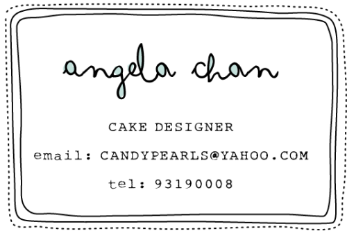 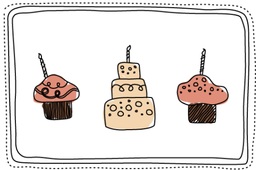 |
|
|
|


 |
Replies
|
May 27 2010, 05:36 PM
Post
#2
|
|
 I'm Jc Group: Mentor Posts: 13,619 Joined: Jul 2006 Member No: 437,556 |
i think you can go down a lot of font size for the information, spacing too. if you want to shorten the information you can do
e: cakepearls@yahoo.com t: 93190008 instead of spelling out email, or better yet you don't even have to indicate it's an email, since anyone interested in using an email address would know what one looks like. |
|
|
|


|
May 27 2010, 07:59 PM
Post
#3
|
|
|
(′ ・ω・`) Group: Official Designer Posts: 6,179 Joined: Dec 2004 Member No: 72,477 |
QUOTE(brooklyneast05 @ May 28 2010, 06:36 AM)  i think you can go down a lot of font size for the information, spacing too. if you want to shorten the information you can do e: cakepearls@yahoo.com t: 93190008 instead of spelling out email, or better yet you don't even have to indicate it's an email, since anyone interested in using an email address would know what one looks like. thanks. that's a good idea. i actually started out without the 'email' and 'tel', i just added them on later. it looks redundant now. and i think i can spare going down a font size to 10. edit. uhhhh my client's being annoying and are asking for them to be on one page. or even add a photo in. imageshack made the colors a bit off. personally, i think the one with the photo is ugly, but i don't have time to touch it up cuz they need it umm, now. these are even shittier. |
|
|
|


|
May 27 2010, 11:39 PM
Post
#4
|
|
 Senior Member Group: Head Staff Posts: 18,173 Joined: Mar 2005 Member No: 108,478 |
QUOTE(doughnut @ May 27 2010, 08:59 PM) I like this first one better, since the central balance makes it look nice. |
|
|
|
Posts in this topic
 doughnut cake business card May 27 2010, 02:18 PM
 tokyo-rose Cute! I like the doodly-looking fonts and illu... May 27 2010, 02:42 PM spambot I hate one page cards. Go with the first one. May 28 2010, 01:29 AM
 tokyo-rose QUOTE(spambot @ May 28 2010, 02:29 AM) I ... Jun 1 2010, 01:35 AM tailoredtrouble I think it's really cute and different. Especi... May 31 2010, 08:40 PM spambot I like when a card has something on the back. So y... Jun 1 2010, 01:40 AM flaunty absolutely love it. soo cute! i hope to be a c... Jun 4 2010, 08:31 PM Tomates So i know you don't like the one with the phot... Jun 5 2010, 11:41 AM ArjunaCapulong i rike it Jun 5 2010, 11:50 AM futura I love it. It's simple but works well. Jun 7 2010, 06:04 AM
 |
1 User(s) are reading this topic (1 Guests and 0 Anonymous Users)
0 Members: