Quick icon help., plz&thnks. |
Resource Center Links
This Month's Contests | Hosts Looking for Hostees | Hostees looking for Hosts | BigBookofResources
Submission Guidelines
 Feb 3 2010, 05:06 PM Feb 3 2010, 05:06 PM
Post
#1
|
|
|
Senior Member        Group: Staff Alumni Posts: 4,665 Joined: Aug 2008 Member No: 676,364 |
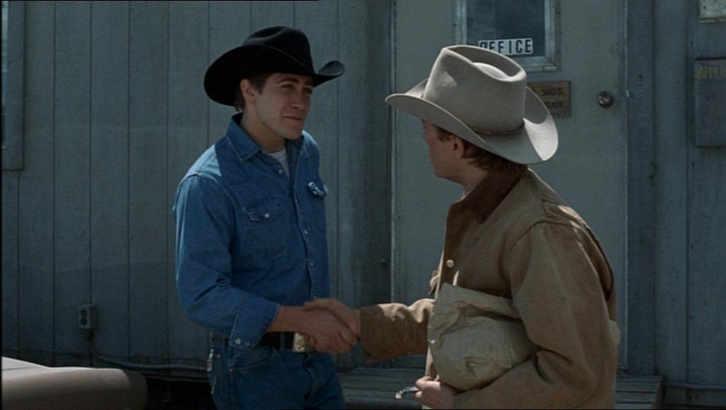
 Need your opinions and feedback. Would this icon look better with the text or without the text? And do you have any other advice to help me improve this icon? And here's the original: |
|
|
|
 |
Replies
 Feb 4 2010, 03:09 AM Feb 4 2010, 03:09 AM
Post
#2
|
|
 Live long and prosper.         Group: Staff Alumni Posts: 10,142 Joined: Apr 2007 Member No: 514,926 |
You transformed the text incorrectly. Which makes it looks like it is jagged. As of right now, without text would be better. If you fix the text, show me, I'll let you know then.
|
|
|
|
 Feb 6 2010, 01:04 PM Feb 6 2010, 01:04 PM
Post
#3
|
|
|
show me a garden thats bursting to life         Group: Staff Alumni Posts: 12,303 Joined: Mar 2005 Member No: 115,987 |
You transformed the text incorrectly. Which makes it looks like it is jagged. As of right now, without text would be better. If you fix the text, show me, I'll let you know then. It's the font that makes it look all jagged-y, but I like it. I think it adds something to the icon. I think you made your subjects too small- I had to squint to really see them. Doesn't help they're completely washed out in blue. Crop your images a bit bigger, so that your subjects will be larger, and then keep playing with coloring. I like the coloring, I just don't think all that blue fits with the icon and what you're trying to convey. |
|
|
|
 Feb 8 2010, 05:24 PM Feb 8 2010, 05:24 PM
Post
#4
|
|
 Senior Member        Group: Administrator Posts: 8,629 Joined: Jan 2007 Member No: 498,468 |
I think you made your subjects too small- I had to squint to really see them. Doesn't help they're completely washed out in blue. This. I like how you crop but you always crop too far, if that makes sense. Also I'd really change the coloring. The first thing I noticed was that the guy in blue and the background mesh too much. I know you can do it! |
|
|
|
Posts in this topic
 Beenly Quick icon help. Feb 3 2010, 05:06 PM
 Mikeplyts I think it'd look better without the text. Eit... Feb 3 2010, 07:56 PM
 deteam looks ok but im not one 4 icons to begin with
... Feb 4 2010, 02:01 AM

 elletricity QUOTE(manny-the-dino @ Feb 8 2010, ... Feb 9 2010, 09:01 PM
 Beenly I changed the text to it's original position, ... Feb 4 2010, 06:14 PM
 Maccabee GAYYY!!! Feb 8 2010, 06:38 PM
 Beenly Irrelevant. Feb 8 2010, 07:02 PM
 Maccabee GAY f****t IS GAY! YOU WARNED ME FOR THAT BEEN... Feb 8 2010, 08:20 PM
 Beenly Yeah, but what's the significance of The Showc... Feb 8 2010, 08:26 PM

 Maccabee QUOTE(Beenly @ Feb 8 2010, 07:26 PM) Yeah... Feb 8 2010, 10:05 PM

 Mikeplyts QUOTE(Maccabee @ Feb 9 2010, 12:05 AM) Ok... Feb 9 2010, 12:37 AM
 Beenly This is where being Bisexual is handy. =) Feb 9 2010, 05:52 PM
  |
1 User(s) are reading this topic (1 Guests and 0 Anonymous Users)
0 Members:


