Rough Draft Layout, For my website |
Resource Center Links
This Month's Contests | Hosts Looking for Hostees | Hostees looking for Hosts | BigBookofResources
Submission Guidelines

 Sep 27 2009, 12:29 PM Sep 27 2009, 12:29 PM
Post
#1
|
|
 Member  Group: Member Posts: 13 Joined: Sep 2009 Member No: 747,069 |
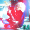
UPDATE 2: Alright - I fixed the lens-flare and completely got rid of the footer and I think those are the last changes im making for tonight, im pretty exhausted from my weekend and the flu doesnt help much

Reason for edit: Please use [thumb] tags instead of [img] tags when posting large images. - Mike
|
|
|
|


 |
Replies
|
Sep 28 2009, 03:34 PM
Post
#2
|
|
 Senior Member Group: Staff Alumni Posts: 7,063 Joined: Jul 2008 Member No: 670,288 |
I don't really like the layout. The fonts just, don't go together whatsoever. That picture looks really low quality when I look at it. It looks like it was just slapped onto the layout. The "Electric Addiction" text (mispelled by the way), is way too hard to read against the same color background.
|
|
|
|


|
Sep 28 2009, 04:12 PM
Post
#3
|
|
 kthxbai Group: Official Designer Posts: 2,832 Joined: Feb 2008 Member No: 621,203 |
QUOTE(A1Bassline @ Sep 28 2009, 03:34 PM)  (mispelled by the way) Misspelled* |
|
|
|

Posts in this topic
 electricaddiction Rough Draft Layout Sep 27 2009, 12:29 PM
 HeartOfPandora First off, don't use the same pictures twice. ... Sep 27 2009, 06:41 PM electricaddiction Alright, thanks. Im gonna start all over. I agree,... Sep 27 2009, 07:41 PM manny-the-dino For your first version, I totally agree with Heart... Sep 27 2009, 10:34 PM emberfly QUOTE(electricaddiction @ Sep 27 2009, 12... Sep 27 2009, 10:41 PM
 electricaddiction QUOTE(emberfly @ Sep 27 2009, 10:41 PM) N... Sep 27 2009, 10:53 PM IWontRapeYou Header looks fine, imo. I pretty much second every... Sep 27 2009, 10:43 PM elletricity ^ Was about to point that out, lol. "ADICTION... Sep 28 2009, 03:43 PM abzz thats cool (: Oct 10 2009, 02:07 PM funride It really has no theme too it. And the navigation ... Oct 14 2009, 12:41 PM Ark Why not take the navigation from top right and pla... Oct 14 2009, 07:46 PM
 |
1 User(s) are reading this topic (1 Guests and 0 Anonymous Users)
0 Members: