Rough Draft Layout, For my website |
Resource Center Links
This Month's Contests | Hosts Looking for Hostees | Hostees looking for Hosts | BigBookofResources
Submission Guidelines

 Sep 27 2009, 12:29 PM Sep 27 2009, 12:29 PM
Post
#1
|
|
 Member  Group: Member Posts: 13 Joined: Sep 2009 Member No: 747,069 |
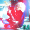
UPDATE 2: Alright - I fixed the lens-flare and completely got rid of the footer and I think those are the last changes im making for tonight, im pretty exhausted from my weekend and the flu doesnt help much

Reason for edit: Please use [thumb] tags instead of [img] tags when posting large images. - Mike
|
|
|
|


 |
Replies
|
Sep 27 2009, 10:34 PM
Post
#2
|
|
 Senior Member Group: Administrator Posts: 8,629 Joined: Jan 2007 Member No: 498,468 |
For your first version, I totally agree with HeartOfPandora. Plus the coloring made a lot of the images darker. And they were low in image quality. As for your second version, you should take off the white orb in-between "electric additions" because it's distracting. Also the footer is too much. I mean you have a bunch of lines going on in the header, so adding even more lines to the bottom isn't a good idea. And I dk, I feel like you should use a better and more exciting font for your navigation.
|
|
|
|


Posts in this topic
 electricaddiction Rough Draft Layout Sep 27 2009, 12:29 PM
 HeartOfPandora First off, don't use the same pictures twice. ... Sep 27 2009, 06:41 PM electricaddiction Alright, thanks. Im gonna start all over. I agree,... Sep 27 2009, 07:41 PM emberfly QUOTE(electricaddiction @ Sep 27 2009, 12... Sep 27 2009, 10:41 PM
 electricaddiction QUOTE(emberfly @ Sep 27 2009, 10:41 PM) N... Sep 27 2009, 10:53 PM IWontRapeYou Header looks fine, imo. I pretty much second every... Sep 27 2009, 10:43 PM elletricity ^ Was about to point that out, lol. "ADICTION... Sep 28 2009, 03:43 PM abzz thats cool (: Oct 10 2009, 02:07 PM funride It really has no theme too it. And the navigation ... Oct 14 2009, 12:41 PM Ark Why not take the navigation from top right and pla... Oct 14 2009, 07:46 PM
 |
1 User(s) are reading this topic (1 Guests and 0 Anonymous Users)
0 Members: