new! :D |
Rating


|
Resource Center Links
This Month's Contests | Hosts Looking for Hostees | Hostees looking for Hosts | BigBookofResources
Submission Guidelines
 Jun 18 2009, 10:09 AM Jun 18 2009, 10:09 AM
Post
#1
|
|
 Senior Member  Group: Member Posts: 113 Joined: Jan 2009 Member No: 712,185 |
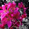
here's some new stuff i made...plez give me some c&c..(sorry if the colors are to bright..the computer i'm using makes everything look dark)
i know this ones kinda weird looking but its just a rough beginning of something i'm trying to make with pictures i take..
Reason for edit: Please thumb large images. Thanks :) -Nat
|
|
|
|


 |
Replies
|
Jun 29 2009, 04:04 PM
Post
#2
|
|
 AIDS at RAVES. Group: Official Designer Posts: 2,386 Joined: Dec 2007 Member No: 598,878 |
The first one shows cool color techniques but the font dosent seem to match
I think the extraction of the subject in the first and second photos are really good, but then again the font seems to be too basic and The Maine one is just too busy and the filters or opacity used takes away from the appeal of the image |
|
|
|

Posts in this topic
musicfreak955 new! :D Jun 18 2009, 10:09 AM moirakas Not feeling the 1st or the 3rd ones. The others ar... Jun 18 2009, 03:24 PM Mikeplyts Yeah, the 1st and 3rd aren't too great but the... Jun 18 2009, 03:42 PM dosomethin888 I love the flowers one. Looks like it would be on ... Jun 18 2009, 06:56 PM manny-the-dino 1) I dk, it could use some work, tbh. I don't ... Jun 18 2009, 09:56 PM HeartOfPandora Two is okay, I like 4 but also agree with ^'s ... Jun 21 2009, 07:08 PM musicfreak955 thats for all your input..i'll work on all tha... Jun 27 2009, 09:24 PM Mikeplyts The first one is pretty good but the second one wa... Jun 27 2009, 09:34 PM technicolour I think, over all, you need to experiment more. Le... Jun 27 2009, 09:38 PM emberfly 1) Too bright for me.
2) I like this one a lot. It... Jun 27 2009, 09:46 PM manny-the-dino Yeah for sure learn some blending techniques. The ... Jun 28 2009, 07:54 PM musicfreak955 mmk....so yeah the second one i know is low qualit... Jun 29 2009, 11:59 AM manny-the-dino Sure. What program do you use? Jun 29 2009, 03:55 PM musicfreak955 kk...i use gimp Jun 29 2009, 06:04 PM manny-the-dino I don't use gimp so I found some on Google for... Jun 29 2009, 06:41 PM musicfreak955 okay..so today i've been doing bunches of tuts... Jun 30 2009, 02:31 PM manny-the-dino ^Please don't double post. Also thumb large im... Jun 30 2009, 02:42 PM musicfreak955 sorry about the double posting :[ and yeah the gra... Jun 30 2009, 02:48 PM musicfreak955 okay heres some more lighting and coloring stuff i... Jul 1 2009, 10:35 PM Mikeplyts You double posted again.
I think the coloring lo... Jul 1 2009, 11:47 PM musicfreak955 ahh sorry! :[ so do you have any suggestions o... Jul 2 2009, 12:03 PM manny-the-dino Actually that's not really double post. IMO. M... Jul 2 2009, 06:57 PM musicfreak955 okay i tried to lower the contrast a little bit to... Jul 3 2009, 10:52 AM musicfreak955 ahh sorry about this double post but my computers ... Jul 3 2009, 04:13 PM musicfreak955 okay so i'm pretty excited about this one... Jul 5 2009, 06:47 PM nikx618 imo, there's not that great of a difference, b... Jul 5 2009, 09:57 PM musicfreak955 ahh okay yeah those are tumbnails of the real imag... Jul 6 2009, 10:06 AM
moirakas Not feeling the 1st or the 3rd ones. The others ar... Jun 18 2009, 03:24 PM Mikeplyts Yeah, the 1st and 3rd aren't too great but the... Jun 18 2009, 03:42 PM dosomethin888 I love the flowers one. Looks like it would be on ... Jun 18 2009, 06:56 PM manny-the-dino 1) I dk, it could use some work, tbh. I don't ... Jun 18 2009, 09:56 PM HeartOfPandora Two is okay, I like 4 but also agree with ^'s ... Jun 21 2009, 07:08 PM musicfreak955 thats for all your input..i'll work on all tha... Jun 27 2009, 09:24 PM Mikeplyts The first one is pretty good but the second one wa... Jun 27 2009, 09:34 PM technicolour I think, over all, you need to experiment more. Le... Jun 27 2009, 09:38 PM emberfly 1) Too bright for me.
2) I like this one a lot. It... Jun 27 2009, 09:46 PM manny-the-dino Yeah for sure learn some blending techniques. The ... Jun 28 2009, 07:54 PM musicfreak955 mmk....so yeah the second one i know is low qualit... Jun 29 2009, 11:59 AM manny-the-dino Sure. What program do you use? Jun 29 2009, 03:55 PM musicfreak955 kk...i use gimp Jun 29 2009, 06:04 PM manny-the-dino I don't use gimp so I found some on Google for... Jun 29 2009, 06:41 PM musicfreak955 okay..so today i've been doing bunches of tuts... Jun 30 2009, 02:31 PM manny-the-dino ^Please don't double post. Also thumb large im... Jun 30 2009, 02:42 PM musicfreak955 sorry about the double posting :[ and yeah the gra... Jun 30 2009, 02:48 PM musicfreak955 okay heres some more lighting and coloring stuff i... Jul 1 2009, 10:35 PM Mikeplyts You double posted again.
I think the coloring lo... Jul 1 2009, 11:47 PM musicfreak955 ahh sorry! :[ so do you have any suggestions o... Jul 2 2009, 12:03 PM manny-the-dino Actually that's not really double post. IMO. M... Jul 2 2009, 06:57 PM musicfreak955 okay i tried to lower the contrast a little bit to... Jul 3 2009, 10:52 AM musicfreak955 ahh sorry about this double post but my computers ... Jul 3 2009, 04:13 PM musicfreak955 okay so i'm pretty excited about this one... Jul 5 2009, 06:47 PM nikx618 imo, there's not that great of a difference, b... Jul 5 2009, 09:57 PM musicfreak955 ahh okay yeah those are tumbnails of the real imag... Jul 6 2009, 10:06 AM frootloop95 oo i love this!!! this is really prett... Jul 6 2009, 10:43 AM
 |
1 User(s) are reading this topic (1 Guests and 0 Anonymous Users)
0 Members: