Opinions on new website design |
Resource Center Links
This Month's Contests | Hosts Looking for Hostees | Hostees looking for Hosts | BigBookofResources
Submission Guidelines

 May 19 2009, 03:08 PM May 19 2009, 03:08 PM
Post
#1
|
|
 talent on another level  Group: Member Posts: 746 Joined: Oct 2006 Member No: 475,735 |
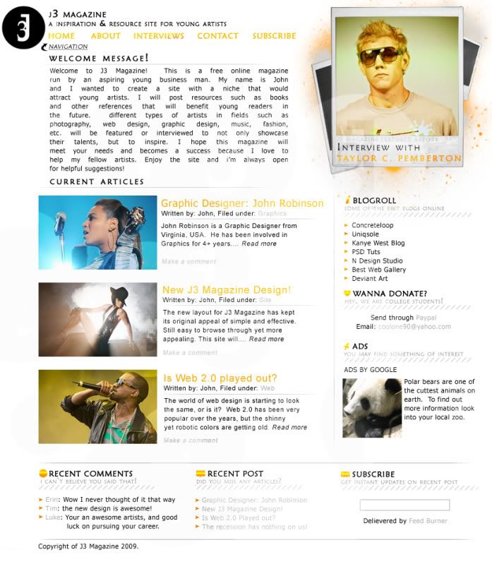
This is a design I made in Photoshop and didn't want to continue to code it until I was completely satisfied. This is my general idea of how I want to place things. I really like the simplicity of it. This is for my online magazine and the article images are just examples. The photo at the top right corner will rotate with different images after coded. What do you think? Be honest  NEW DESIGN |
|
|
|


 |
Replies
|
May 19 2009, 03:47 PM
Post
#2
|
|
 Mel Blanc was allergic to carrots. Group: Official Designer Posts: 6,371 Joined: Aug 2008 Member No: 676,291 |
I think it looks nice! I like the simplicity and that orange you used. I'm gonna have to agree with Nat about the spacing but I don't really think the polaroid thing is too bad. The only other thing that I don't really like is that font used on the headers and all. Otherwise, great job.

|
|
|
|


Posts in this topic
 bigtrey90 Opinions on new website design May 19 2009, 03:08 PM
 manny-the-dino I think it looks nice and simple. The only things ... May 19 2009, 03:19 PM -SoDifferent I love it. Very nice. Except I don't like the ... May 19 2009, 04:07 PM bigtrey90 thanks for the comments. May 19 2009, 06:29 PM gausarts Very nice, save for the justify letter on the welc... May 19 2009, 06:44 PM IWontRapeYou Love the color scheme you got going. May 19 2009, 09:04 PM technicolour Hot, and simple to the MAX. Love it. May 19 2009, 09:28 PM bigtrey90 thanks everybody
the letter spacing will change o... May 19 2009, 09:50 PM bigtrey90 its coming out really well May 27 2009, 08:30 AM manny-the-dino Yay! No update for us? lol May 27 2009, 02:16 PM
manny-the-dino I think it looks nice and simple. The only things ... May 19 2009, 03:19 PM -SoDifferent I love it. Very nice. Except I don't like the ... May 19 2009, 04:07 PM bigtrey90 thanks for the comments. May 19 2009, 06:29 PM gausarts Very nice, save for the justify letter on the welc... May 19 2009, 06:44 PM IWontRapeYou Love the color scheme you got going. May 19 2009, 09:04 PM technicolour Hot, and simple to the MAX. Love it. May 19 2009, 09:28 PM bigtrey90 thanks everybody
the letter spacing will change o... May 19 2009, 09:50 PM bigtrey90 its coming out really well May 27 2009, 08:30 AM manny-the-dino Yay! No update for us? lol May 27 2009, 02:16 PM bigtrey90 lol sorry
well i'm almost done but majority o... May 28 2009, 12:57 PM
bigtrey90 lol sorry
well i'm almost done but majority o... May 28 2009, 12:57 PM |
1 User(s) are reading this topic (1 Guests and 0 Anonymous Users)
0 Members: