Heart |
Resource Center Links
This Month's Contests | Hosts Looking for Hostees | Hostees looking for Hosts | BigBookofResources
Submission Guidelines

 May 18 2009, 08:25 AM May 18 2009, 08:25 AM
Post
#1
|
|
 Onen i-Estel Edain, ú-chebin estel anim.  Group: Official Designer Posts: 425 Joined: May 2008 Member No: 653,128 |
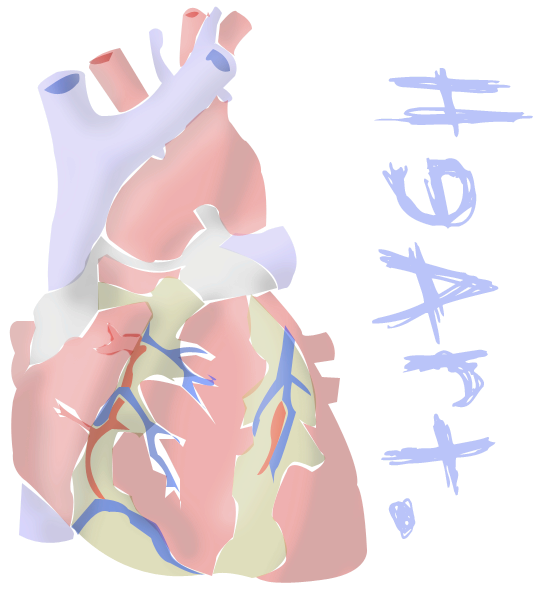
Uhmm..
So I TRIED using the pen tool in Photoshop I don't really think it worked out all that good... |
|
|
|


 |
Replies
|
May 18 2009, 02:15 PM
Post
#2
|
|
 Senior Member Group: Administrator Posts: 8,629 Joined: Jan 2007 Member No: 498,468 |
Hmm I don't think it looks that bad, tbh. I just think it would look better if you filled in all the shapes. Meaning get rid of the white spaces around some of the shapes. But I like it. The colors are good. The font is... eh. I don't really like fonts that contain backward letters. But it's nice, really.

|
|
|
|


Posts in this topic
 xzkdxrawrx Heart May 18 2009, 08:25 AM
 schizo I actually kinda like the white spaces. To me it m... May 18 2009, 04:21 PM ForgiveTheSinner ^agree
I like it though, kind of abstract :) May 18 2009, 09:21 PM xzkdxrawrx Haha thanks for the comments
The white spaces and... May 19 2009, 01:16 AM Janette This actually looks pretty cool imo (: I like the ... May 19 2009, 02:46 AM
schizo I actually kinda like the white spaces. To me it m... May 18 2009, 04:21 PM ForgiveTheSinner ^agree
I like it though, kind of abstract :) May 18 2009, 09:21 PM xzkdxrawrx Haha thanks for the comments
The white spaces and... May 19 2009, 01:16 AM Janette This actually looks pretty cool imo (: I like the ... May 19 2009, 02:46 AM
 xzkdxrawrx QUOTE(Janette @ May 19 2009, 03:46 PM) Th... May 19 2009, 07:43 AM Janette QUOTE(xzkdxrawrx @ May 19 2009, 05:43 AM)... May 19 2009, 07:17 PM jcp I think you should fill in the spaces. Doesn't... May 19 2009, 09:47 AM Mikeplyts I think it looks pretty nice as well. I think you ... May 19 2009, 03:51 PM superstitious Reminds me of something I might see on a threadles... May 19 2009, 03:55 PM -SoDifferent It's nice. I just hate the font. May 19 2009, 04:04 PM
 |
1 User(s) are reading this topic (1 Guests and 0 Anonymous Users)
0 Members: