Logo Designs |
Resource Center Links
This Month's Contests | Hosts Looking for Hostees | Hostees looking for Hosts | BigBookofResources
Submission Guidelines

 Apr 26 2009, 10:05 PM Apr 26 2009, 10:05 PM
Post
#1
|
|
 Melieized  Group: Official Designer Posts: 1,372 Joined: Nov 2006 Member No: 478,715 |
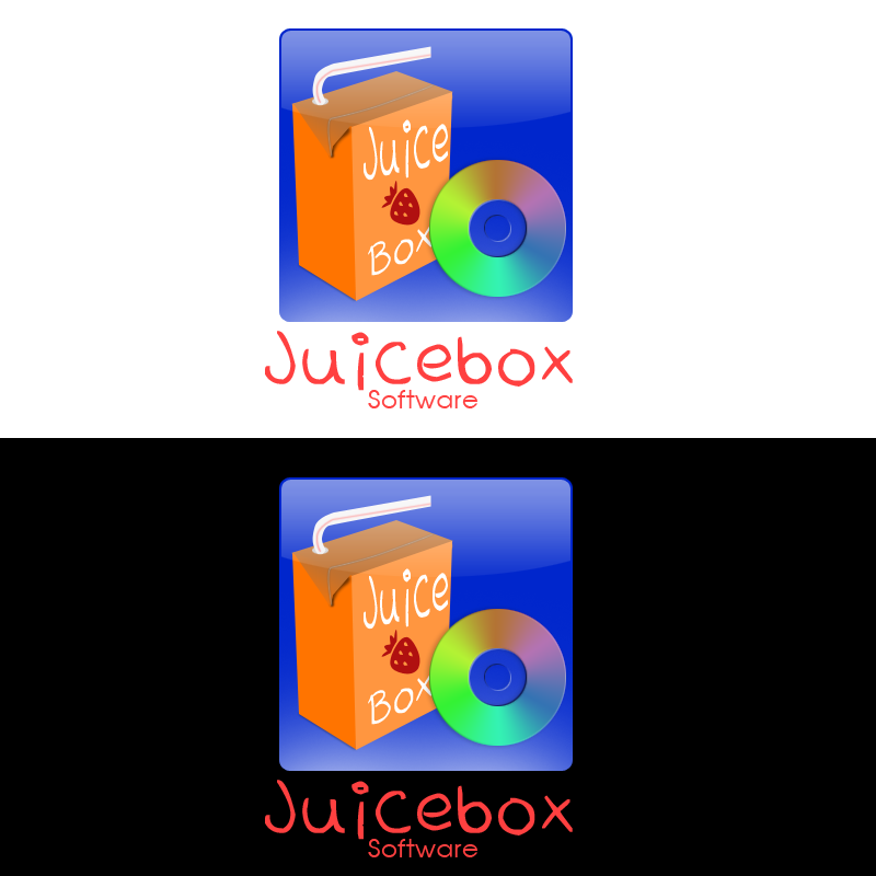
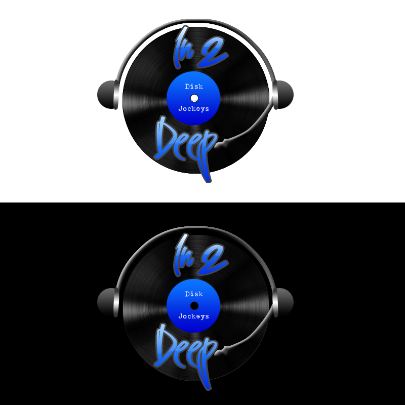
Here are some logos that i have been designing for the past couple of days. C&C please!!
1. 2. 3. 4. |
|
|
|


 |
Replies
|
Apr 28 2009, 09:15 AM
Post
#2
|
|
 yes......and? Group: Staff Alumni Posts: 209 Joined: Feb 2005 Member No: 94,410 |
Have you tried any of these in just black and white? A logo isn't successful unless it translate well in black and white, no matter how great it may look in color. The reason being is that when your logo is printed on material it will eventually be copied or faxed and a logo that doesn't work in white and black in those conditions reflects badly on you as a designer.
Also, a good idea is resize your logo to the size that would it be on a business card, which in a lot of cases makes for a very small logo. This is done so that you know what details you will lose as your logo goes smaller. For example, your first logo, when you resize this to business card size, your text that says "Follow yours" will mostly likely being illegible. I can see the same thing happening in your last logo with the text in the middle, it's barely readable at the size it is now, you won't be able to make it out at all once you have to resize it smaller. Your second logo looks good. I'm not entirely sure how I feel about the typeface for "Optimal". But as whole, you have a good logo here, it looks professional. |
|
|
|
Posts in this topic
 Melie Logo Designs Apr 26 2009, 10:05 PM
 manny-the-dino Are they for that one site? I can't remember t... Apr 26 2009, 10:11 PM Mikeplyts ^I think it's called crowdSPRING?
Anyways, ye... Apr 26 2009, 10:35 PM
manny-the-dino Are they for that one site? I can't remember t... Apr 26 2009, 10:11 PM Mikeplyts ^I think it's called crowdSPRING?
Anyways, ye... Apr 26 2009, 10:35 PM
 Melie QUOTE(Mikeplyts @ Apr 26 2009, 10:35 PM) ... Apr 27 2009, 11:01 AM schizo I LOVE two, but I'm not too sure about the res... Apr 27 2009, 03:45 PM Melie QUOTE(schizo @ Apr 27 2009, 03:45 PM) I L... Apr 27 2009, 05:23 PM ForgiveTheSinner I like #2. The font on #4 doesn't look that gr... Apr 28 2009, 07:45 AM Melie QUOTE(hi-res @ Apr 28 2009, 09:15 AM... Apr 28 2009, 09:18 AM hi-res Most of the good articles you will come across onl... Apr 28 2009, 10:02 AM Melie ^thanks so much for those links. i'm checking ... Apr 28 2009, 10:50 AM
 |
1 User(s) are reading this topic (1 Guests and 0 Anonymous Users)
0 Members: