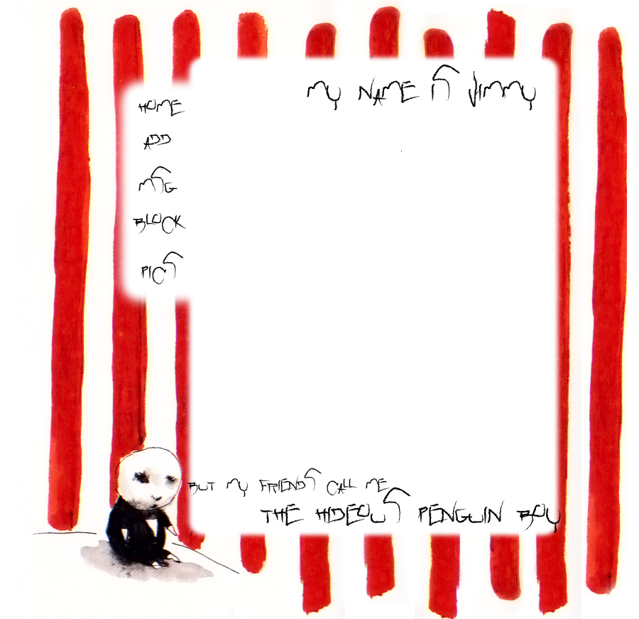
Hideous penguin boy |
Resource Center Links
This Month's Contests | Hosts Looking for Hostees | Hostees looking for Hosts | BigBookofResources
Submission Guidelines

 Mar 1 2009, 09:57 PM Mar 1 2009, 09:57 PM
Post
#1
|
|
 Senior Member  Group: Member Posts: 351 Joined: Jul 2007 Member No: 543,127 |
please help on what i could do to make it good. is it low quality? is the nav wierd? and is the font okay? not really sure of it. just wanna know if i should bother coding it or not... |
|
|
|


 |
Replies
|
Mar 2 2009, 12:37 AM
Post
#2
|
|
 사랑해 ~ 我愛你 ♥ Group: Design Staff Posts: 825 Joined: Jan 2007 Member No: 492,587 |
yeah (: it's kinda cute, other than that the font is hard to read.
|
|
|
|


Posts in this topic
 fredatemespleen Hideous penguin boy Mar 1 2009, 09:57 PM
 IWontRapeYou I don't know if I like the font that much, or ... Mar 1 2009, 09:59 PM manny-the-dino I don't see that as a penguin, really. It kind... Mar 1 2009, 10:00 PM 1angel3 I don't care for the font and that doesn't... Mar 1 2009, 10:05 PM IWontRapeYou I think it does, because hes wearing a tux but hes... Mar 1 2009, 10:07 PM manny-the-dino Yeah it's more of an abstract penguin. Mar 1 2009, 10:09 PM fredatemespleen haha its a story that tim burton made. thats his s... Mar 1 2009, 10:13 PM salcha4u Change the font for the navigation to a plainer fo... Mar 2 2009, 02:16 AM
 Beenly I think the penguin looks like a baby version of J... Mar 2 2009, 07:11 AM
 |
1 User(s) are reading this topic (1 Guests and 0 Anonymous Users)
0 Members: