my graphics :] |
Rating


|
Resource Center Links
This Month's Contests | Hosts Looking for Hostees | Hostees looking for Hosts | BigBookofResources
Submission Guidelines
 Jan 30 2009, 11:59 AM Jan 30 2009, 11:59 AM
Post
#1
|
|
 Senior Member  Group: Member Posts: 113 Joined: Jan 2009 Member No: 712,185 |
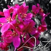
hey, i'm new on here and i've been making graphics for a couple months with gimp and this is some of my work plez let me know what you think and what i can do to make my stuff better : ]
       if you go down a little theres a couple new ones let me know what you think :] |
|
|
|


 |
Replies
|
Feb 1 2009, 01:36 AM
Post
#2
|
|
 Senior Member Group: Administrator Posts: 8,629 Joined: Jan 2007 Member No: 498,468 |
1. Looks really simple. I'm not sure how the original looked like but I can see this on a prayer card or something.
2. MAJOR props for using Cam instead of Robert.  But the blending is bad, tbh. You didn't really blending anything. It seems like you just placed some images on top of each other & lowered the opacity. It's pretty plain too. No editing was done to the images. But the blending is bad, tbh. You didn't really blending anything. It seems like you just placed some images on top of each other & lowered the opacity. It's pretty plain too. No editing was done to the images.3. Make sure to use a hard brush when erasing things. And to have a steady hand because the edges look choppy. 4. Cute. I like it. 5. You need to blend the center because it just seems like you placed the images next to each other. Also if you're going to edit one image, make sure to edit the other. It just looks weird lol. I like the font though. Fits in well. Okay I'm done putting in my 2 cents. :) |
|
|
|


Posts in this topic
 musicfreak955 my graphics :] Jan 30 2009, 11:59 AM
 YukkaPukka i like the first one Jan 30 2009, 12:16 PM IWontRapeYou The 1st 3rd and 4th are probably the best, nice jo... Jan 30 2009, 12:57 PM technicolour Very beginner-ish. They're definitely a start ... Jan 30 2009, 03:01 PM manny-the-dino I like the first one the most; it's pretty coo... Jan 30 2009, 03:21 PM musicfreak955 thanks :] yeah i know i am very beginer-ish i... Jan 30 2009, 06:41 PM Smarmosaur i like the idea of the last one, it just wasn... Jan 30 2009, 09:59 PM musicfreak955 yeah well i'm only 14...so i have a long time ... Jan 30 2009, 11:13 PM Aberisk I only like the first one, the others are either t... Jan 31 2009, 12:20 AM elletricity The first one could use a little softening around ... Jan 31 2009, 03:59 AM musicfreak955 hmmmmk..heres a new one..my dad is really into rel... Jan 31 2009, 07:05 PM Mikeplyts I like the 1st, 3rd, and 4th. Jan 31 2009, 07:41 PM
 musicfreak955 QUOTE(manny-the-dino @ Feb 1 2009, ... Feb 1 2009, 11:35 AM
 |
1 User(s) are reading this topic (1 Guests and 0 Anonymous Users)
0 Members: