Dita VonTeese, what could i do to make it better? |
Resource Center Links
This Month's Contests | Hosts Looking for Hostees | Hostees looking for Hosts | BigBookofResources
Submission Guidelines

 Jan 28 2009, 08:03 PM Jan 28 2009, 08:03 PM
Post
#1
|
|
 Senior Member  Group: Member Posts: 351 Joined: Jul 2007 Member No: 543,127 |
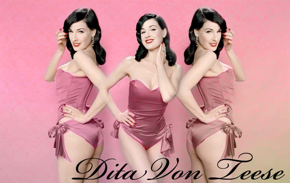
ive been trying to improve on my graphic making skills(not like i really have any) and this is the final(?) product.
tips? comments? criticism? |
|
|
|


 |
Replies
|
Jan 28 2009, 08:04 PM
Post
#2
|
|
 Senior Member Group: Head Staff Posts: 18,173 Joined: Mar 2005 Member No: 108,478 |
Maybe put the left image a bit farther away from the middle one since it looks like the two Dita images are joined at the elbow.
|
|
|
|
|
Jan 28 2009, 08:48 PM
Post
#3
|
|
 Senior Member Group: Administrator Posts: 8,629 Joined: Jan 2007 Member No: 498,468 |
QUOTE(interpretation @ Jan 28 2009, 05:04 PM)  Maybe put the left image a bit farther away from the middle one since it looks like the two Dita images are joined at the elbow. Or you could also flip both of the outer pictures horizontally so that none of her elbows join. I like the background & love the fact that you used Dita. She's amazing.  But I think it looks a bit plain. Like you didn't really edit the pictures. No coloring or anything, you know? I dk, I always look for those things. But great job! :) But I think it looks a bit plain. Like you didn't really edit the pictures. No coloring or anything, you know? I dk, I always look for those things. But great job! :)
|
|
|
|


Posts in this topic
 fredatemespleen Dita VonTeese Jan 28 2009, 08:03 PM
 shakeene QUOTE(interpretation @ Jan 28 2009, 07:04... Jan 28 2009, 08:17 PM iinstantGLAM QUOTE(interpretation @ Jan 28 2009, 08:04... Jan 28 2009, 08:23 PM Tomates ^agree
also i'm not crazy about the font Jan 28 2009, 08:33 PM iinstantGLAM And I'd also like to add that the font is a bi... Jan 28 2009, 08:53 PM Aberisk definately change the font :] Jan 28 2009, 09:06 PM shannlovin i really don't like how the background is pink... Jan 28 2009, 10:38 PM karmakiller I agree with the elbows comment. You could always ... Jan 28 2009, 11:31 PM fredatemespleen click to enlarge
i moved her over so theyre not to... Jan 28 2009, 11:39 PM
shakeene QUOTE(interpretation @ Jan 28 2009, 07:04... Jan 28 2009, 08:17 PM iinstantGLAM QUOTE(interpretation @ Jan 28 2009, 08:04... Jan 28 2009, 08:23 PM Tomates ^agree
also i'm not crazy about the font Jan 28 2009, 08:33 PM iinstantGLAM And I'd also like to add that the font is a bi... Jan 28 2009, 08:53 PM Aberisk definately change the font :] Jan 28 2009, 09:06 PM shannlovin i really don't like how the background is pink... Jan 28 2009, 10:38 PM karmakiller I agree with the elbows comment. You could always ... Jan 28 2009, 11:31 PM fredatemespleen click to enlarge
i moved her over so theyre not to... Jan 28 2009, 11:39 PM hi-C QUOTE(fredatemespleen @ Jan 28 2009, 11:3... Jan 29 2009, 06:18 PM shannlovin lol no like the background. the background pink ki... Jan 29 2009, 06:09 PM
 |
1 User(s) are reading this topic (1 Guests and 0 Anonymous Users)
0 Members: