city |
Resource Center Links
This Month's Contests | Hosts Looking for Hostees | Hostees looking for Hosts | BigBookofResources
Submission Guidelines

 Aug 3 2008, 08:21 PM Aug 3 2008, 08:21 PM
Post
#1
|
|
|
AKA RockIt Studios  Group: Official Member Posts: 2,286 Joined: Jun 2006 Member No: 421,809 |
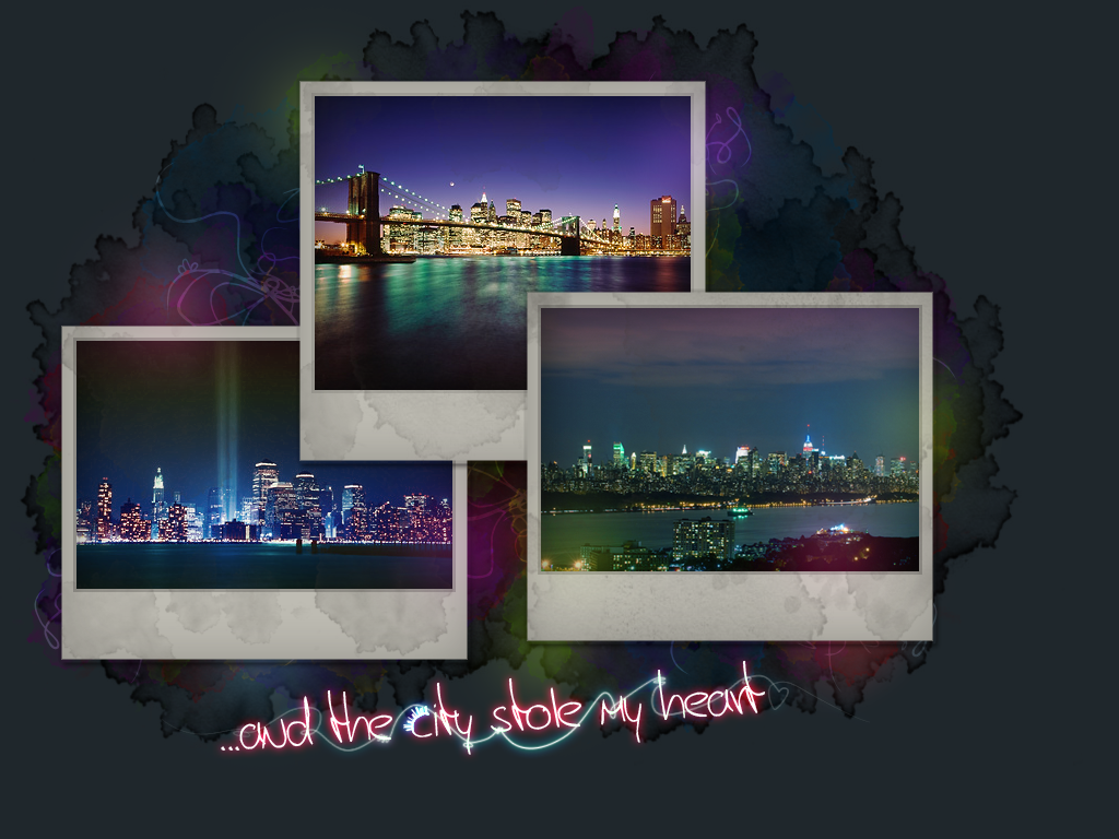
obviously inspired by my love of the city.
all three photos are in new york city. credit to Scott Murphy and Patrick Batchelder I originally wanted it to be a smallish header for a layout, but sort of turned out as a big one. I spruced up the text (it took me three hours to get simulate pressure to work) by adding the city skyline to the c in city, and adding the glowy lines. originally, only the blue one was there and I thought it wasn't enough. then I added the red one and now it feels like too much.  anyways. opinions/suggestions? thumbed. number twooo: |
|
|
|


 |
Replies
|
Aug 4 2008, 12:52 PM
Post
#2
|
|
|
Treasure Pleasure Group: Head Staff Posts: 11,193 Joined: Oct 2005 Member No: 281,127 |
Those photographs are incredible! I like the font, as well. I prefer the second one, though.
I agree with it being a little too busy around the text. You should try removing the red swirl under the text and change the font color to red. Either that or try adding a black shadow to the white text, because it's a bit hard to understand it. Other than that, it's amazing. 
|
|
|
|

|
Aug 4 2008, 09:47 PM
Post
#3
|
|
|
AKA RockIt Studios Group: Official Member Posts: 2,286 Joined: Jun 2006 Member No: 421,809 |
QUOTE(Anarchy @ Aug 4 2008, 12:52 PM)  Those photographs are incredible! I like the font, as well. I prefer the second one, though. I agree with it being a little too busy around the text. You should try removing the red swirl under the text and change the font color to red. Either that or try adding a black shadow to the white text, because it's a bit hard to understand it. Other than that, it's amazing. oo, thanks for the tip! I added a red glow to the text. also, I changed the top photo. the other one sort of wasn't fitting. new photo credit: amazingnewyorkcity |
|
|
|
Posts in this topic
 RockItStudios city Aug 3 2008, 08:21 PM
 brooklyneast05 overall i like it.
i think in some ways it seems... Aug 3 2008, 08:25 PM karmakiller I would've made the background colors a little... Aug 3 2008, 09:41 PM Relentless I really like the photos. Also, the bright light s... Aug 3 2008, 10:00 PM RockItStudios updated original post with image.
QUOTE(brooklyne... Aug 3 2008, 10:05 PM shortcake Great picture & color choices.
The font is ok... Aug 3 2008, 11:00 PM Markster I love the colorth. Aug 4 2008, 01:00 PM aaayotiffany the photos are gorgeous. i really like both of the... Aug 4 2008, 01:28 PM souperstar THose are really pretty pictures!~ Aug 6 2008, 01:14 PM
brooklyneast05 overall i like it.
i think in some ways it seems... Aug 3 2008, 08:25 PM karmakiller I would've made the background colors a little... Aug 3 2008, 09:41 PM Relentless I really like the photos. Also, the bright light s... Aug 3 2008, 10:00 PM RockItStudios updated original post with image.
QUOTE(brooklyne... Aug 3 2008, 10:05 PM shortcake Great picture & color choices.
The font is ok... Aug 3 2008, 11:00 PM Markster I love the colorth. Aug 4 2008, 01:00 PM aaayotiffany the photos are gorgeous. i really like both of the... Aug 4 2008, 01:28 PM souperstar THose are really pretty pictures!~ Aug 6 2008, 01:14 PM rockguy that looks nice
there's something in it... the... Aug 6 2008, 01:17 PM
rockguy that looks nice
there's something in it... the... Aug 6 2008, 01:17 PM |
1 User(s) are reading this topic (1 Guests and 0 Anonymous Users)
0 Members: