my workings, some of my artwork |
Resource Center Links
This Month's Contests | Hosts Looking for Hostees | Hostees looking for Hosts | BigBookofResources
Submission Guidelines

 Jul 30 2008, 01:15 PM Jul 30 2008, 01:15 PM
Post
#1
|
|
 Member  Group: Member Posts: 12 Joined: Jul 2008 Member No: 671,189 |
i thought some of you would like to see my work so i wanted to share with you guys
        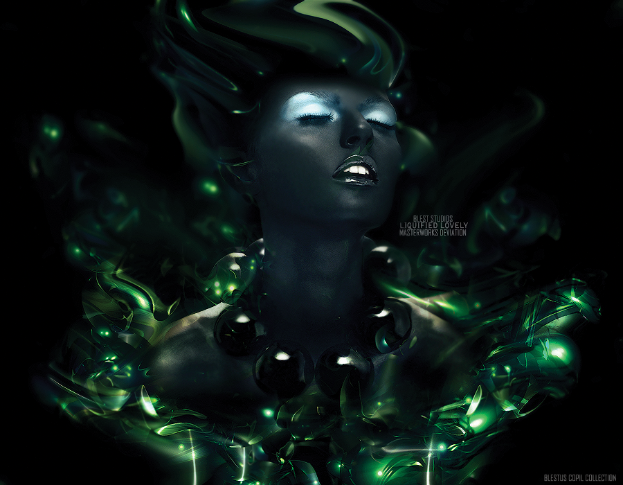   thats some of them i hope you enjoy my share 
|
|
|
|


 |
Replies
|
Aug 2 2008, 05:33 PM
Post
#2
|
|
|
define our lives for us. Group: Staff Alumni Posts: 11,656 Joined: Aug 2004 Member No: 43,293 |
:D I really love the flow in your artwork, but since you're making tags, just saying, some of the depth doesn't really work well (IMO, it's probably the too much visual blur for some ><) But I really looove most of them. Especially the 2nd one. Ionno why.. haha. For the one above the stamp, I just think the wireframe should probably not be blurred. Although it does add very good depth, I just think that it's a little TOO blurred. perhaps change the opacity more? :X
|
|
|
|

Posts in this topic
 Blest my workings Jul 30 2008, 01:15 PM
 schizo Woah. A lot of those are fantastic. The one that r... Jul 30 2008, 01:26 PM nikx618 ^agree totally with both of them, these are amazin... Jul 30 2008, 02:20 PM venti-anemoi All of them are amazing! My favorites: 2,4,6,9... Jul 30 2008, 02:43 PM absinthe I like them all Jul 30 2008, 03:08 PM ItsPirateMaria oh my gosh. you made that? you are truly amazing. Jul 30 2008, 03:09 PM rockguy wth, those are amazing....
someone is a pro.. Jul 31 2008, 05:48 AM Blest thank you guys yeah the last one is a smudge pai... Jul 31 2008, 01:32 PM shortcake Whoa, these are all really cool. I absolutely love... Jul 31 2008, 04:06 PM ForgiveTheSinner I seriously love the first one and the one above t... Jul 31 2008, 06:07 PM ArjunaCapulong How much do you charge? Jul 31 2008, 06:10 PM
schizo Woah. A lot of those are fantastic. The one that r... Jul 30 2008, 01:26 PM nikx618 ^agree totally with both of them, these are amazin... Jul 30 2008, 02:20 PM venti-anemoi All of them are amazing! My favorites: 2,4,6,9... Jul 30 2008, 02:43 PM absinthe I like them all Jul 30 2008, 03:08 PM ItsPirateMaria oh my gosh. you made that? you are truly amazing. Jul 30 2008, 03:09 PM rockguy wth, those are amazing....
someone is a pro.. Jul 31 2008, 05:48 AM Blest thank you guys yeah the last one is a smudge pai... Jul 31 2008, 01:32 PM shortcake Whoa, these are all really cool. I absolutely love... Jul 31 2008, 04:06 PM ForgiveTheSinner I seriously love the first one and the one above t... Jul 31 2008, 06:07 PM ArjunaCapulong How much do you charge? Jul 31 2008, 06:10 PM
 Blest QUOTE(ArjunaCapulong @ Jul 31 2008, 06:10... Aug 1 2008, 03:49 AM Relentless Amazing. I love your work. Aug 1 2008, 01:27 AM Blaqheartedstar i agree on that last one... odd
love the signature... Aug 5 2008, 11:32 PM Tomates Wow. I really like them all.
I wish i was good lik... Aug 5 2008, 11:34 PM souperstar Oh my God, these are so cool! My faces are the... Aug 6 2008, 12:57 PM MiSSP They're all really good you're really tale... Aug 6 2008, 01:00 PM
Blest QUOTE(ArjunaCapulong @ Jul 31 2008, 06:10... Aug 1 2008, 03:49 AM Relentless Amazing. I love your work. Aug 1 2008, 01:27 AM Blaqheartedstar i agree on that last one... odd
love the signature... Aug 5 2008, 11:32 PM Tomates Wow. I really like them all.
I wish i was good lik... Aug 5 2008, 11:34 PM souperstar Oh my God, these are so cool! My faces are the... Aug 6 2008, 12:57 PM MiSSP They're all really good you're really tale... Aug 6 2008, 01:00 PM |
1 User(s) are reading this topic (1 Guests and 0 Anonymous Users)
0 Members: