vexel |
Resource Center Links
This Month's Contests | Hosts Looking for Hostees | Hostees looking for Hosts | BigBookofResources
Submission Guidelines

 Jun 12 2008, 09:46 PM Jun 12 2008, 09:46 PM
Post
#1
|
|
|
AKA RockIt Studios  Group: Official Member Posts: 2,286 Joined: Jun 2006 Member No: 421,809 |
just thought i'd try out vexelling. i definitely like it better than vectoring.
it's really horrible, IMO, don't think i'll ever finish it, but i'll for sure start a different one. and i'm aware of the...awkward coloring. 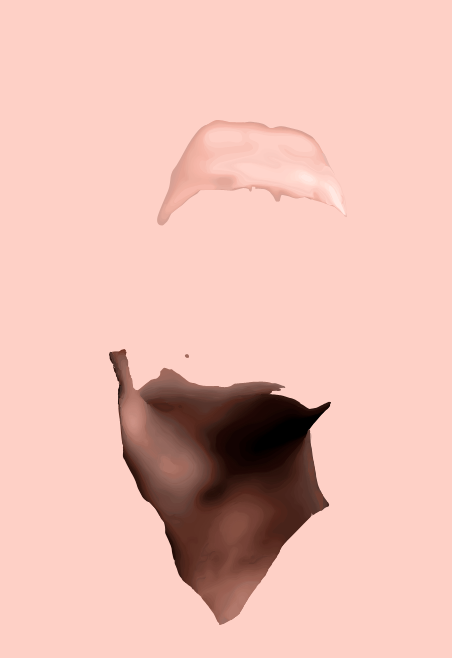 original (enhanced) 
|
|
|
|


 |
Replies
|
Jun 12 2008, 10:22 PM
Post
#2
|
|
 in a matter of time Group: Staff Alumni Posts: 7,151 Joined: Aug 2005 Member No: 191,357 |
I don't think the colours are THAT bad - it's good because human skin has natural differences in colours. If you think it's a little harsh, you can fix it pretty easily. I swear I've mentioned this a few times so I might sound like a broken record.
Find two layers that you think have a big leap in colour difference (I can see one pretty big one in the neck), then create a new layer. Make a new skin layer in between those two layers (about the mid-point, if that makes any sense at all...I'll clarify later). Then, fill with the same colour as the top of the two layers. Set this new layer to 50% opacity - this way you get the "midtone" between the two awkward colours, and they blend much better. |
|
|
|


Posts in this topic
 RockItStudios vexel Jun 12 2008, 09:46 PM
 RockItStudios ^transition layers, right? way ahead of you. I mig... Jun 13 2008, 10:17 AM Gigi ^ That's too bad, because I can see this one t... Jun 13 2008, 08:09 PM 1angel3 I like it so far but what's the differences be... Jun 13 2008, 08:22 PM Gigi In a nutshell, they're the same thing. I mean,... Jun 13 2008, 08:24 PM emberfly What's Twilight about?
/offtopic Jun 13 2008, 10:36 PM
RockItStudios ^transition layers, right? way ahead of you. I mig... Jun 13 2008, 10:17 AM Gigi ^ That's too bad, because I can see this one t... Jun 13 2008, 08:09 PM 1angel3 I like it so far but what's the differences be... Jun 13 2008, 08:22 PM Gigi In a nutshell, they're the same thing. I mean,... Jun 13 2008, 08:24 PM emberfly What's Twilight about?
/offtopic Jun 13 2008, 10:36 PM
 Synesthesia QUOTE(emberfly @ Jun 13 2008, 11:36 PM) W... Jun 13 2008, 10:39 PM emberfly ^ thanks so much :D .. always wondered why everyon... Jun 13 2008, 10:41 PM Saruna I love it so far!! you have talent O_O Jun 17 2008, 08:14 PM
 |
1 User(s) are reading this topic (1 Guests and 0 Anonymous Users)
0 Members: