Technology Blow Up, Experimental Work |
Resource Center Links
This Month's Contests | Hosts Looking for Hostees | Hostees looking for Hosts | BigBookofResources
Submission Guidelines

 Jun 8 2008, 04:38 PM Jun 8 2008, 04:38 PM
Post
#1
|
|
 talent on another level  Group: Member Posts: 746 Joined: Oct 2006 Member No: 475,735 |
Here is my most recent piece. I drew a different concept out on paper and thought of this concept instead. Just improving my creativity and trying styles I have never done. This is not even close to being finish, but would like to know what you think I could improve on.
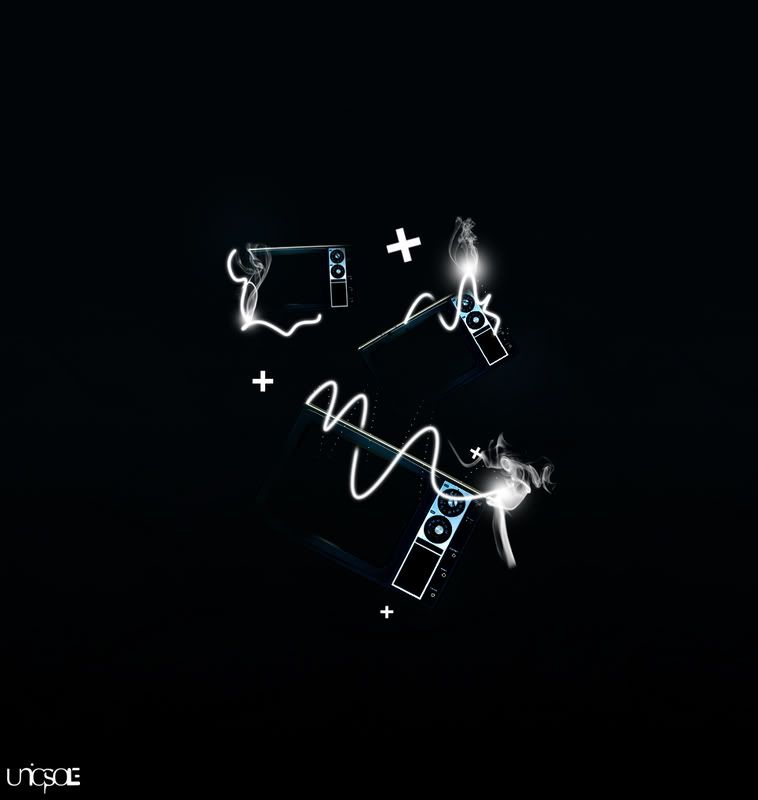 P.S: The original is much bigger and sharper than what is shown. EDITED VERSION BELOW! |
|
|
|


 |
Replies
|
Jun 9 2008, 03:08 PM
Post
#2
|
|
 torn Group: Official Designer Posts: 953 Joined: Oct 2004 Member No: 55,718 |
I think you could still work the text in there without it looking strange. My biggest issue with the text was that I really don't like the font you chose. I would pick a default-ish serif font like times, palantino, centaur, sylfaen, perpetua..... yeah, just something default. It's not a good idea to have two "special" or unique fonts on the same thing. I would also, I dunno, lower the opacity of the that text or something to make it not stand out so much. You want people to look at the image first, then read the text (or that's the way it works in my mind), so kind of make the not-main text subtler.
Sorry for the essay <_< I'm not good at explaining things. |
|
|
|

Posts in this topic
bigtrey90 Technology Blow Up Jun 8 2008, 04:38 PM Tungster dis ok... Jun 8 2008, 04:39 PM vintage-toile this is excellent, you've really come through ... Jun 8 2008, 04:45 PM bigtrey90 you are speaking the truth with leaps and bounds, ... Jun 8 2008, 04:52 PM Tungster ^ how cum i don't get no thanksss....?? Jun 8 2008, 04:52 PM vintage-toile ^^ how comes you stopped with the BIG RED FONT?
o... Jun 8 2008, 04:54 PM bigtrey90 lol don't argue. but yeah Tungster, you didn... Jun 8 2008, 04:58 PM bigtrey90 EDITED VERSION Jun 8 2008, 06:07 PM vintage-toile awesome, im still finding it a little fuzzy but th... Jun 8 2008, 06:11 PM bigtrey90 thanks, i'll keep that in mind. Jun 8 2008, 07:28 PM bigtrey90 thanks.
the brushes are there because i like them... Jun 8 2008, 07:56 PM dreamstar7 Maybe I'm just dumb, but I can't for the l... Jun 8 2008, 08:19 PM bigtrey90 lol good.
i don't ever remember microwaves wi... Jun 9 2008, 05:49 AM doughnut i thought they were slim cameras. looks like they... Jun 9 2008, 07:18 AM bigtrey90 thats a good thing.
thanks Jun 9 2008, 07:26 AM bigtrey90 EDITED VERSION 2
any suggestions? Jun 9 2008, 09:10 AM GunsNRachel I REALLY don't like that text at top. It just ... Jun 9 2008, 09:58 AM bigtrey90 yeah i agree on the text at the top. i'll fin... Jun 9 2008, 10:23 AM mizzkewl06 i think this looks cool. unique & different. i... Jun 9 2008, 11:50 AM bigtrey90 okay text is out. i'll just explain the conce... Jun 9 2008, 11:55 AM bigtrey90 i know what you mean.
i'll keep that in mind. Jun 9 2008, 04:12 PM bigtrey90 its not an eraser, its a soft brush. i feel it fi... Jun 9 2008, 07:12 PM bigtrey90 here is the final product....well until i think of... Jun 9 2008, 07:23 PM xTHExDUDEx Reminds me of 2012, the text, not the imagery. Jun 10 2008, 10:50 AM bigtrey90 i have no idea what that means, lol. Jun 10 2008, 06:57 PM
Tungster dis ok... Jun 8 2008, 04:39 PM vintage-toile this is excellent, you've really come through ... Jun 8 2008, 04:45 PM bigtrey90 you are speaking the truth with leaps and bounds, ... Jun 8 2008, 04:52 PM Tungster ^ how cum i don't get no thanksss....?? Jun 8 2008, 04:52 PM vintage-toile ^^ how comes you stopped with the BIG RED FONT?
o... Jun 8 2008, 04:54 PM bigtrey90 lol don't argue. but yeah Tungster, you didn... Jun 8 2008, 04:58 PM bigtrey90 EDITED VERSION Jun 8 2008, 06:07 PM vintage-toile awesome, im still finding it a little fuzzy but th... Jun 8 2008, 06:11 PM bigtrey90 thanks, i'll keep that in mind. Jun 8 2008, 07:28 PM bigtrey90 thanks.
the brushes are there because i like them... Jun 8 2008, 07:56 PM dreamstar7 Maybe I'm just dumb, but I can't for the l... Jun 8 2008, 08:19 PM bigtrey90 lol good.
i don't ever remember microwaves wi... Jun 9 2008, 05:49 AM doughnut i thought they were slim cameras. looks like they... Jun 9 2008, 07:18 AM bigtrey90 thats a good thing.
thanks Jun 9 2008, 07:26 AM bigtrey90 EDITED VERSION 2
any suggestions? Jun 9 2008, 09:10 AM GunsNRachel I REALLY don't like that text at top. It just ... Jun 9 2008, 09:58 AM bigtrey90 yeah i agree on the text at the top. i'll fin... Jun 9 2008, 10:23 AM mizzkewl06 i think this looks cool. unique & different. i... Jun 9 2008, 11:50 AM bigtrey90 okay text is out. i'll just explain the conce... Jun 9 2008, 11:55 AM bigtrey90 i know what you mean.
i'll keep that in mind. Jun 9 2008, 04:12 PM bigtrey90 its not an eraser, its a soft brush. i feel it fi... Jun 9 2008, 07:12 PM bigtrey90 here is the final product....well until i think of... Jun 9 2008, 07:23 PM xTHExDUDEx Reminds me of 2012, the text, not the imagery. Jun 10 2008, 10:50 AM bigtrey90 i have no idea what that means, lol. Jun 10 2008, 06:57 PM
 xTHExDUDEx QUOTE(bigtrey90 @ Jun 11 2008, 12:57 AM) ... Jun 11 2008, 02:09 AM dreamstar7 Mm, lovely. Like the use of color, smoky bits (hah... Jun 11 2008, 01:23 AM bigtrey90 thanks so much dreamstar7
thanks xTHExDUDEx
i ch... Jun 11 2008, 09:59 AM mackenziee I really like this.
good job. Jun 11 2008, 01:54 PM bigtrey90 thanks. Jun 11 2008, 02:37 PM bigtrey90 OFFICIAL FINAL EDIT!
go to my deviantart acco... Jun 11 2008, 05:07 PM xTHExDUDEx Are those graphs etc about the sun's magnetic ... Jun 16 2008, 03:55 PM Rachel wooooah, i really dig it. sooo glad you got rid of... Jun 17 2008, 02:47 AM bigtrey90 thanks.
& no it has nothing to do with space,... Jun 17 2008, 06:48 AM
xTHExDUDEx QUOTE(bigtrey90 @ Jun 11 2008, 12:57 AM) ... Jun 11 2008, 02:09 AM dreamstar7 Mm, lovely. Like the use of color, smoky bits (hah... Jun 11 2008, 01:23 AM bigtrey90 thanks so much dreamstar7
thanks xTHExDUDEx
i ch... Jun 11 2008, 09:59 AM mackenziee I really like this.
good job. Jun 11 2008, 01:54 PM bigtrey90 thanks. Jun 11 2008, 02:37 PM bigtrey90 OFFICIAL FINAL EDIT!
go to my deviantart acco... Jun 11 2008, 05:07 PM xTHExDUDEx Are those graphs etc about the sun's magnetic ... Jun 16 2008, 03:55 PM Rachel wooooah, i really dig it. sooo glad you got rid of... Jun 17 2008, 02:47 AM bigtrey90 thanks.
& no it has nothing to do with space,... Jun 17 2008, 06:48 AM |
1 User(s) are reading this topic (1 Guests and 0 Anonymous Users)
0 Members: