Graphic help, need some feedback |
Resource Center Links
This Month's Contests | Hosts Looking for Hostees | Hostees looking for Hosts | BigBookofResources
Submission Guidelines

 Apr 24 2008, 07:10 AM Apr 24 2008, 07:10 AM
Post
#1
|
|
 Member  Group: Member Posts: 20 Joined: Aug 2006 Member No: 452,308 |
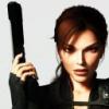
What do you think about it? its been rejected a lot, nd wanted to know how i can improve it and ideas, thankks
 
|
|
|
|


 |
Replies
|
Apr 24 2008, 10:15 AM
Post
#2
|
|
 Addict Group: Staff Alumni Posts: 3,918 Joined: Jun 2007 Member No: 538,522 |
Sorry, I didn't mean pixellated - I meant blurred. Try using the anti-aliasing tool on Photoshop to fix that.
OK, so you're creating a banner - typically banners will have a greater width than height so you'll need to get that sorted. To make your text stand out more, try using a white color and drop shadow the text. Set opacity levels to whatever you think is best. For banners to be accepted on Createblog, you'll need to demonstrate a medium to high level of creativity, effort and design. That does mean using different layering techniques, brushes and smartening up fonts. 
|
|
|
|


Posts in this topic
 rizzee Graphic help Apr 24 2008, 07:10 AM
 S-Majere I like the concept and the quote - but the design ... Apr 24 2008, 07:14 AM rizzee Well, im trying to create a banner, I cant find an... Apr 24 2008, 07:21 AM
 Teesa QUOTE(S-Majere @ Apr 24 2008, 11:15 ... Apr 24 2008, 11:40 AM mizzkewl06 i agree about the proportions and colors. the font... Apr 24 2008, 10:19 AM rizzee ooh, thing is om not great at photoshop >.<
... Apr 24 2008, 11:40 AM digitalfragrance I agree with all remarks said here...
A word of a... Apr 24 2008, 01:24 PM rizzee QUOTE(digitalfragrance @ Apr 24 2008, 06... Apr 24 2008, 01:44 PM aaayotiffany i don't really like it, i guess its because of... Apr 24 2008, 02:32 PM rizzee i'm back with a new banner, well the same but ... Apr 24 2008, 02:42 PM Glamourouz It looks a lot better but I still think you should... Apr 24 2008, 06:30 PM manny-the-dino well..
first off, i LOVE the picture.
very good ca... Apr 24 2008, 07:24 PM aaayotiffany hmmm, this is better. the color of the text fits t... Apr 24 2008, 07:34 PM rizzee wehey, thank you!
The position of the text is... Apr 25 2008, 11:48 AM
Teesa QUOTE(S-Majere @ Apr 24 2008, 11:15 ... Apr 24 2008, 11:40 AM mizzkewl06 i agree about the proportions and colors. the font... Apr 24 2008, 10:19 AM rizzee ooh, thing is om not great at photoshop >.<
... Apr 24 2008, 11:40 AM digitalfragrance I agree with all remarks said here...
A word of a... Apr 24 2008, 01:24 PM rizzee QUOTE(digitalfragrance @ Apr 24 2008, 06... Apr 24 2008, 01:44 PM aaayotiffany i don't really like it, i guess its because of... Apr 24 2008, 02:32 PM rizzee i'm back with a new banner, well the same but ... Apr 24 2008, 02:42 PM Glamourouz It looks a lot better but I still think you should... Apr 24 2008, 06:30 PM manny-the-dino well..
first off, i LOVE the picture.
very good ca... Apr 24 2008, 07:24 PM aaayotiffany hmmm, this is better. the color of the text fits t... Apr 24 2008, 07:34 PM rizzee wehey, thank you!
The position of the text is... Apr 25 2008, 11:48 AM |
1 User(s) are reading this topic (1 Guests and 0 Anonymous Users)
0 Members: