more help?, i really want to improve so some comments & advice would be AWESOM |
Resource Center Links
This Month's Contests | Hosts Looking for Hostees | Hostees looking for Hosts | BigBookofResources
Submission Guidelines

 Apr 2 2008, 09:56 PM Apr 2 2008, 09:56 PM
Post
#1
|
|
|
Member  Group: Member Posts: 20 Joined: Mar 2008 Member No: 631,643 |
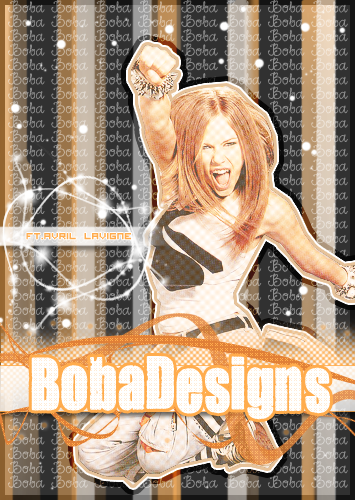 if you've seen my other stuff i think you'll notice the cutting has gotten MUCHHH better hehe(= i want like advice because there's alot of smart & creative people on createblog |
|
|
|


 |
Replies
|
Apr 5 2008, 06:10 PM
Post
#2
|
|
 Kissing for yesterday. Group: Official Designer Posts: 465 Joined: Sep 2007 Member No: 569,813 |
first of all, there is a lot of image credit on there if you want to use it as just an image. if it's to promote your site then fine.
then cutting is nice actually, i think you've outlined her well. i try to stress this to everyone with background texts, if you're going to slap your name all over the background, please change the opacity to between 10-30% depending on the image, so that you've still got it there and won't lose sleep, but it just looks a bit neater. its very nice, the concept is good but from a personal preference, i dont think the colours work so well. and her face is beyond bright, so try taking the image and going to image >> adjustments >> auto colour and see what happens. nice job though, its just a bit too...happy? 
|
|
|
|


Posts in this topic
bobadesigns more help? Apr 2 2008, 09:56 PM Comptine The colors are better.
But Avril is a little too... Apr 2 2008, 10:08 PM manny-the-dino k i'm being honest
-avril's too bright
-i... Apr 3 2008, 12:02 AM
Comptine The colors are better.
But Avril is a little too... Apr 2 2008, 10:08 PM manny-the-dino k i'm being honest
-avril's too bright
-i... Apr 3 2008, 12:02 AM
 Drama Lower the opacity of the lines on Avril, take of t... Apr 3 2008, 05:02 PM bobadesigns thanks so much!!
the world needs more hone... Apr 3 2008, 08:07 PM bobadesigns ohh yea i think i love overlay too much hehe (=
i... Apr 3 2008, 08:07 PM OhMyAnniee I agree about the Boba pattern in the back. To me,... Apr 3 2008, 09:16 PM bobadesigns thanks for your opinions
i never even thought abou... Apr 3 2008, 09:26 PM aaayotiffany it feels like there's too much going on in thi... Apr 3 2008, 09:26 PM bobadesigns hehe i like this one better
i think i go over the ... Apr 3 2008, 09:46 PM Comptine Like everyone else said, you plastering your name ... Apr 5 2008, 04:01 PM bobadesigns OMG
i really thought i took that out
lolol i feel ... Apr 5 2008, 06:04 PM
Drama Lower the opacity of the lines on Avril, take of t... Apr 3 2008, 05:02 PM bobadesigns thanks so much!!
the world needs more hone... Apr 3 2008, 08:07 PM bobadesigns ohh yea i think i love overlay too much hehe (=
i... Apr 3 2008, 08:07 PM OhMyAnniee I agree about the Boba pattern in the back. To me,... Apr 3 2008, 09:16 PM bobadesigns thanks for your opinions
i never even thought abou... Apr 3 2008, 09:26 PM aaayotiffany it feels like there's too much going on in thi... Apr 3 2008, 09:26 PM bobadesigns hehe i like this one better
i think i go over the ... Apr 3 2008, 09:46 PM Comptine Like everyone else said, you plastering your name ... Apr 5 2008, 04:01 PM bobadesigns OMG
i really thought i took that out
lolol i feel ... Apr 5 2008, 06:04 PM |
1 User(s) are reading this topic (1 Guests and 0 Anonymous Users)
0 Members: