latest work. |
Resource Center Links
This Month's Contests | Hosts Looking for Hostees | Hostees looking for Hosts | BigBookofResources
Submission Guidelines

 Aug 27 2007, 08:33 PM Aug 27 2007, 08:33 PM
Post
#1
|
|
|
Senior Member  Group: Member Posts: 125 Joined: Aug 2006 Member No: 455,453 |
|
|
|
|


 |
Replies
| *karmakiller* |
Aug 28 2007, 07:16 PM
Post
#2
|
|
Guest |
^ I agree.
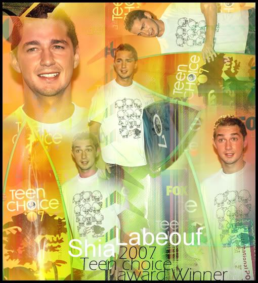
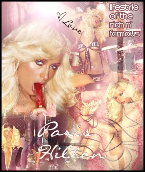
I'd also have to say that I'm not a big fan of the text in the second one. The image(s) seem very soft and then there's the text that doesn't blend into the image very well. Overall, they're really nice. I think a suggestion for your future blends would be to be careful with the amount of images that you use. You don't want the finished product to be too busy, and I've found that when someone has a lot of image (like 3+) it takes away from the hard work that they've put into them. |
|
|
|
Posts in this topic
 shorty_d09 latest work. Aug 27 2007, 08:33 PM
 mysticalazxn I really like the first one! It look really we... Aug 28 2007, 02:21 AM
 jammylise I don't like the Paris Hilton one
She's pr... Aug 28 2007, 11:12 PM
jammylise I don't like the Paris Hilton one
She's pr... Aug 28 2007, 11:12 PM |
1 User(s) are reading this topic (1 Guests and 0 Anonymous Users)
0 Members: