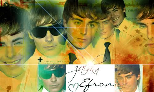
aly & aj +zack efron |
Resource Center Links
This Month's Contests | Hosts Looking for Hostees | Hostees looking for Hosts | BigBookofResources
Submission Guidelines
 May 12 2007, 06:28 PM May 12 2007, 06:28 PM
Post
#1
|
|
|
Senior Member     Group: Member Posts: 125 Joined: Aug 2006 Member No: 455,453 |
 
|
|
|
|
 |
Replies
 May 12 2007, 10:06 PM May 12 2007, 10:06 PM
Post
#2
|
|
|
show me a garden thats bursting to life         Group: Staff Alumni Posts: 12,303 Joined: Mar 2005 Member No: 115,987 |
You're getting better. However, in the second one, the Zac Efron one, you used wayyy tooo manyyy textures. His face looks like he got in a fight with a paint brush. And the colours, are, well, interesting. And the white area behind the text doesn't really flow well with the rest of the piece.
Oh gosh, i'm sorry for critizing you so much. The first one, though, I reealllyyyy like. Its just the second one that could use some work. |
|
|
|
Posts in this topic
 shorty_d09 aly & aj +zack efron May 12 2007, 06:28 PM
 toyo loco First one -Seems pretty crowded. I like some of th... May 13 2007, 03:03 AM
 Last Dollar i agree with toya May 13 2007, 09:08 AM
 supimateecup I love love love the first one. The second one is ... May 18 2007, 10:38 PM
 loveylovely There's a big, blurry white spot in the 2nd on... May 18 2007, 10:43 PM
 UniversalRoyalty I agree with Toya.
They're both really good, ... May 20 2007, 02:59 PM
 IVIike I agree with toya you did a pretty good job on the... May 24 2007, 08:53 AM
  |
1 User(s) are reading this topic (1 Guests and 0 Anonymous Users)
0 Members:


