Graphic Submissions Requirements & Moderators Guide for Submitting Graphics/Layouts |

 Sep 5 2006, 04:24 PM Sep 5 2006, 04:24 PM
Post
#1
|
|
 Senior Member  Group: Staff Alumni Posts: 7,025 Joined: Feb 2004 Member No: 4,051 |
This is not deviantART; this is not a place for you to establish a portfolio. This is a resource and we reserve the right to reject your submissions.
Many people ask us what we are looking for in graphics, and what they should submit. Here's a loose set or rules/requirements that we have put together: General -Crips, smooth lines (as in not pixelated). -No copyright images. -Good quality. -Good color scheme. -Correct spelling. Photos -Any submitted photos must be taken by you! Do NOT submit any images under photos that you did not personally take. -The image has to be in focus. -If the image is grainy/blurry, it will be rejected. -No personal pictures. Keep in mind these pictures are to be used for graphics. No one is going to want a silly picture of you and your friend. If you want us to see what you look like, you should post the pictures in the Members' Photos threads in the Pictures forum. -If there are already too many that are similar, it won't be accepted. (ie: no more heart hands, hands spelling out love, eyes, stop/danger/road signs, etc). Check around before you submit. -No time stamps; they're highly unprofessional. -No more hand/shoe/feet pictures. -Decent size. Not too big (over 1024x768) and not too small (under 350x350). NOTE: Any pictures featuring the Eiffel tower at night will not be accepted. This violates copyright laws and a fee must be paid in order to publish it anywhere. (see Reference) Avatars/Icons -No bigger than 100x100px. -Not an exact copy of a tutorial (as in using the exact same effects and images) -More than just a cropped image (unless it suits the icon) Backgrounds -It must be made by you. This does not mean slapping some text onto an image. It includes altering it. -Good, crisp quality. -Repeated backgrounds: try not to make is to simple (ie: just dots/lines) There will be exceptions to this of course, if it is unique. -Wallpapers: -At least 800 by 600px (unless it's a repeated pattern) This post has been edited by alovesopure: Sep 7 2007, 02:13 PM |
|
|
|


 |
Replies
| *digital.fragrance* |
Feb 7 2007, 11:45 PM
Post
#2
|
|
Guest |
All of the moderators (past and present) participated in this uber long topic to help you! Special hats off to Kristina (Sherlock.) for getting this started! YOU ARE THE BEST!
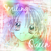
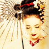
Also, please PM a design staff member if you would like to see some comments written on something that hasn't been mentioned in this thread. We'd love to heard from you! Moderator's Guide for Judging-your-graphic-to-see-if-it-will-get-accepted! Yay for long titles! I. Pixely Text Pixely text is THE WORST thing that you can have on a graphic. It ruins the graphic. It makes it look tacky and disgusting and COMPLETELY low end. Examples of Bad Text: And for some examples of GOOD TEXT: http://www.createblog.com/graphics/download.php?id=17637 http://www.createblog.com/graphics/download.php?id=17639 II. Blurry Text Once again, another one of the worst things you can do. I'm dead serious. It looks awful when it's blurred. DEAD SERIOUS. Examples of what I mean:   III. Cliché Graphics Brushes Stop it with the "gangsta" look... and for that matter, quit the "girly girly girly" stuff. With the cluttered splatter brushes or those stupid swirls. I'm serious, guys. It isn't cool. At all. Everyone else uses them! We look for originality, but when people keep using those brushes over and over again, it DOESN'T look cool. Also, those silhouette brushes of models aren't "fly" either. Example:  Fonts and Quotes DON'T USE SCRIPTINA! Yes, it was pretty at one point in time, and then everyone started using it. So basically, it's overdone and overused. It's like the ex-girlfriend of graphics. Same goes for New Romantics. Also, the love quotes that you see every where on myspace don't really work either. Unless you have some real meaning behind it with a VERY WELL done graphic (as in a real picture, not just brushes and text), forget it. Example:  IV. Bad image Quality Bad image quality comes down to this - it's blurry, out of focus, grainy, or pixellated. What's pixellated? It's when you can see all of the individual tiny squares of color - a definite graphics "no no." Examples: This photo is very blurry. Please focus your lens!  This avatar is pixellated and blurry (and too large).  Now, how do you solve this image crisis? 1. Find a better base image - a clear, more vibrant image. 2. Avoid making the graphic larger from it's original size. 3. Find a larger version of an image and scale it down. 4. Focus your lens when taking a photo! 5. Use the lowest compression rate possible when saving graphics files - I suggest the .png (Portable Network Graphic) file. AVOID THE .GIF if you want your work to be presented in the best quality. V. Messy Graphics I have always been a fan of the clean-cut image. Of course, you can always make a "grungy" graphic "clean-cut" in my mind. It should have a focus, a good color scheme, and the design should be applied with skill. Where "messy" or "grunge" is taken too far, is the Paint graphic.
 These graphics or decorations on graphics are somewhat silly and need to be avoided. VI. Inverted Images We decided to devote an entire section to this alone. Take this image:  And turn it into this:  Congratulations, your image has been rejected. Harsh? Maybe. But just because you took a picture, avatar, banner, graphic, or artwork and inverted it (took a negative image) doesn't mean it's acceptable. Usually when this technique is done, it doesn't look too good.... at all. So, if just HAVE TO INVERT, at least add brushes, textures, and have some kind of focused theme as is discussed in the all of the sections here. VII. Photos - What we don't want to see:
 VIII. Icons/Avatars
I think the title speaks for itself. We don't want to see anything that is crude or nasty. This includes:
X. Personal Graphics Do Not Submit PERSONAL GRAPHICS or REQUESTS fulfilled graphics. If the graphic is meant to be used by one persona only, don't even bother submitted. It's an automatic rejection. These are things that have your name as the focus of the graphic or anything exclusively personalized. Here's an example :  This is not allowed, because createblog submissions are not for just YOUR personal use. If everyone can't use it then don't submit it, because it won't be accepted. Createblog isn't your personal portfolio for your designs. Submissions are for everyone to use, not just you! If you are looking for a place to host your images, try Imageshack. NOTE This applies to layouts as well!!! XI. Creditlines Images with blatant creditlines will be straight out rejected because they're tacky and because they bear no relevance to the image itself. Yes, we understand why people want credit on their images, but at the same time, by submitting it to createBlog, you're letting other people use it as resources. There isn't any harm in putting your name along a border of a photo or image, as long as it won't prevent someone from using it. Discrete creditlines, especially in the case of avatars, are allowed, but anything with extremely obvious that takes away from the graphic should be rejected. Please remember, though, that the key word here is discrete. XII. Rule of Thirds Basically, does your photo have balance? Does your artwork have a focus? How can you make sure that it's positioned correctly on the canvas? This is the Rule of Thirds!. Check the link for a more detailed explanation. If your image is rejected because of a lack of focus, balance, or is just plain awkward, refer to the Rule of Thirds. XIII. The Spelling Bee This is pretty self-explanatory. We are gonna reject a design that isn't spelled correctly. Unless, this is a way of artistic interpretation... but still, come on guys, spell the words correctly. If you're having trouble knowing if the word is spelled correctly, type it in MICROSOFT WORD and see if Spell Check flags it. Or try Dict.org. XIV. Great Graphics So, you've read this page, and know you say, "WHAT THE CRAP. NOW I CAN'T DO ANYTHING!" Wrong. Here's some people's work that you should look at if you're trying to accomplish a certain style. Oh, and a word for the wise: Usually the most favorited ones in the graphics/layouts sections are superb, or at least good  Hip-Hop, R&B, Gangsta
This post has been edited by Synesthesia: Apr 24 2008, 10:44 AM |
|
|
|


Posts in this topic
 Gypsy Eyes Graphic Submissions Requirements & Moderators Guide for Submitting Graphics/Layouts Sep 5 2006, 04:24 PM
 digitalfragrance Ever wondered why your layout wasn't accepted.... Aug 1 2007, 11:30 PM
 digitalfragrance STILL HAVE A QUESTION OR DON'T UNDERSTAND?
Th... Aug 25 2007, 11:58 AM
digitalfragrance STILL HAVE A QUESTION OR DON'T UNDERSTAND?
Th... Aug 25 2007, 11:58 AM |
1 User(s) are reading this topic (1 Guests and 0 Anonymous Users)
0 Members: