britney spears |
Resource Center Links
This Month's Contests | Hosts Looking for Hostees | Hostees looking for Hosts | BigBookofResources
Submission Guidelines

 Nov 10 2006, 05:58 PM Nov 10 2006, 05:58 PM
Post
#1
|
|
|
Senior Member  Group: Member Posts: 125 Joined: Aug 2006 Member No: 455,453 |
|
|
|
|


 |
Replies
|
Nov 11 2006, 05:27 PM
Post
#2
|
|
 mrs. paul dano. Group: Member Posts: 907 Joined: Nov 2006 Member No: 478,992 |
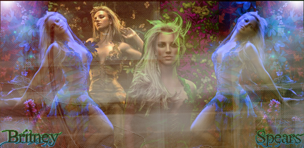
i think the first one is good.
i just really don't like the stroked text. it would be better off left alone. also it seems to plain. try to add some brushes. plus, the texture in the 2nd one would not match. you should probably get one that isn't so plain. you should get one with more colours. |
|
|
|
Posts in this topic
 shorty_d09 britney spears Nov 10 2006, 05:58 PM
 Jeng i htink theses would look better blended.
and the... Nov 10 2006, 06:08 PM Zatanna I prefer the first one. I think that the textures... Nov 10 2006, 06:11 PM towntown2 The first one is good. But, once again, your font ... Nov 10 2006, 09:29 PM
Jeng i htink theses would look better blended.
and the... Nov 10 2006, 06:08 PM Zatanna I prefer the first one. I think that the textures... Nov 10 2006, 06:11 PM towntown2 The first one is good. But, once again, your font ... Nov 10 2006, 09:29 PM
 |
1 User(s) are reading this topic (1 Guests and 0 Anonymous Users)
0 Members: