britney spears |
Resource Center Links
This Month's Contests | Hosts Looking for Hostees | Hostees looking for Hosts | BigBookofResources
Submission Guidelines

 Nov 10 2006, 05:58 PM Nov 10 2006, 05:58 PM
Post
#1
|
|
|
Senior Member  Group: Member Posts: 125 Joined: Aug 2006 Member No: 455,453 |
|
|
|
|


 |
Replies
| *Zatanna* |
Nov 10 2006, 06:11 PM
Post
#2
|
|
Guest |
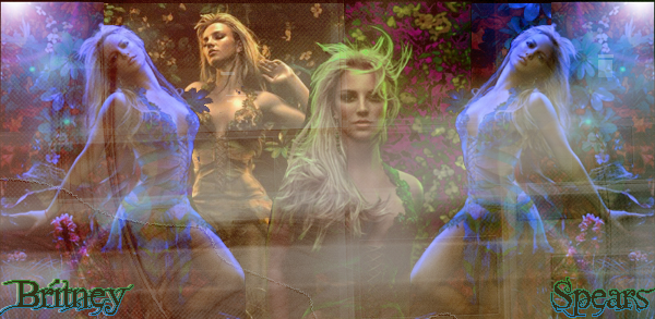
I prefer the first one. I think that the textures used on the second are too light in color and just don't fit the blend. The middle most upfront image is ok, but there's too much left not cropped out on the upper part of her right arm (it's particularly noticeable in the second blend).
Beautiful colors, great job. :) |
|
|
|
Posts in this topic
 shorty_d09 britney spears Nov 10 2006, 05:58 PM
 Jeng i htink theses would look better blended.
and the... Nov 10 2006, 06:08 PM towntown2 The first one is good. But, once again, your font ... Nov 10 2006, 09:29 PM
Jeng i htink theses would look better blended.
and the... Nov 10 2006, 06:08 PM towntown2 The first one is good. But, once again, your font ... Nov 10 2006, 09:29 PM showstopper! i think the first one is good.
i just really don... Nov 11 2006, 05:27 PM
showstopper! i think the first one is good.
i just really don... Nov 11 2006, 05:27 PM |
1 User(s) are reading this topic (1 Guests and 0 Anonymous Users)
0 Members: