Icons..&blend&set, once more? |
Resource Center Links
This Month's Contests | Hosts Looking for Hostees | Hostees looking for Hosts | BigBookofResources
Submission Guidelines

 Jul 12 2006, 02:59 PM Jul 12 2006, 02:59 PM
Post
#1
|
|
 My peanut.  Group: Member Posts: 948 Joined: Jul 2005 Member No: 187,456 |
   those are the icons.. are they better? heres a set I made. 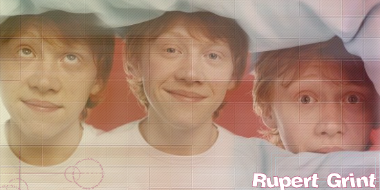 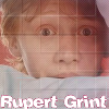 cc? |
|
|
|


 |
Replies
|
Jul 12 2006, 09:18 PM
Post
#2
|
|
 I intend to live forever-so far, so good. Group: Member Posts: 2,820 Joined: Mar 2005 Member No: 115,137 |
the patterns and such make your icons look a lil 'dull' as in theres no contrast. duplicating your icon when you're finished it and setting the top layer to overlay may help this *shrugs*
|
|
|
|


Posts in this topic
RupertGrintluvr15 Icons..&blend&set Jul 12 2006, 02:59 PM Jeng make the opacities of the patterns lower, or erase... Jul 12 2006, 03:26 PM xbabyboo These look much better..just mess with the opacity... Jul 12 2006, 04:08 PM TATiisoHO0D i like the 1st icon, its getting better. Jul 12 2006, 04:51 PM Kristinaa You're still overdoing the patterns and such. ... Jul 12 2006, 04:54 PM RupertGrintluvr15 geeze.. Idk why I try. :[ Jul 12 2006, 06:57 PM Kristinaa Because trying is practice and practice will event... Jul 12 2006, 06:59 PM This Confession well I don't know the icons bother me actually... Jul 12 2006, 07:14 PM RupertGrintluvr15 I think I do blends better than Icons too. THNX :]... Jul 12 2006, 09:06 PM marzipan ^ i agree with maryland. the icons just seem rathe... Jul 12 2006, 09:24 PM
 toyo loco I agree with everyone about the icons. Sometimes p... Jul 12 2006, 09:43 PM
 |
1 User(s) are reading this topic (1 Guests and 0 Anonymous Users)
0 Members: