simple new layout.. check it out, :) |
Resource Center Links
This Month's Contests | Hosts Looking for Hostees | Hostees looking for Hosts | BigBookofResources
Submission Guidelines

 Jul 5 2006, 09:03 PM Jul 5 2006, 09:03 PM
Post
#1
|
|
 Kara Mc  Group: Member Posts: 27 Joined: Nov 2005 Member No: 297,398 |
its just simple .. not a div overlay or anything... let me know what you think... thanks :)
oh yea, and it looks like shit in firefox! lol :) myspace.com/karamc p.s. if anyone can help me... i want to get rid of this space between the image and the table.. it only has a space on some of the tables and it drives me crazy lol.. please any help would be appreciated! here's what i mean.... 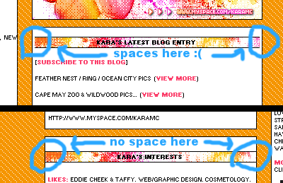
|
|
|
|


 |
Replies
| *This Confession* |
Jul 6 2006, 12:44 AM
Post
#2
|
|
Guest |
0_o
i don't get the whole spaces thing and thats not even the same layout as whats on the actualy myspace link you provided. atleast not on my computer. Theres no contact table or extended network either? why didn't you just hide the contact table 0_o i like the colors though. EDIT nvm it took them a few min to load for some odd reason and then i clicked the link again and they came up right away. but yea its okay, I'm not a big fan of sparkly stuff. |
|
|
|
Posts in this topic
 KaraMc simple new layout.. check it out Jul 5 2006, 09:03 PM
 Ralph501 Very bright colors. It looks really nice for those... Jul 6 2006, 02:14 AM
 KaraMc QUOTE(Ralph501 @ Jul 6 2006, 3:14 AM) Ver... Jul 6 2006, 04:14 AM silvernsilent I like the colors. I don't know about the spac... Jul 6 2006, 02:18 AM
 |
1 User(s) are reading this topic (1 Guests and 0 Anonymous Users)
0 Members: