superman blend, in the works |
Resource Center Links
This Month's Contests | Hosts Looking for Hostees | Hostees looking for Hosts | BigBookofResources
Submission Guidelines

 Jul 3 2006, 02:54 PM Jul 3 2006, 02:54 PM
Post
#1
|
|
 My peanut.  Group: Member Posts: 948 Joined: Jul 2005 Member No: 187,456 |
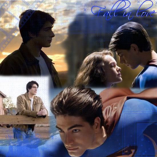 okay ya'll im looking for some suggestions on what I should do because this one could become better.. what do you think I should do to make it look better? |
|
|
|


 |
Replies
|
Jul 3 2006, 07:55 PM
Post
#2
|
|
 Senior Member Group: Posts: 8,274 Joined: Mar 2004 Member No: 8,001 |
omfg. it got better !
pratice makes perfect. a picture of a girl and a guy holding a girl kind of need to be redo again. cut outt the white spot ! dont forget to use opacity. if you did, use more. i like those two picture on top. it fit realllllyyy well. and that's what i'm talking about, real nice blending. afterall, KEEP IT UP! 
|
|
|
|

|
Jul 3 2006, 08:00 PM
Post
#3
|
|
|
My peanut. Group: Member Posts: 948 Joined: Jul 2005 Member No: 187,456 |
QUOTE(Spiritual Winged Aura @ Jul 3 2006, 7:55 PM)  omfg. it got better ! pratice makes perfect. a picture of a girl and a guy holding a girl kind of need to be redo again. cut outt the white spot ! dont forget to use opacity. if you did, use more. i like those two picture on top. it fit realllllyyy well. and that's what i'm talking about, real nice blending. afterall, KEEP IT UP! Its the background its not the picture cuz i cut it out already. its just the background of the new image thing.. (i hope that made sense...) uhh.. any suggestions on what to do with it? |
|
|
|
Posts in this topic
 RupertGrintluvr15 superman blend Jul 3 2006, 02:54 PM
 Zatanna If possible, get rid of the square looking thing y... Jul 3 2006, 02:59 PM RupertGrintluvr15 okay ya'll im looking for some suggestions on ... Jul 3 2006, 03:07 PM Jeng dont use that brush filrm strip brush or that brus... Jul 3 2006, 03:18 PM Zatanna I could have sworn I replied to this.
Oh wait, I ... Jul 3 2006, 03:23 PM salcha4u Feather a lot more. Jul 3 2006, 03:32 PM Kristinaa ^ Definately. Use a jumbo eraser.
Merged the 2 ... Jul 3 2006, 03:33 PM Mooka009 Use the eraser tool, and maybe set the opacity of ... Jul 3 2006, 03:36 PM tainted_angel I think you should have it so that the edges of ea... Jul 3 2006, 03:51 PM mizz_americaz Everyone stole my ideas already. I like the placem... Jul 3 2006, 04:35 PM
Zatanna If possible, get rid of the square looking thing y... Jul 3 2006, 02:59 PM RupertGrintluvr15 okay ya'll im looking for some suggestions on ... Jul 3 2006, 03:07 PM Jeng dont use that brush filrm strip brush or that brus... Jul 3 2006, 03:18 PM Zatanna I could have sworn I replied to this.
Oh wait, I ... Jul 3 2006, 03:23 PM salcha4u Feather a lot more. Jul 3 2006, 03:32 PM Kristinaa ^ Definately. Use a jumbo eraser.
Merged the 2 ... Jul 3 2006, 03:33 PM Mooka009 Use the eraser tool, and maybe set the opacity of ... Jul 3 2006, 03:36 PM tainted_angel I think you should have it so that the edges of ea... Jul 3 2006, 03:51 PM mizz_americaz Everyone stole my ideas already. I like the placem... Jul 3 2006, 04:35 PM
 Spiritual Winged Aura redo it again.
use feather.
use opacity.
overla... Jul 3 2006, 04:38 PM mizz_americaz ^huh, I'm kinda confused. I was just saying th... Jul 3 2006, 04:56 PM TATiisoHO0D i don't like it, but once again i agree with e... Jul 3 2006, 05:25 PM RupertGrintluvr15 anyone have any suggestions on what font I should ... Jul 3 2006, 06:42 PM TATiisoHO0D QUOTE(RupertGrintluvr15 @ Jul 3 2006, 6:4... Jul 3 2006, 07:48 PM RupertGrintluvr15 I re-did it how do you like it now? Jul 3 2006, 07:38 PM hollywood. It got better, but there's something about it ... Jul 3 2006, 08:07 PM Kristinaa QUOTE(hollywood. @ Jul 3 2006, 8:07 PM) I... Jul 3 2006, 09:06 PM xbabyboo It got much better,I don`t really like the blu... Jul 3 2006, 09:04 PM zebzie I'm sorry, but i agree with TATiisoHO0D, and i... Jul 3 2006, 09:06 PM marzipan the edited one looks so much better, but i don... Jul 3 2006, 09:18 PM
Spiritual Winged Aura redo it again.
use feather.
use opacity.
overla... Jul 3 2006, 04:38 PM mizz_americaz ^huh, I'm kinda confused. I was just saying th... Jul 3 2006, 04:56 PM TATiisoHO0D i don't like it, but once again i agree with e... Jul 3 2006, 05:25 PM RupertGrintluvr15 anyone have any suggestions on what font I should ... Jul 3 2006, 06:42 PM TATiisoHO0D QUOTE(RupertGrintluvr15 @ Jul 3 2006, 6:4... Jul 3 2006, 07:48 PM RupertGrintluvr15 I re-did it how do you like it now? Jul 3 2006, 07:38 PM hollywood. It got better, but there's something about it ... Jul 3 2006, 08:07 PM Kristinaa QUOTE(hollywood. @ Jul 3 2006, 8:07 PM) I... Jul 3 2006, 09:06 PM xbabyboo It got much better,I don`t really like the blu... Jul 3 2006, 09:04 PM zebzie I'm sorry, but i agree with TATiisoHO0D, and i... Jul 3 2006, 09:06 PM marzipan the edited one looks so much better, but i don... Jul 3 2006, 09:18 PM |
1 User(s) are reading this topic (1 Guests and 0 Anonymous Users)
0 Members: