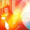
blends, past 2 present |
Resource Center Links
This Month's Contests | Hosts Looking for Hostees | Hostees looking for Hosts | BigBookofResources
Submission Guidelines
 Dec 30 2005, 04:22 PM Dec 30 2005, 04:22 PM
Post
#1
|
|
 Are You Kidding?       Group: Member Posts: 1,714 Joined: Sep 2005 Member No: 237,747 |
|
|
|
|
 |
Replies
 Dec 30 2005, 04:32 PM Dec 30 2005, 04:32 PM
Post
#2
|
|
 You'll find me in your dreams.        Group: Official Member Posts: 8,536 Joined: Mar 2005 Member No: 114,010 |
Don't cut the pictures out unless you know what you're doing, they look choppy otherwise. The line options in PSP... Don't use them. They end up looking stupid, as in your first blend. The pictures also are bad quality in most of the blends. Using high quality pictures makes the blend more clean-cut.
On the Jesse McCartney one, you don't want to cover the faces like that. it looks bad. Also, the border completely doesn't match the color scheme. For the Alexis one, make the texture softer unless you're going for a really grunge look. But then... It doesn't really fit her. You should make the feel of a blend match the feel of the subject. On the Teairra one, her legs look odd because of the texture you use. Meh, it doesn't look so great. |
|
|
|
Posts in this topic
 maryissa blends Dec 30 2005, 04:22 PM
 CUTEBUNNY160 they all look funny to me. the textures are bad an... Dec 30 2005, 04:25 PM
 xbabyboo The pictures are a little pixely.other than that G... Dec 30 2005, 04:27 PM
 -lana Did you use the eraser tool, and erase the backrou... Dec 30 2005, 04:28 PM
 skp86 The cinderella story one is, okay, I don't rea... Dec 30 2005, 04:36 PM
 CUTEBUNNY160 ha i just noticed. YOU DID CUT THEM OUT. if you d... Dec 30 2005, 08:05 PM
 mizz_americaz if you cut out the picture, make the cut out large... Dec 30 2005, 09:35 PM
 maryissa Ok thanks 4 the comments i guess? I do have real b... Dec 30 2005, 11:46 PM
 ilauqh um in the first one chad michael murray's ear ... Dec 30 2005, 11:54 PM
  |
1 User(s) are reading this topic (1 Guests and 0 Anonymous Users)
0 Members:


